











- Client
- MediFlow
- Industry
- Healthcare
- Headquarters
- USA
- Service
- UI/UX & branding
( About the project )
About
MediFlow is a digital healthcare platform connecting patients and providers in one ecosystem. The brief combined a patient mobile app with a dedicated provider dashboard: two very different experiences inside one cohesive product.
( The brief )
Challenge
Problem
Two opposite user groups. Patients needed a simple way to manage appointments and health data without overload; providers needed a dense, fast dashboard to review summaries, monitor trends and prioritise during clinical decisions.
Solution
The patient app has clear navigation and simplified health information. The provider dashboard organises metrics, schedules and trends into a structured hierarchy for faster decisions. One shared design system connects both products and adapts to each audience.
( How we worked )
Process
- DiscoveryUser interviews, Competitor analysis, Personas & journeys
- UX designInformation architecture, User flows, Wireframes
- UI designPatient app, Provider dashboard, Responsive layouts
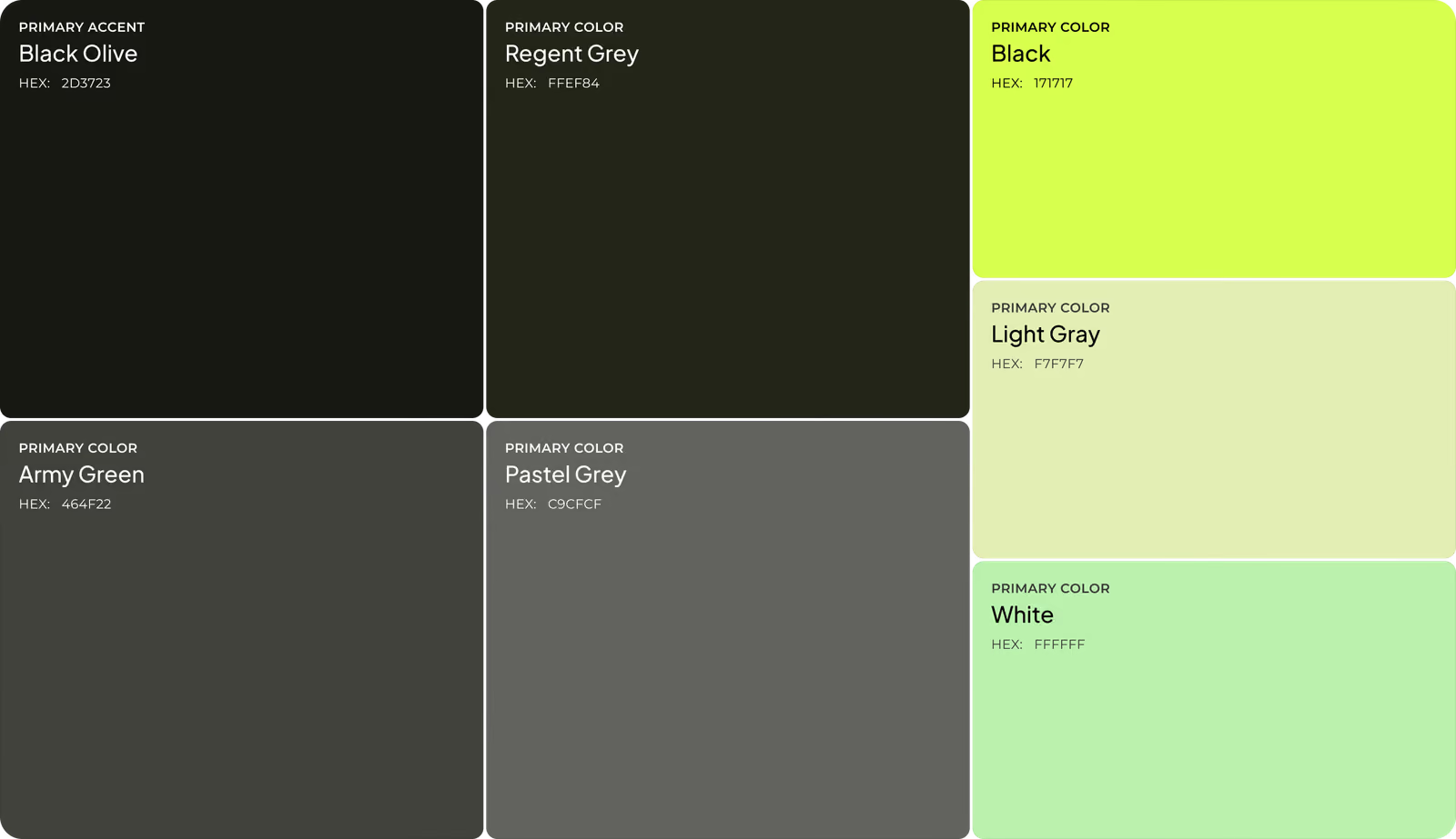
- Design systemComponent library, Typography & patterns, Shared colour principles
App flow
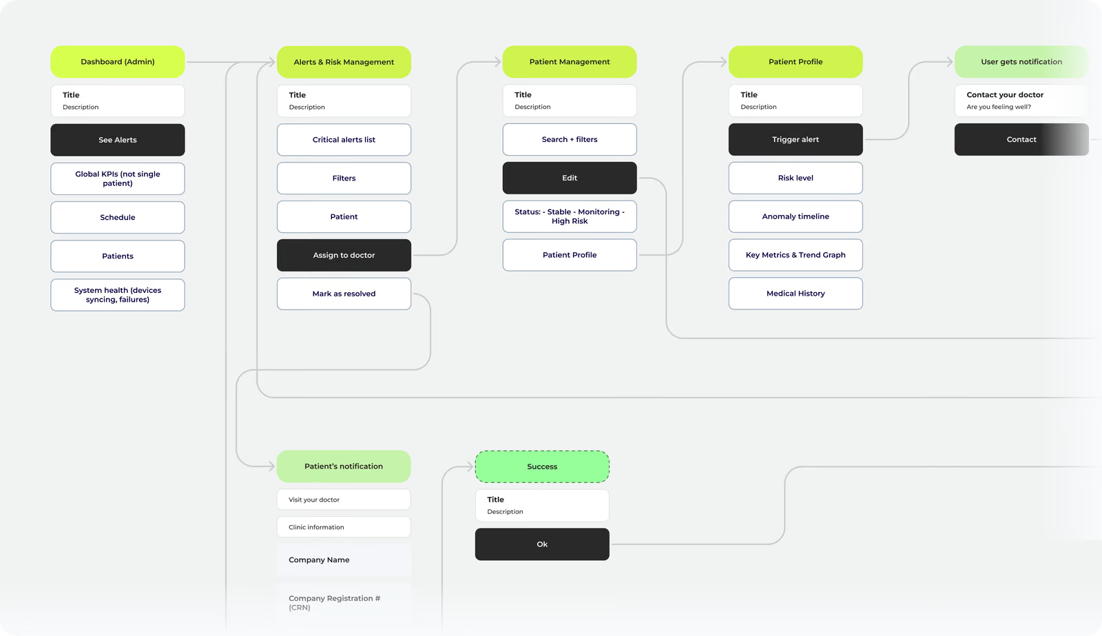
The patient flow runs from onboarding through tracking, appointments and insights in one continuous path. The provider flow moves from an overview into patient management, trends and risk assessment.
Moodboard
Soft neutrals, subtle accents and rounded forms reassure patients; structured grids and data-focused type support precision for providers.
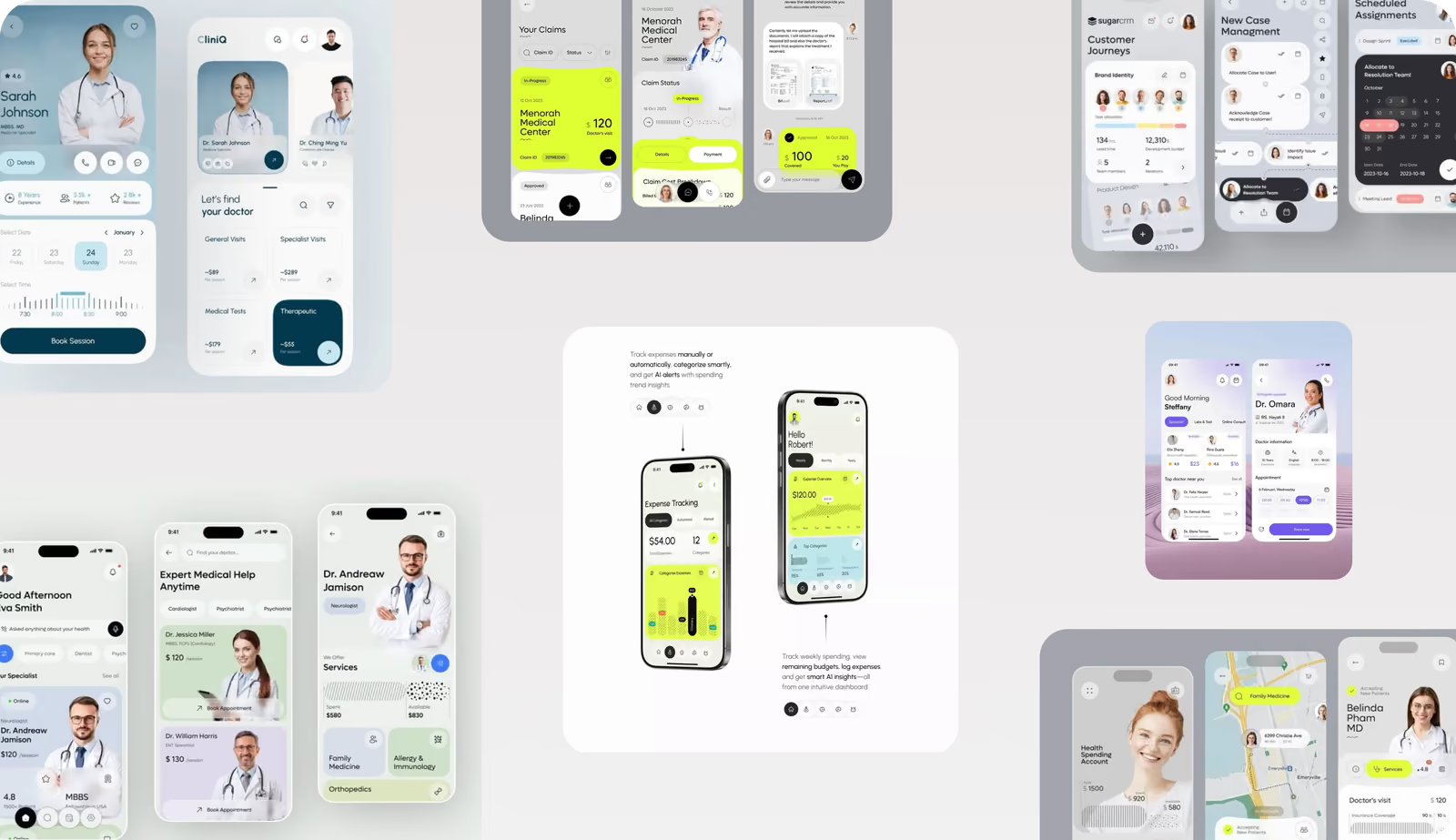
Wireframing
Mobile wireframes made everyday tasks simple; for the dashboard we explored several layouts to find the most efficient way to review data and prioritise tasks.
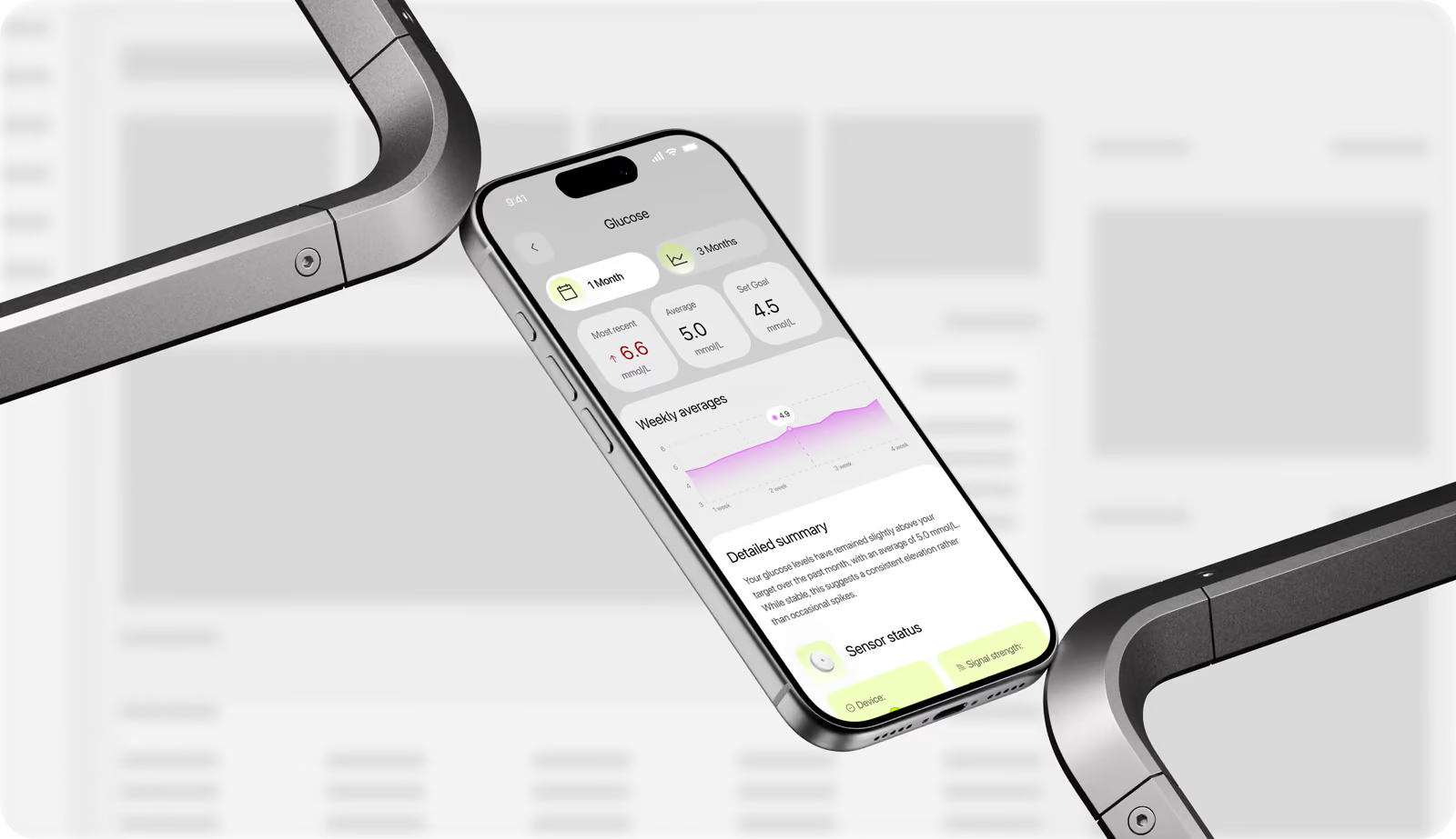
One design system that serves patient simplicity and provider speed at once.
Logo design
Three rounded bars arranged like pills make the healthcare purpose recognisable at a glance, and work as the app icon on a lime background.
Mobile app design
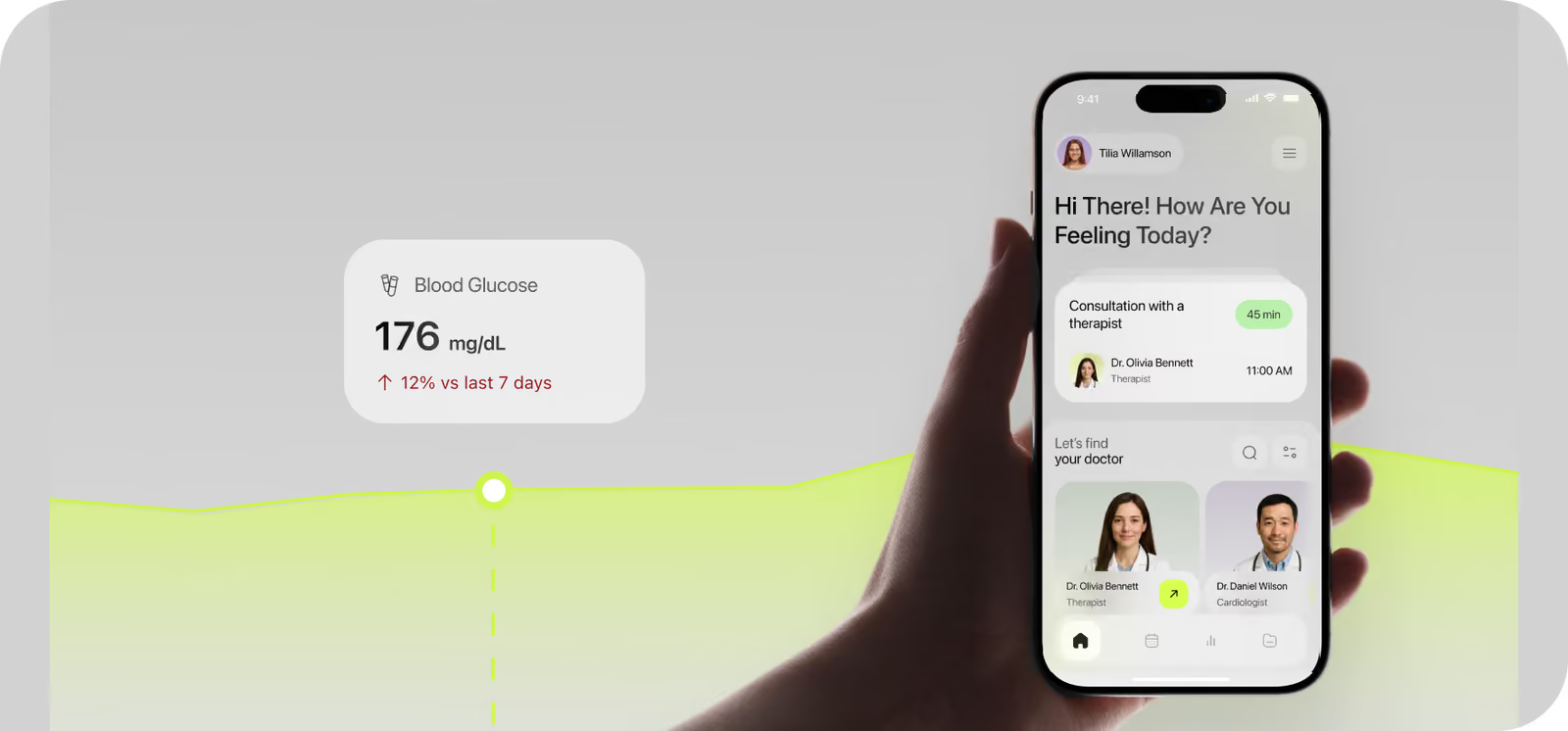
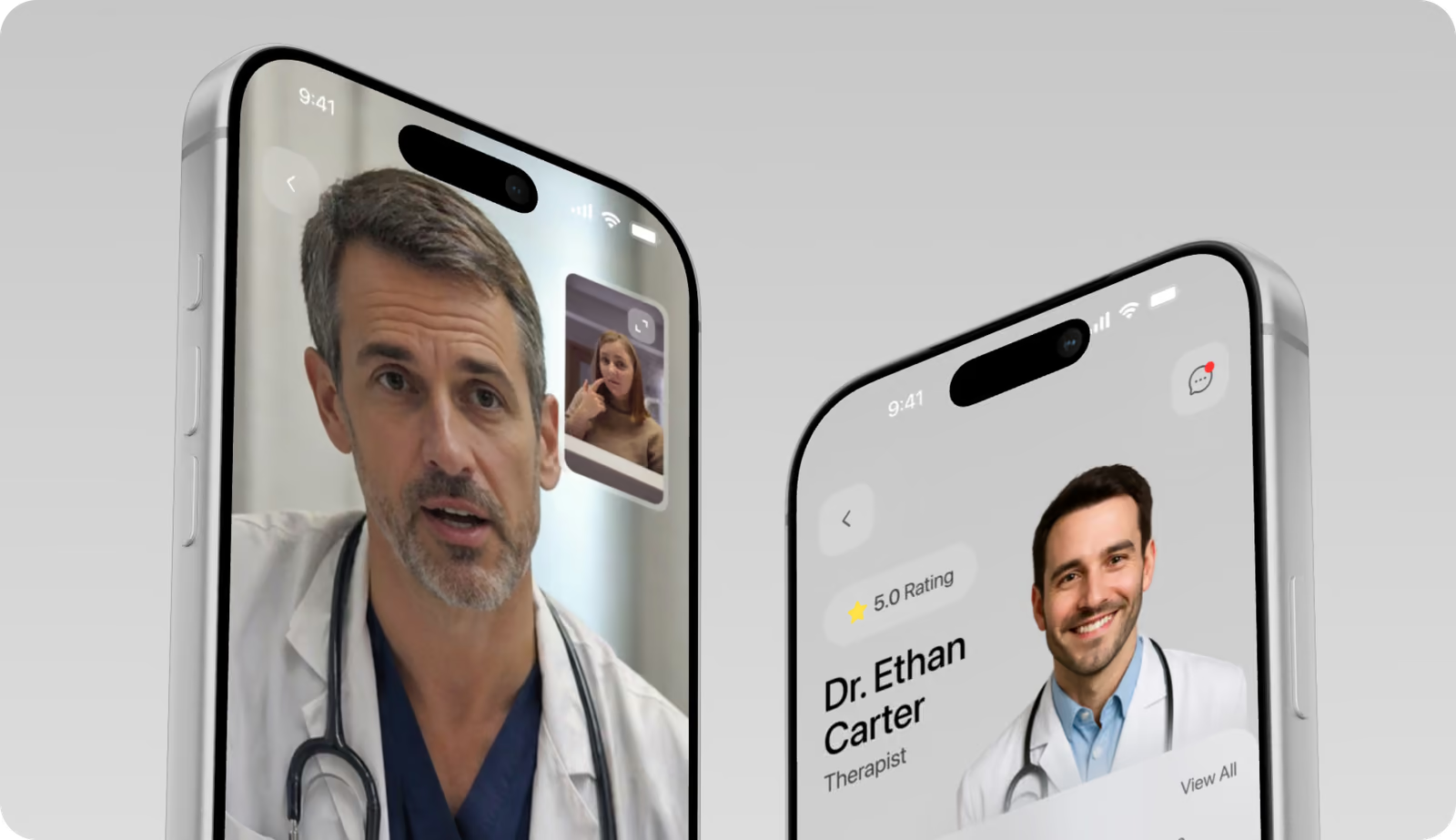
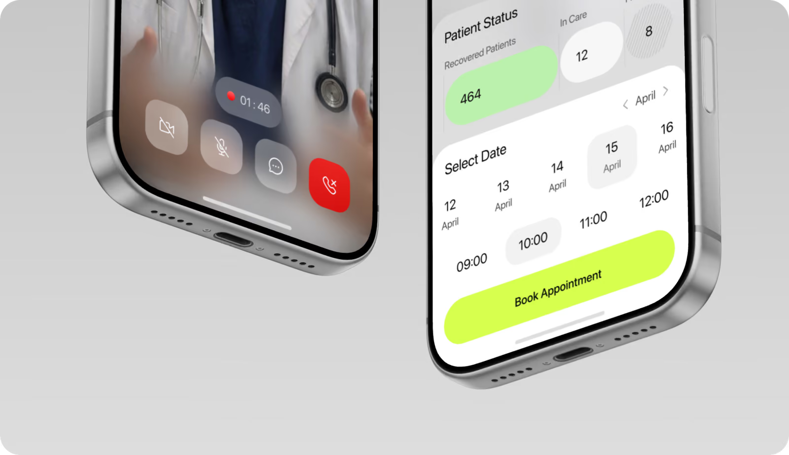
One-step booking, a monitoring dashboard against personal goals and video consultations on a single screen: fewer steps and more consistent daily use.
Web application design
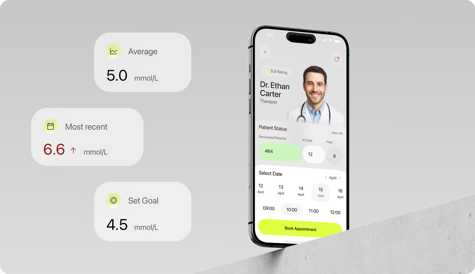
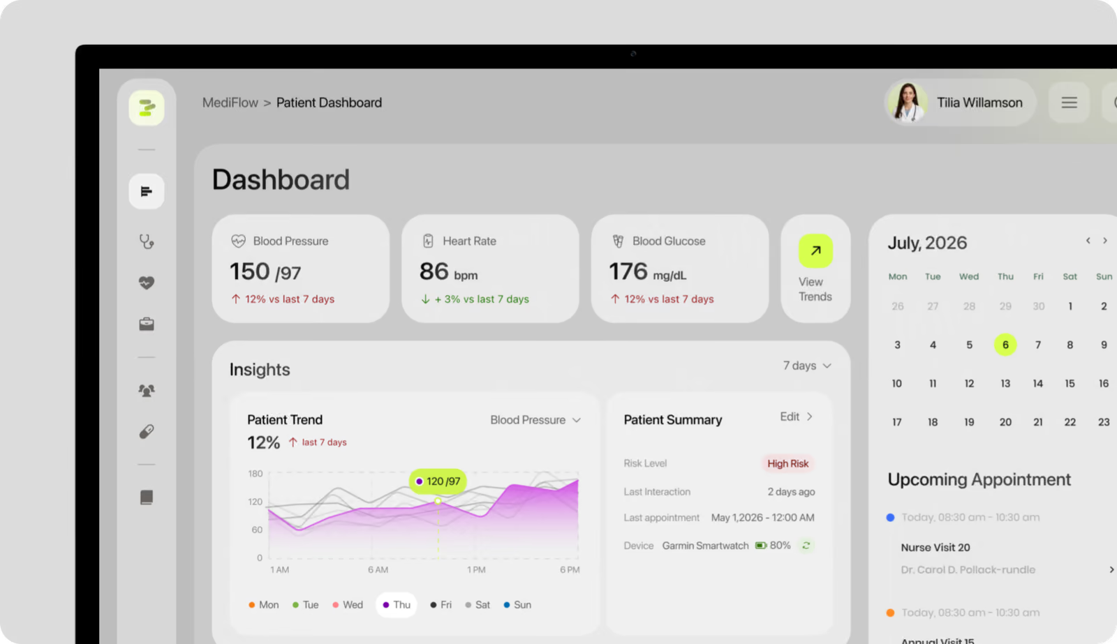
Risk level and trend direction sit ahead of the detailed charts, so providers can assess a patient's status before opening any detail view.
Design system
Shared components, tokens and patterns for both products.
( Stack )
- Flutter
- Next.js
- Figma
( Results )
WHAT CHANGED
91%
Positive clarity feedback
Usability participants said tracking, appointments and consultations were clear and understandable.
84/100
Usability score
The patient app prototype reached an 84 SUS score.
29%
Lower provider load
Providers reported 29% less effort reviewing patient summaries than in competitor dashboards.
30%
Fewer steps to book
Booking a visit took 30% fewer steps than in similar healthcare apps.

Social media
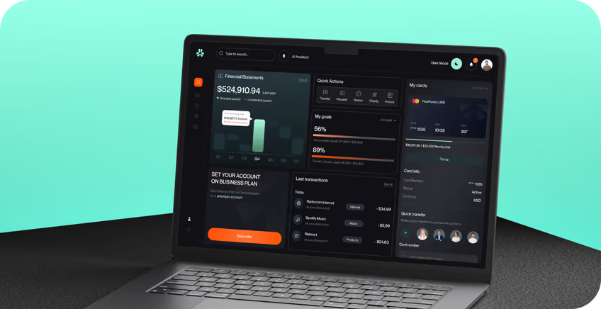
Story-format assets pair short, direct headlines with real app screens, keeping the brand human, calm and trustworthy.