












- Client
- FlowFunds
- Industry
- Fintech
- Headquarters
- UK
- Service
- UI/UX | Branding
( About the project )
About
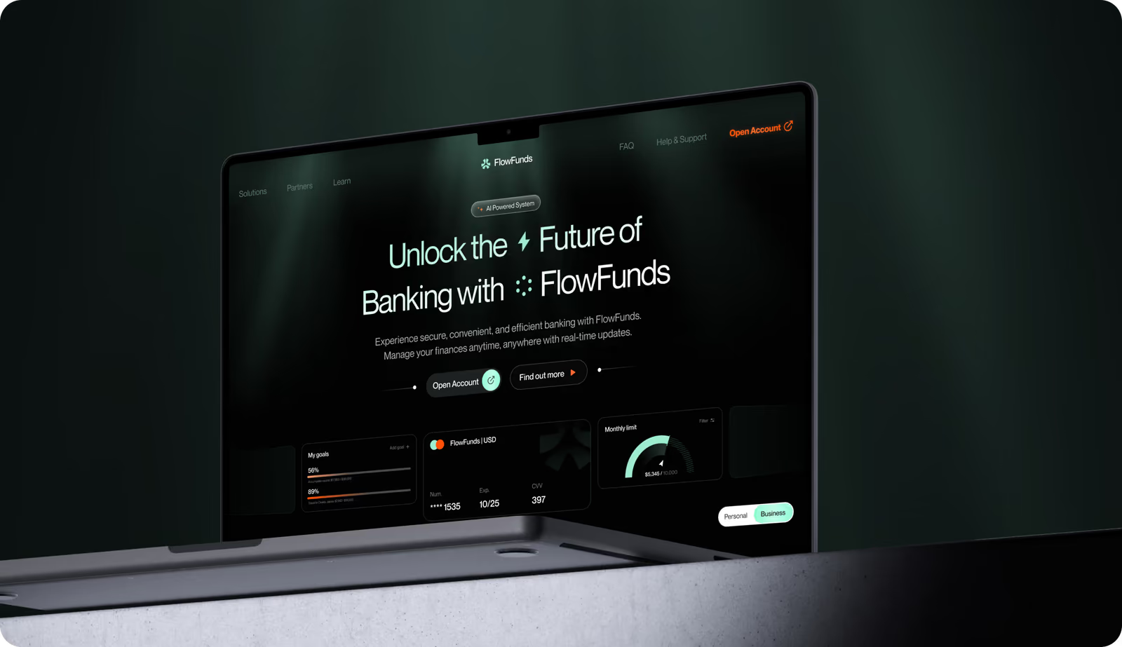
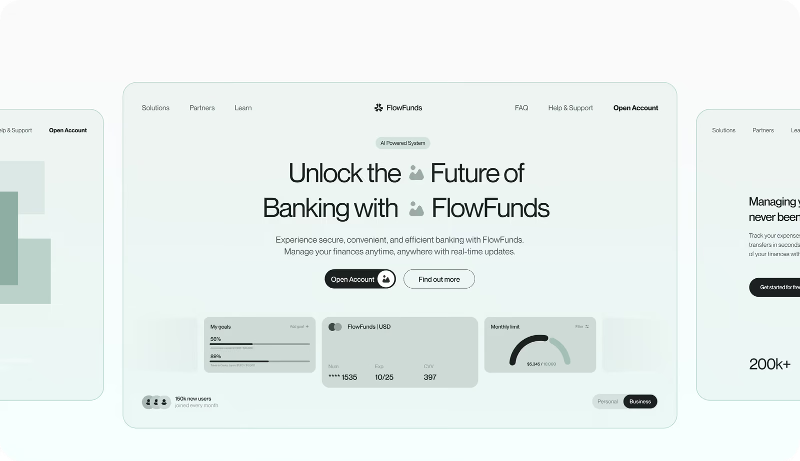
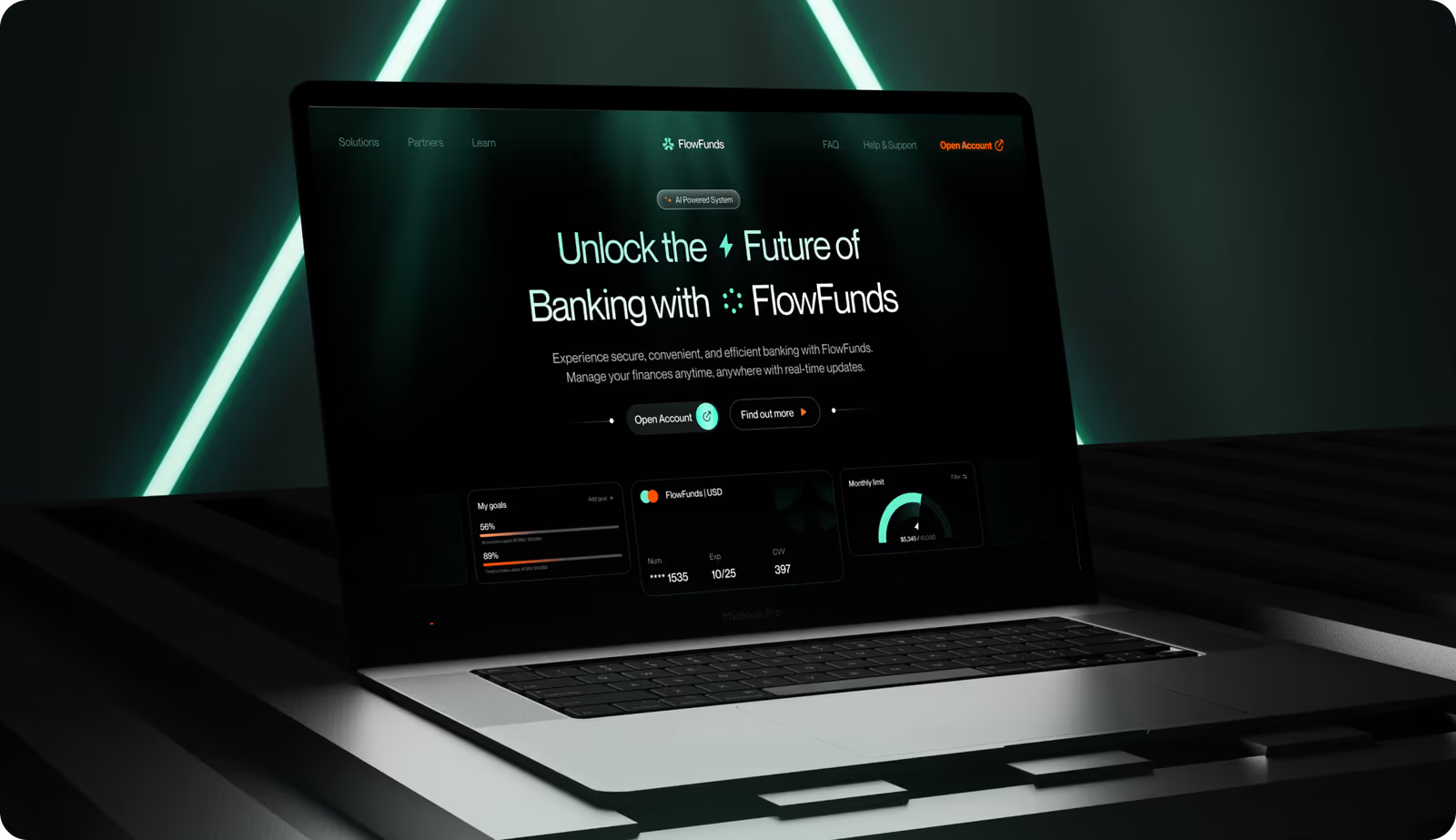
FlowFunds is a fintech platform that combines personal finance management, digital banking, and investment tools. It serves individual users and businesses. The client needed a complete digital ecosystem: a landing page, a web platform, and a mobile app built as one coherent product.
( The brief )
Challenge
Problem
Their brand felt inconsistent across touchpoints and didn’t signal the reliability fintech users expect. We had to create a unified yet flexible design system for web, mobile, and offline presence. Also, our task was to design clear interactive dashboards for complex financial data.
Solution
Our team created a cohesive design system with interactive dashboards, clear data visualization, and AI assistance for transaction searches and financial recommendations. Core actions such as card management are front and center, allowing users to top up, block, or add cards with a single tap on any device.
( How we worked )
Process
- DiscoveryBriefing & onboarding, Onboarding, Competitors Research
- BrandingMoodboard, Concept design, Layouts design, Design system
- UX DesignProduct/business goals, Wireframes
- UI DesignMoodboard, Concept design, Layouts design, Design system
App Flow
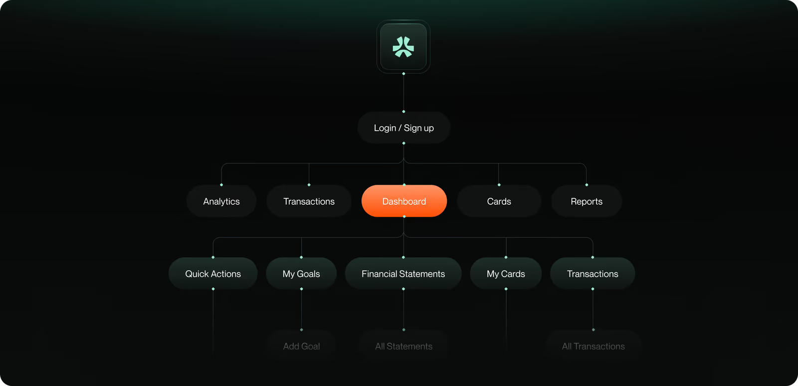
Our UI/UX designer organized the dashboard around the most common tasks to make them accessible from the main screen. They are transfers, top-ups, and card management. Testing revealed that customers preferred faster access to tasks. So, we moved them from secondary menus to the main display.
Wireframing
Our team began with low-fidelity sketches to outline user flows and hierarchy before creating mid-fidelity wireframes. Client comments at each level formed the final high-fidelity prototypes. A core challenge was maintaining consistent navigation logic across the landing page, web platform, and mobile app. We solved this with modular, reusable layouts that kept the same structure and interaction patterns on every screen.
We help fintech teams go from inconsistent brands to products that users rate 90% easy to use.
Web Application Design
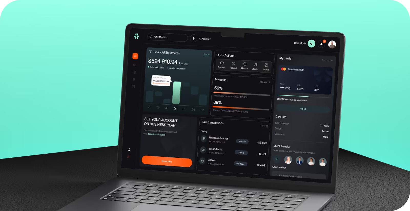
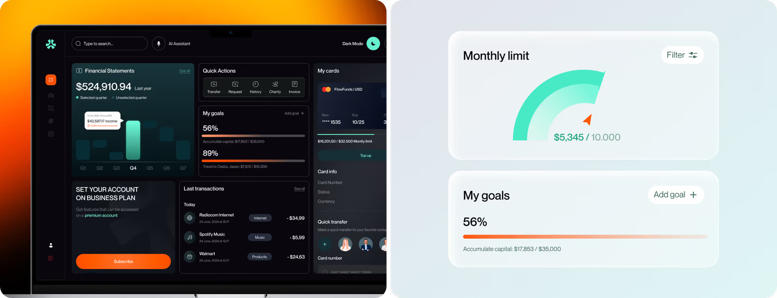
The web UI centers on a modular dashboard where complex financial data breaks into expandable sections. Users see priority information first and drill down when needed. We embedded an AI-powered assistant directly in the dashboard. People can search transactions and get financial insights without leaving the main screen.
Mobile App
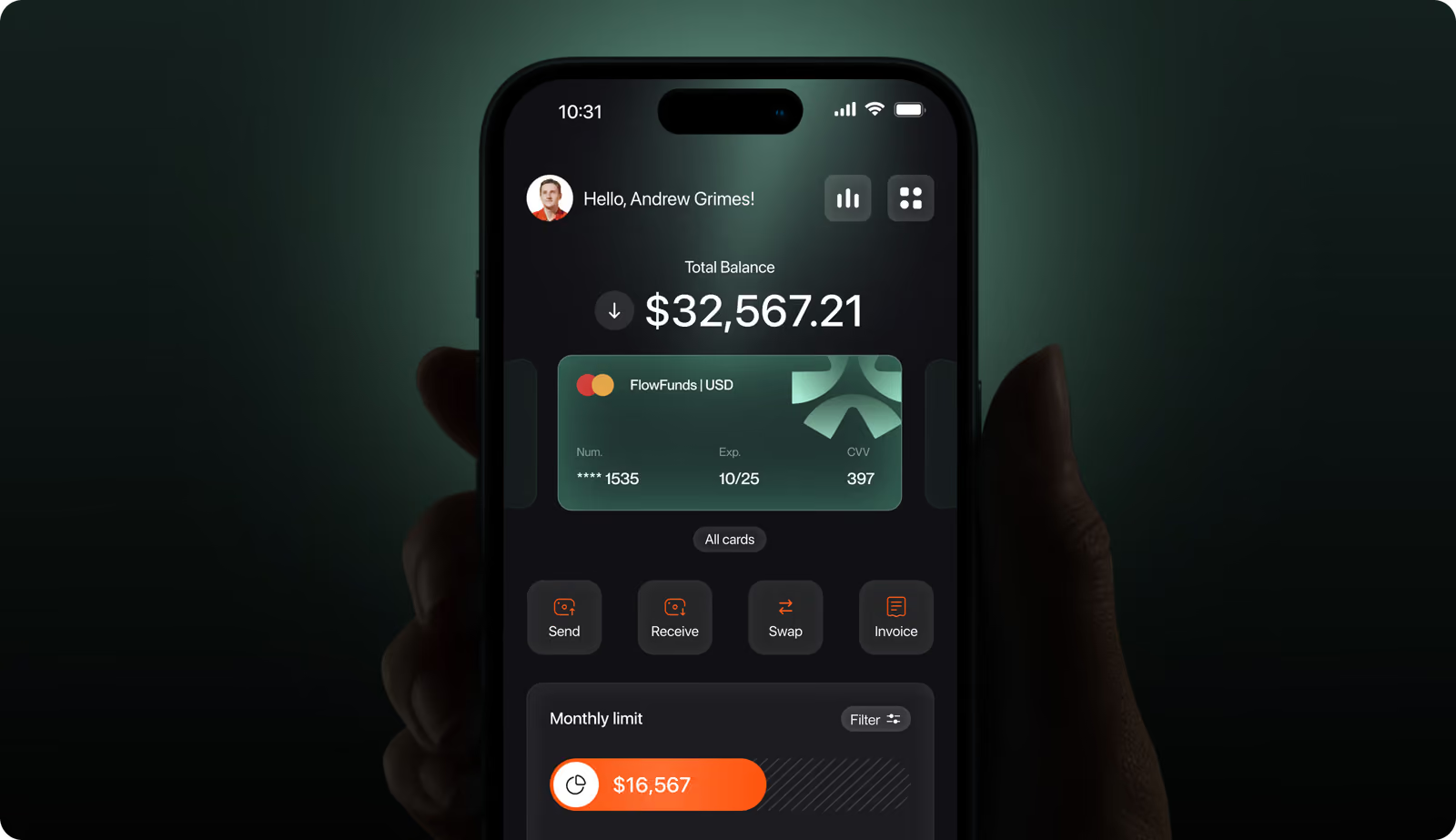
The mobile app uses touch-optimized interactions that people can complete in a few taps. Adaptive layouts and scalable components have the same visual hierarchy and navigation logic as the web platform. So, users switch between devices without relearning the interface. Our designer adjusted the typography and spacing specifically for smaller screens to keep financial data readable without reducing the available information density.

Printed Materials
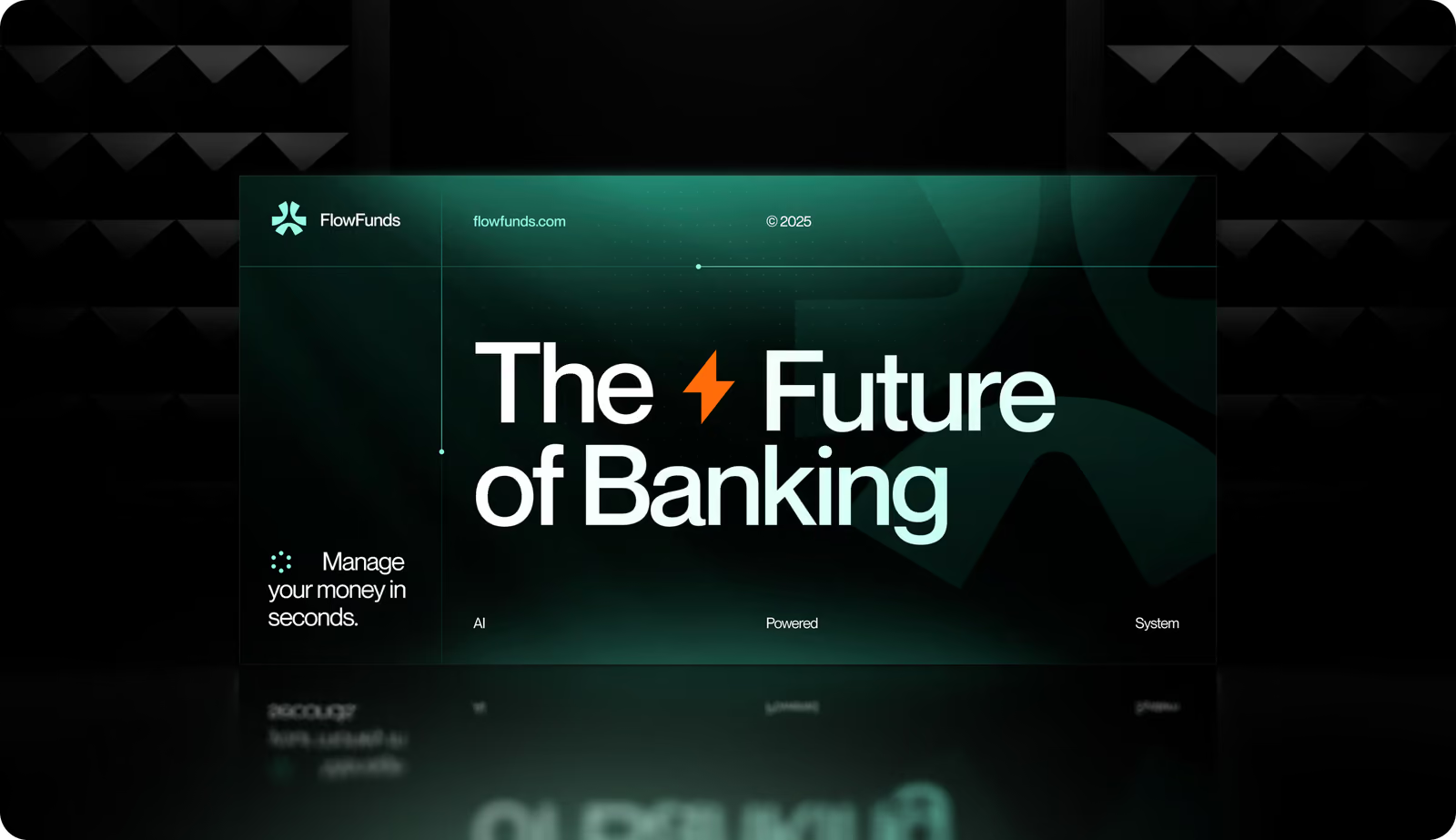
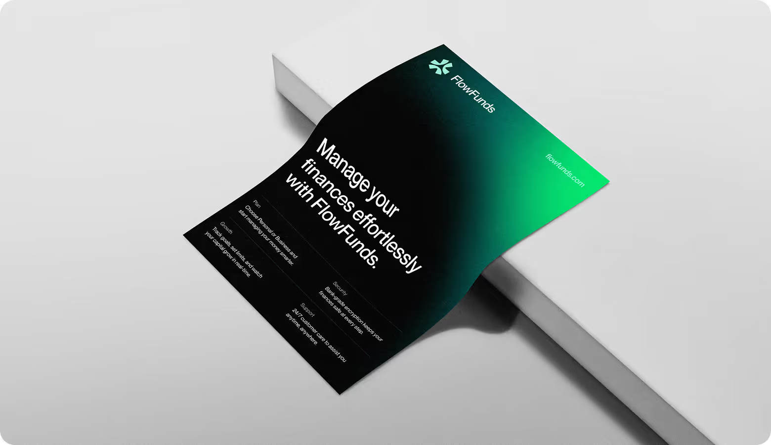
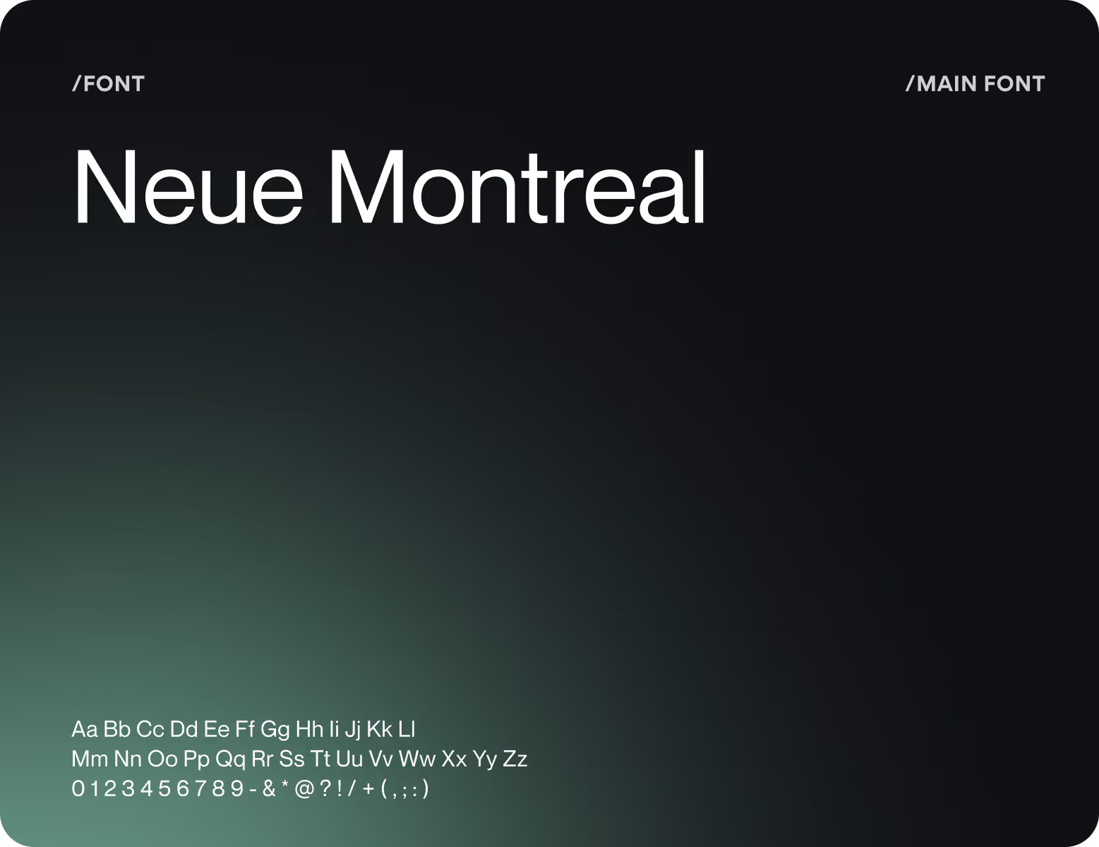
Brochures and marketing collateral use a black-to-green gradient, logo, and type hierarchy as the digital product. The constraint was making screen-native visuals work in print without losing brand coherence. Our goal at this stage was to make offline materials immediately recognizable as part of the same product.
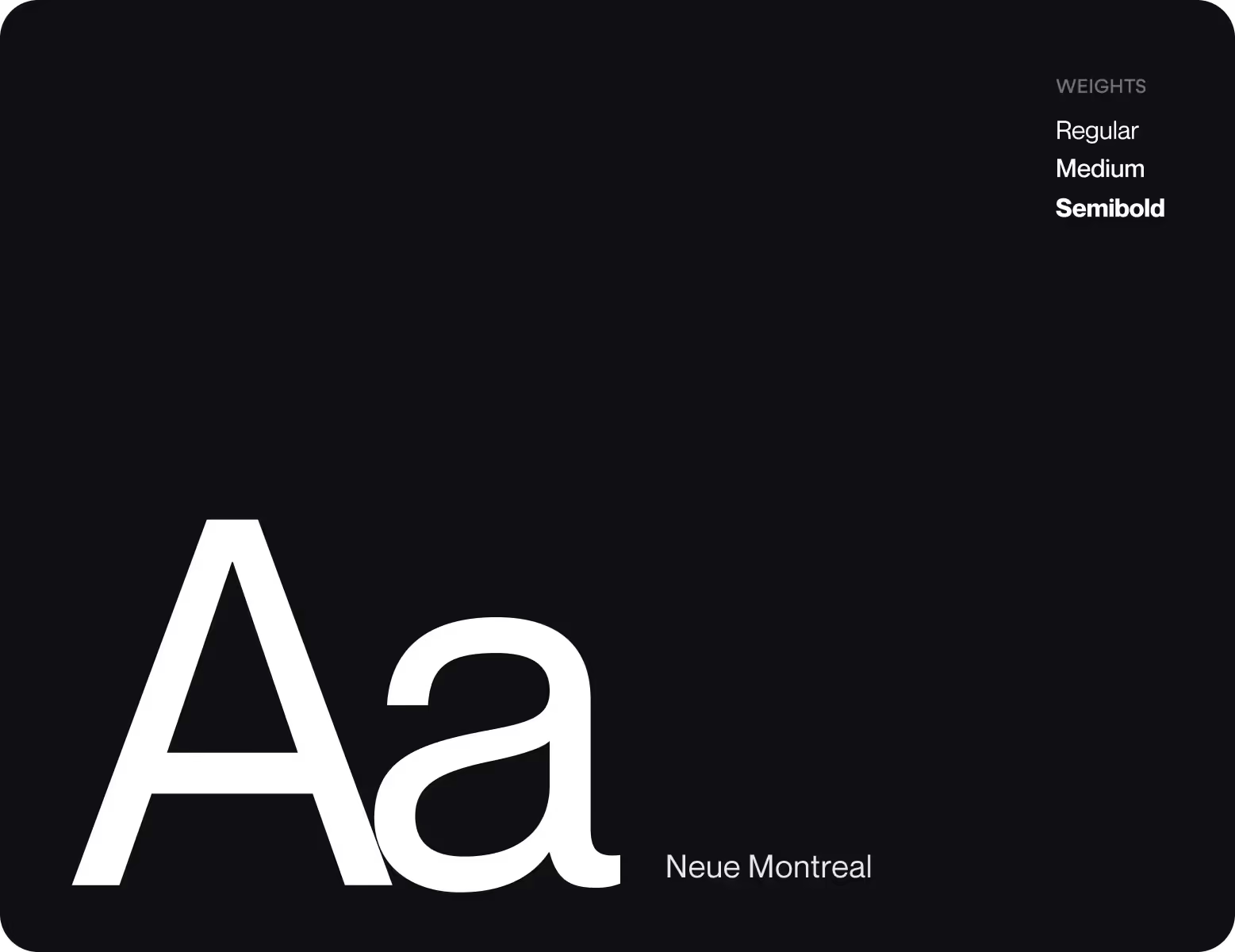
Design system
( Results )
WHAT CHANGED
x2
Registered users within the first 6 months post-launch.
A consistent brand identity across web, mobile, and print built the trust needed to convert new sign-ups.
90%
Of surveyed users rated the platform as easy to use.
Clear visual hierarchy, touch-optimized interactions, and readable typography across all screen sizes made the difference.
150k+
New users join the platform every month.
Simplified onboarding and adaptive mobile design reduced the barrier to entry for new users.
+40%
Average session time after launch.
Modular dashboards with expandable data views kept users engaged longer without overwhelming them.
Social Media
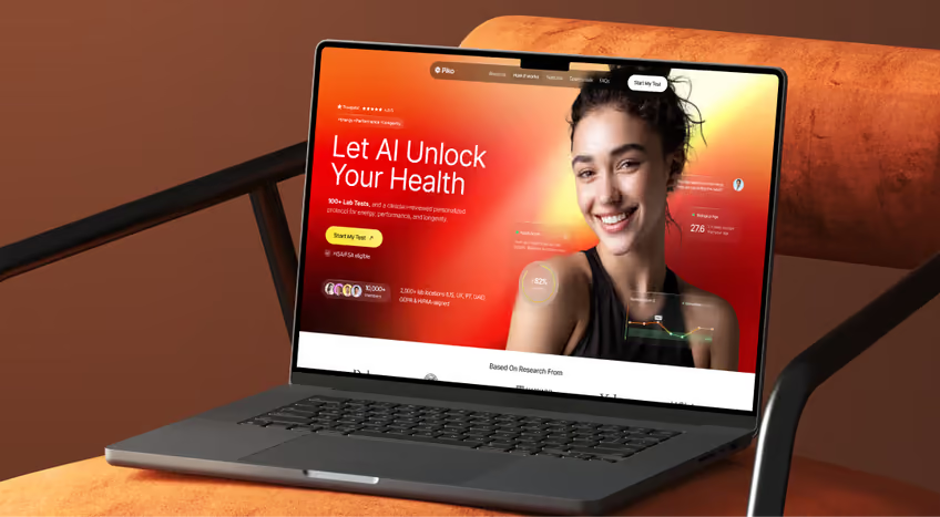
Social media formats have the same visual system to feel like a natural extension of the product and reinforce brand recognition. We avoided decorative filler, so each asset leads with one specific message. For example, metric, a feature, or social proof.