








- Client
- PayPossible
- Industry
- Fintech
- Headquarters
- USA
( About the project )
About
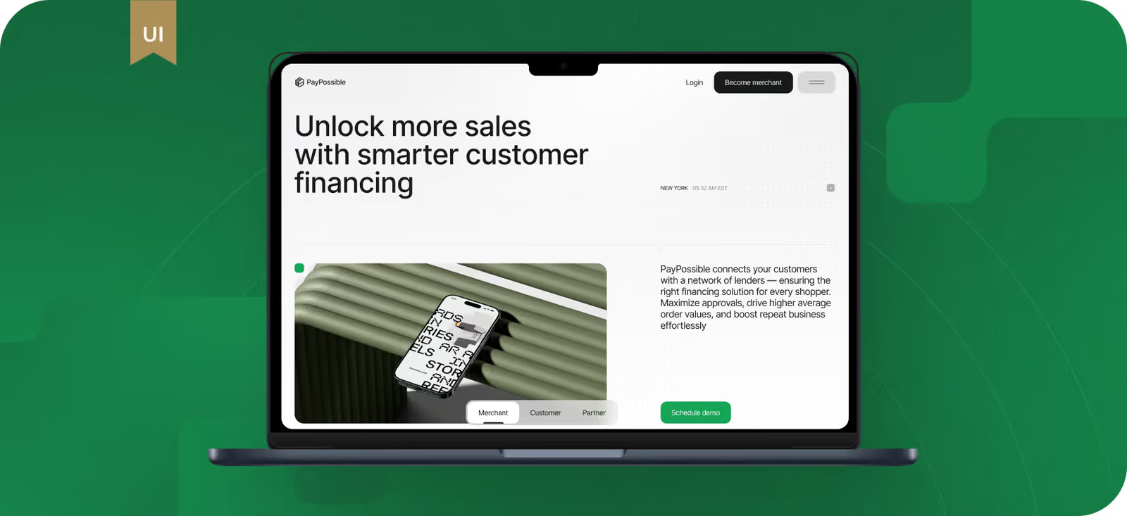
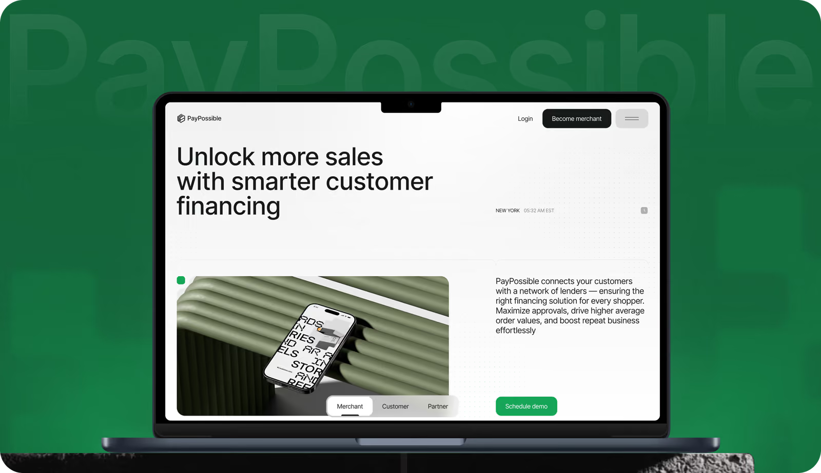
PayPossible is a fintech platform for merchants, lenders, and banks. The client required a website redesign that would clearly convey information to enterprise clients and help merchants quickly understand how the platform works and why they can trust it.
( The brief )
Challenge
Problem
The website was outdated, without a clear structure, and didn’t build enough trust for clients. We had to explain a complex multi-lender model and waterfall financing logic simply. The website had to be fast, responsive, and visually appealing, with modern graphics and animation.
Solution
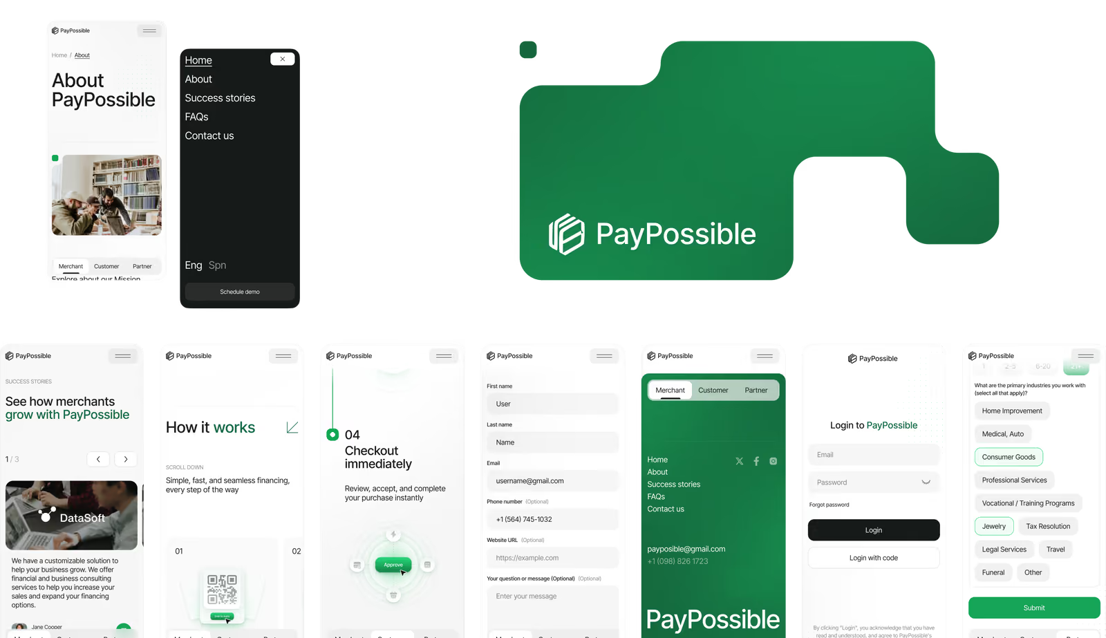
Our team designed a modern website with simple navigation, strong calls to action, and custom illustrations. We implemented a floating action button for constant access to key actions. A step-by-step registration process includes progress indicators to improve usability and increase conversion.
( How we worked )
Process
- DiscoveryBriefing & onboarding, Product/business goals, UX audit, Roadmap
- UX DesignInformation architecture, User flows & onboarding logic, Wireframes, Usability validation
- UI DesignVisual system & moodboard, Custom illustrations, Responsive design, UI kit
Wireframes
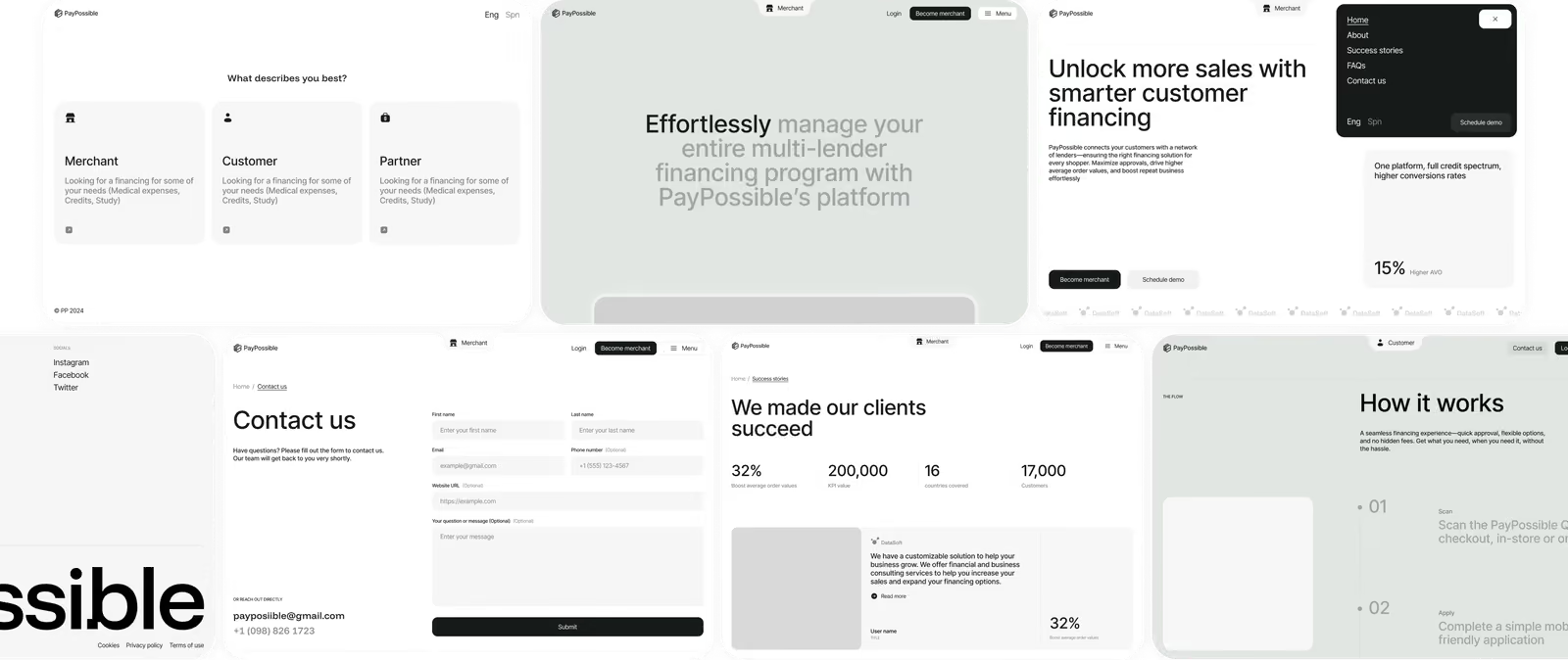
The research-driven approach helped us create clear user flows and step-by-step actions, with content and calls to action carefully placed. The client trusted our design judgment and gave us complete creative freedom. The main task here was to turn a broad vision ‘clean, professional, and modern’ into a structure with the proper hierarchy and pacing.
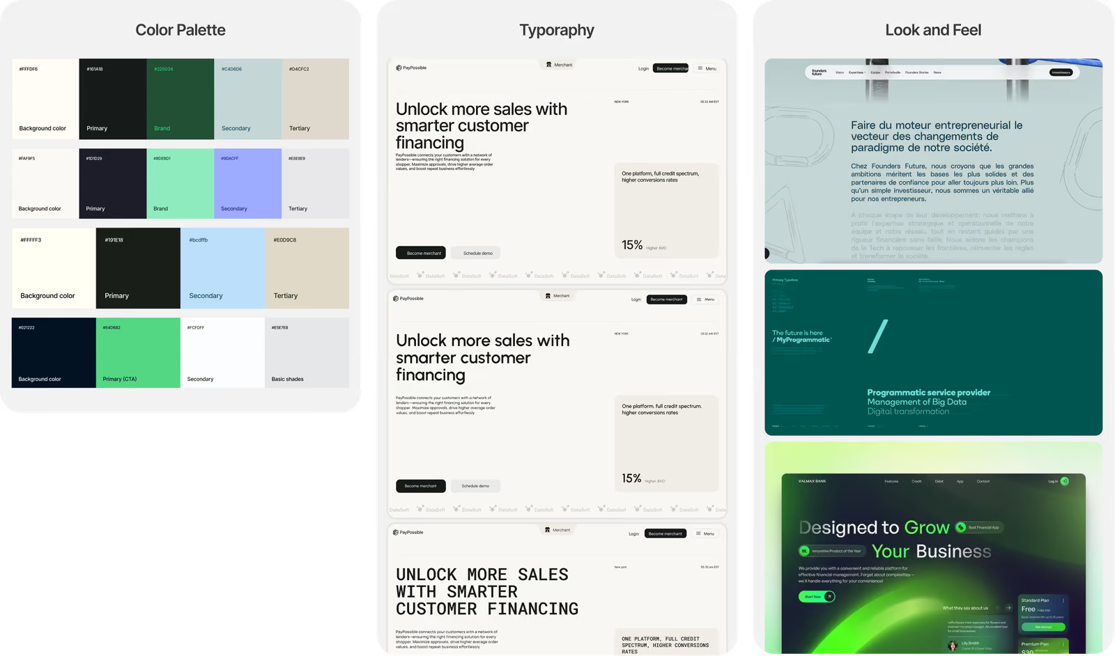
Moodboard
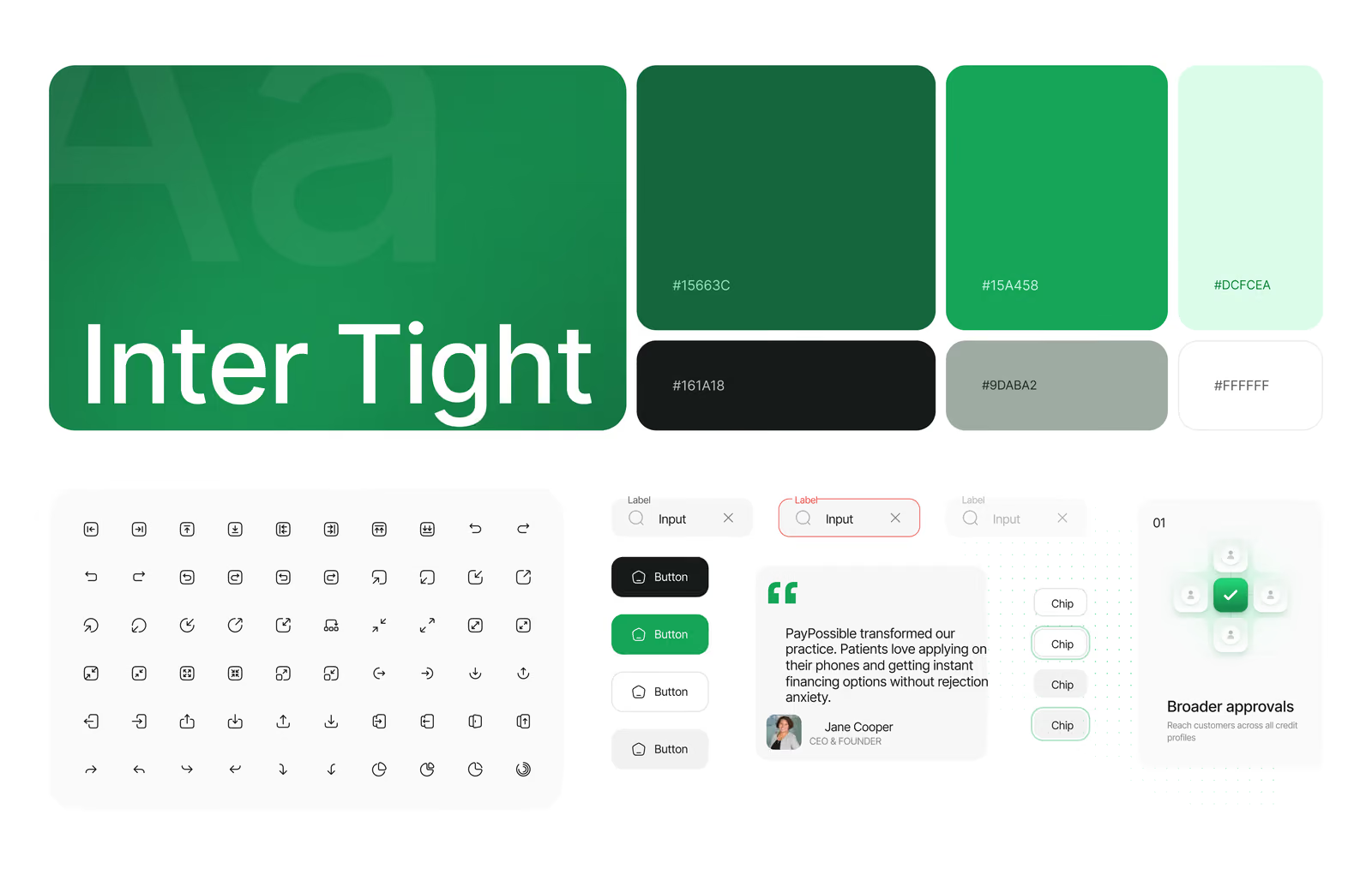
The moodboard focused on trust and professionalism, with a green-led color palette that reflects stability, growth, and financial reliability. Structured typography (Inter Tight), clean layouts, restrained contrasts, and subtle motion support a mature B2B fintech presence without distracting from usability.
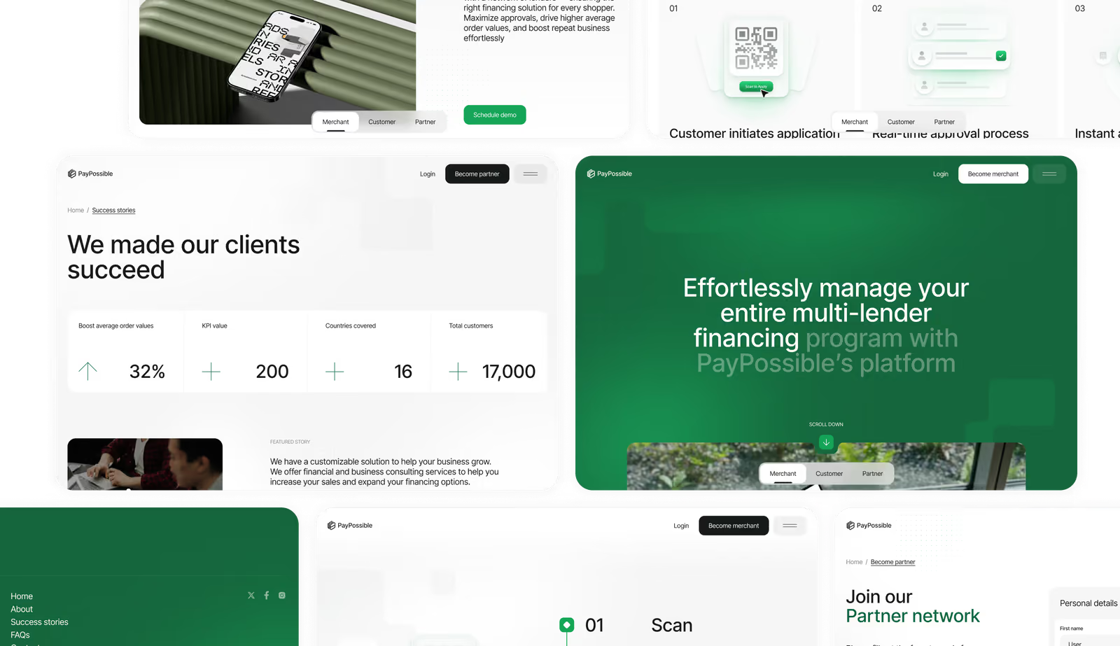
UI Layouts
The previous website didn't reflect the PayPossible experience, had an outdated interface, an obscure hierarchy, and complex processes. We created a new interface with a clear hierarchy, step-by-step registration with progress indicators, a permanent action bar, and fully responsive layouts. These changes led to a doubling of merchant registrations and an increase in the completion rate of key actions.
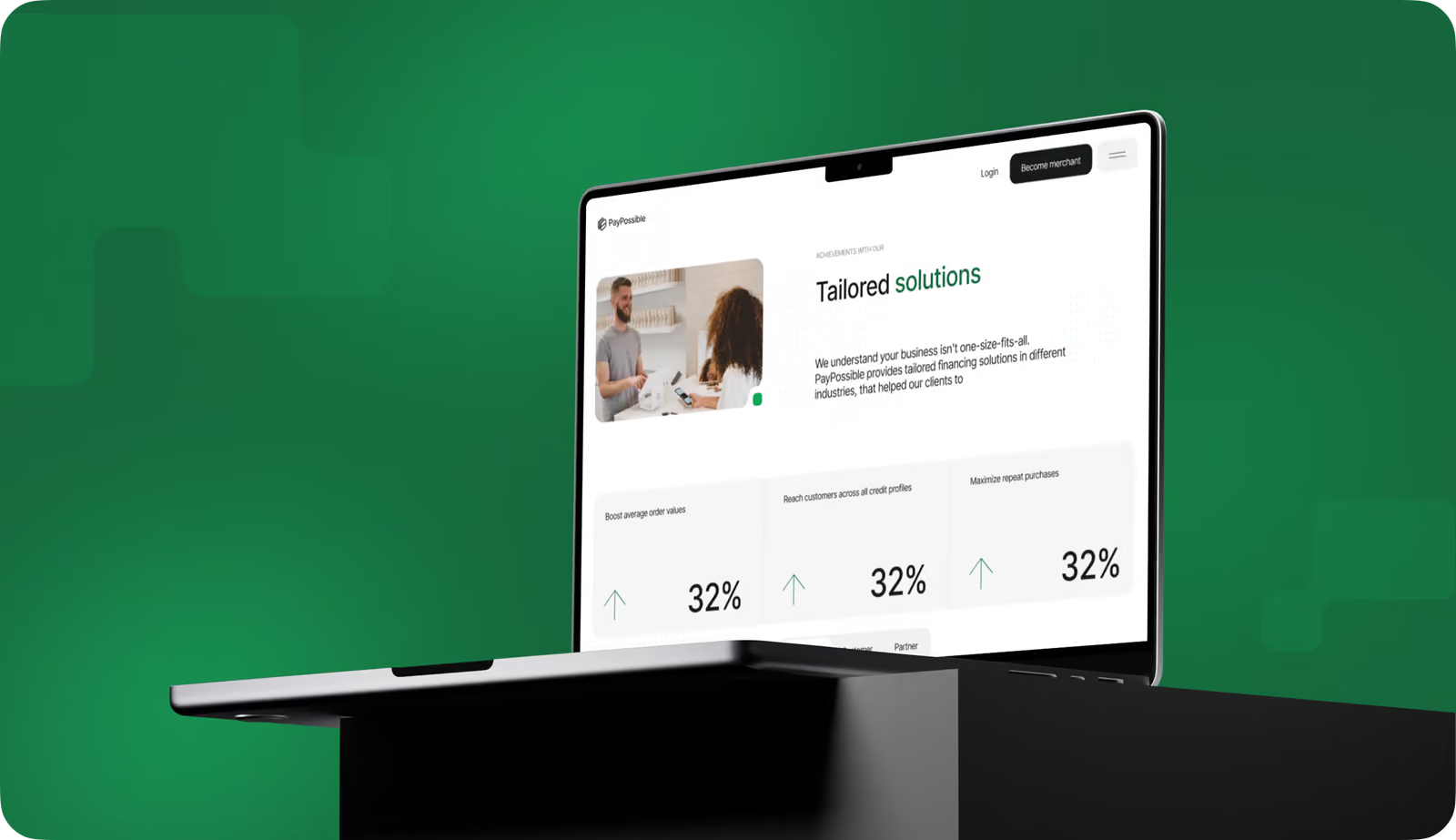
Redesign your website to increase trust, conversions, and enterprise-ready clarity.
Mobile
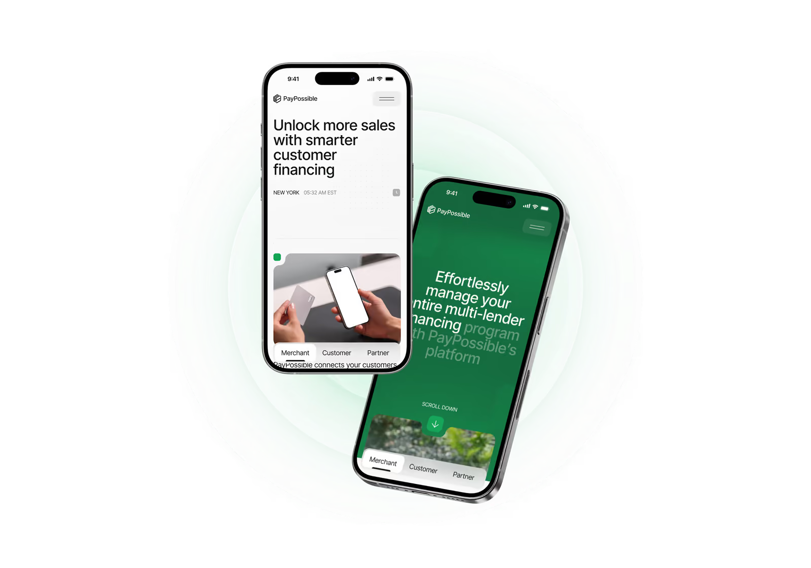
We designed the PayPossible website mobile-first. Convenient touch controls, intuitive navigation, and simple visual elements allow users to easily familiarize themselves with the platform, complete the registration process, and take the necessary actions without delays or confusion.
Illustrations
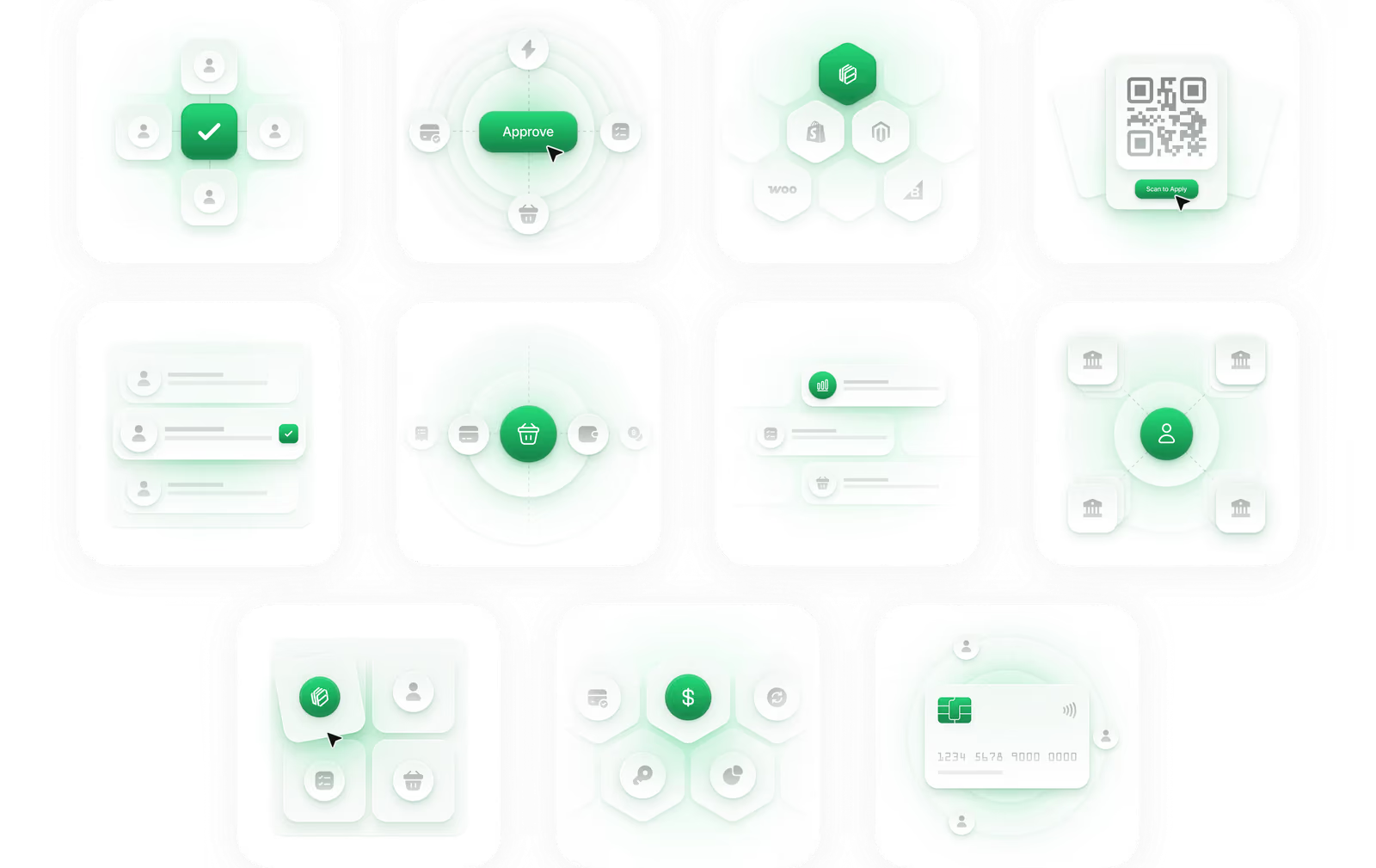
A custom illustration system shows PayPossible’s multi-lender financing logic without text-heavy explanations. Each visual breaks the process into explicit steps. It helps merchants and customers understand how financing works, and reinforces speed, integration, and broad lender coverage.
Design System
( Results )
WHAT CHANGED
2x
Merchant signups
Clear onboarding steps and visible calls to action doubled merchant registrations.
+40%
Completed financing applications
Simplified flows and improved navigation increased application completion.
88%
User satisfaction score
Merchants and customers rated the experience high for clarity, trust, and ease of use.
UI Award
The redesign received a ui award on behance.
It validates the platform's visual quality and usability.