









- Client
- Piko Health
- Industry
- Healthcare
- Headquarters
- Portugal
( About the project )
About
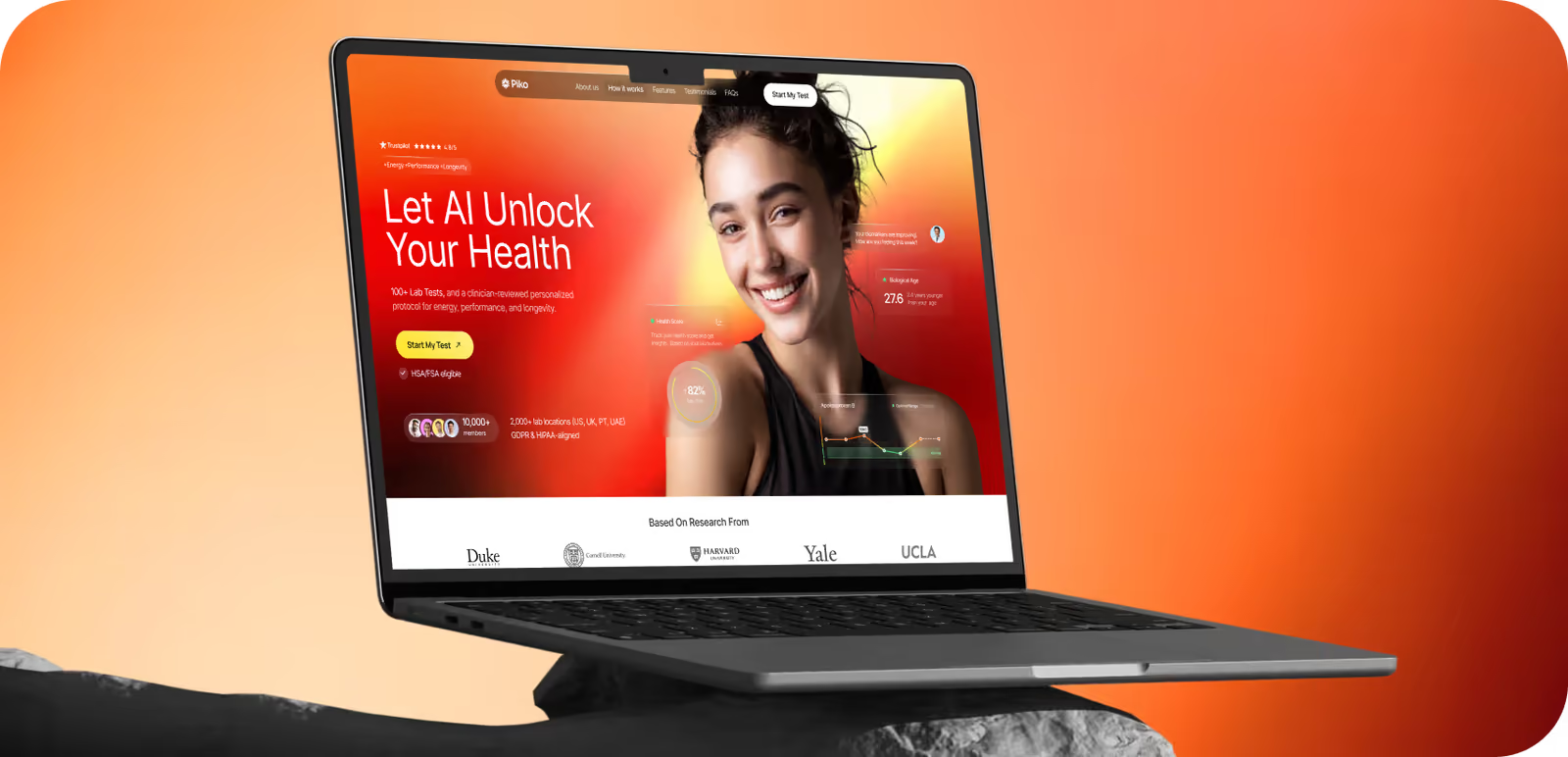
Piko is a personalized digital health platform that combines advanced blood testing, medical programs, and coaching. It helps users optimize biomarkers, manage weight, and slow biological aging. The client came to us to design the brand identity, landing page, and web app.
( The brief )
Challenge
Problem
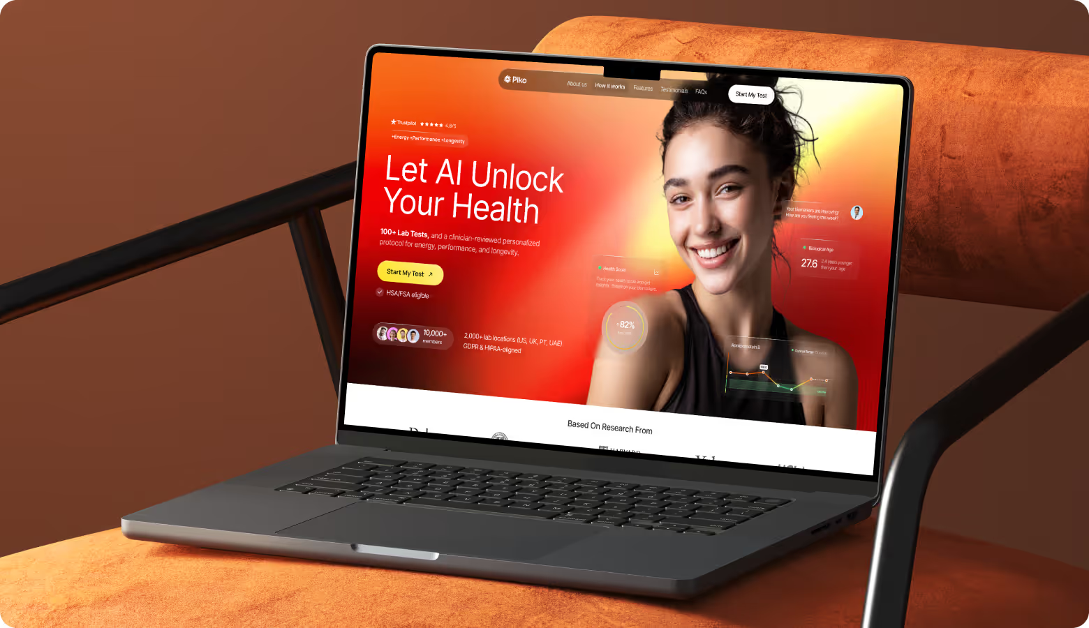
The design shouldn’t be too close to traditional healthcare. Our task was to make the platform feel medically credible but energetic, modern, ambitious, and human. Complex health data had to be understandable without heavy dashboards or distracting interactions. The interface must be simple.
Solution
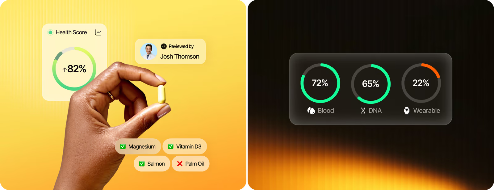
A visual identity positions Piko as a performance-focused health platform. To avoid clinical patterns, it uses lifestyle photography, effective typography, and a simple interface. Instead of complex displays, we implemented simple indicators to make biomarker data easier to grasp.
( How we worked )
Process
- DiscoveryBriefing & onboarding, Competitor analysis
- BrandingLogo Concepts, Social Media, Brand Guidelines
- Web designDiscovery, Wireframe, Moodboard, UI Concept, UI Kit
- App designDiscovery, App flow, UI Concept, UI Layouts
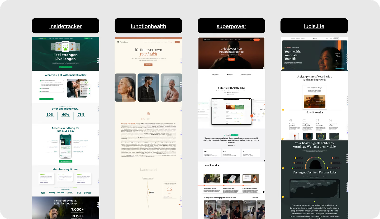
Competitor analysis
Our research showed that most competitors use neutral palettes, clinical layouts, and dashboard-heavy interfaces. They are strong in credibility but weak in emotional engagement and lifestyle positioning. We deliberately moved in a different direction: a more expressive visual language, lifestyle imagery, high-level health indicators instead of raw data, and no medical routine.
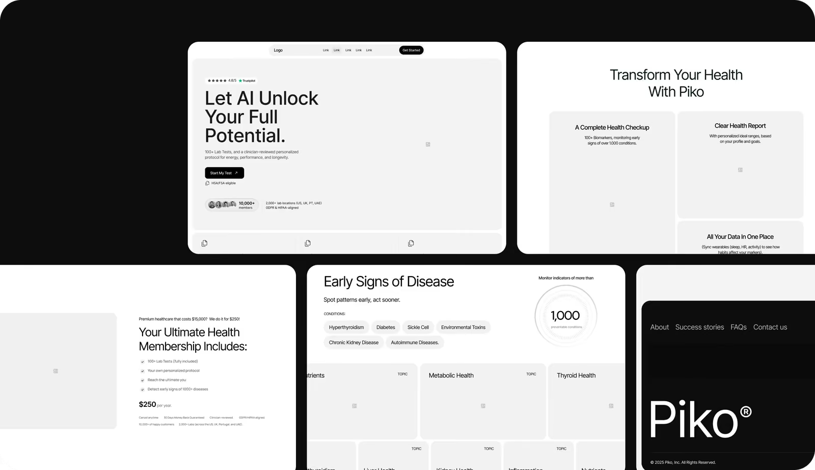
Wireframing
Wireframing is a risk management tool in design because it focuses on structure and decision-making. Every block placement influences how credible, complex, or trustworthy the product feels. For PIKO, the priority was sequencing: value proposition → trust signals → scope of health insights → membership logic. After validating this logic in wireframes, we move to visual execution.
Logo Concept Design
The logo expresses human vitality and avoids common medical symbols . The radial form suggests progress and biological optimization. Its symmetry reflects precision and trust. The bold orange gradient adds energy and helps Piko stand apart from clinical-looking health brands.

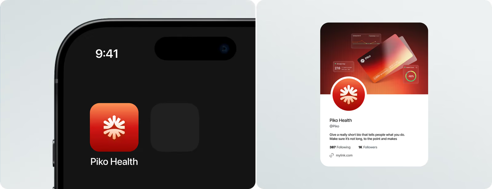
When advanced features slow down conversions, it’s time to rethink structure.
Landing Page Layouts
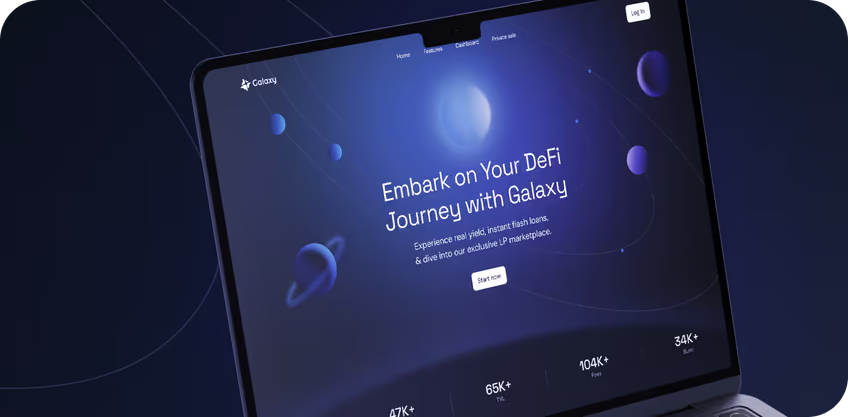
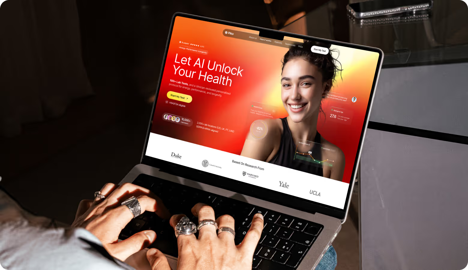
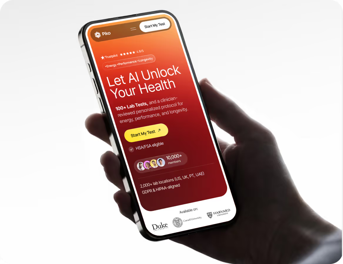
The landing page should encourage users to move from inspiration to action through a structured flow. Our UI/UX experts offered a result-oriented hero section with visible signs of trust (research, reviews, compliance) and simplified health information. Each block supports the same goal: to quickly gain trust, demonstrate measurable value, and naturally encourage users to start testing or sign up.
Mobile Version
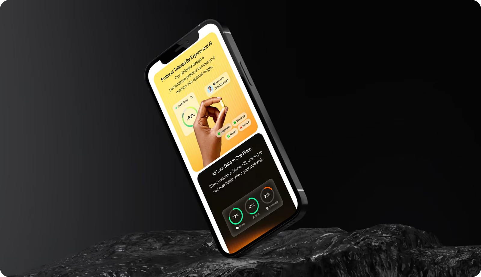
70% of users connect with health data, coaching updates, and test results through their phones. That's why the primary goal at this stage was to eliminate the barrier between curiosity and action on smaller screens. We prioritized thumb-friendly navigation, an intuitive vertical hierarchy, and high-contrast health indicators. Our expert additionally improved the "Start My Test" flow for faster decisions and higher conversions.
Web Application Design
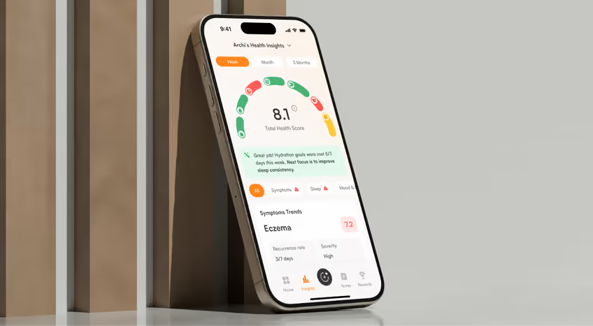
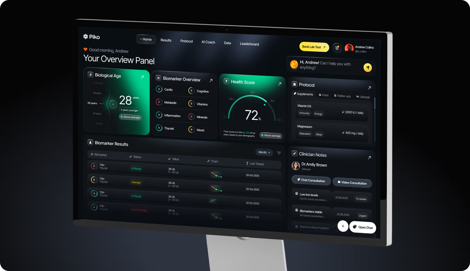
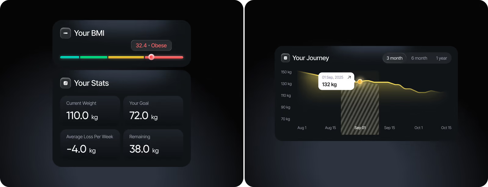
Our guiding approach for apps is to present users with what is important first, then details. In the Piko app, the overview page displays the Biological Age and Health Score first. We arranged deeper biomarker data, physician notes, and protocols into digestible modules. The AI assistant and progress charts help users comprehend their results and what they should do next.
( Results )
WHAT CHANGED
+38%
Lower perceived interface complexity.
Structured layouts and high-level health scores reduced cognitive load in usability testing.
+40%
Stronger visual consistency.
A unified design system aligned landing, branding, and web app into one coherent experience across all touchpoints.
29%
Higher trust perception during early validation.
Clear hierarchy, compliance signals, and simplified health indicators increased user confidence at first interaction.
+34%
Clear differentiation from traditional health platforms.
A bold visual direction and lifestyle positioning helped Piko stand apart from clinical, dashboard-heavy competitors.