












- Client
- Kinves
- Industry
- Fintech
- Timeframe
- 2 months
- Headquarters
- USA
( About the project )
About
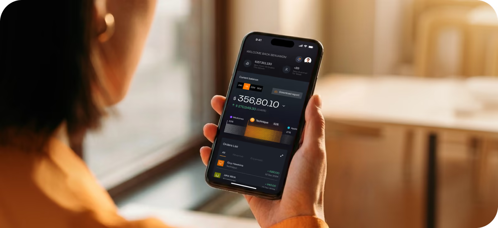
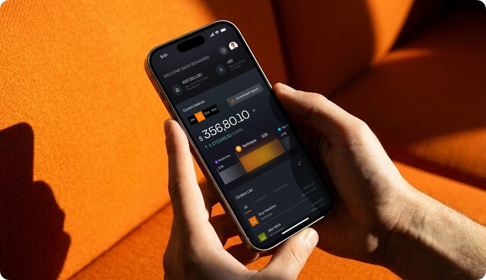
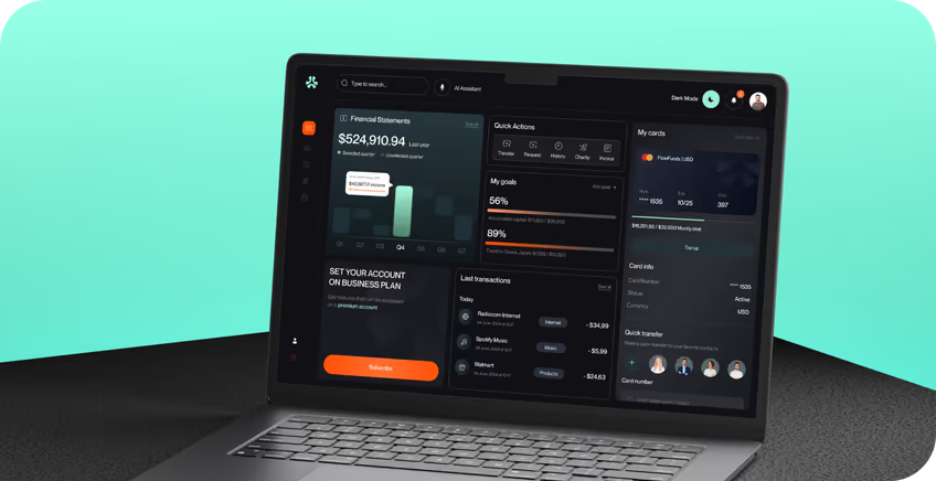
Kinves is a personal finance app centred on a single home screen, giving users immediate access to their balance and a direct path to everyday money tasks. The client wanted a product people could understand from the first interaction, with routine financial tasks simple enough to complete without a learning curve.
( The brief )
Challenge
Problem
When a user opens a finance app to check one number or do one action, they have to process several metrics. Secondary data hides balance checks and transfers, making adoption harder, causing navigation mistakes and giving users fewer reasons to come back.
Solution
Instead of one screen showing every metric, we gave each one its own priority. The balance answers the first question at a glance, and a shorter payment flow lets users act faster: 31% fewer navigation errors and 92% success on the transfer task.
( How we worked )
Process
- DiscoveryBriefing & onboarding, Competitor research
- UX designUX audit, Site map, Wireframes
- UI designMoodboard, Concept design, Layouts, UI kit
- BuildFlutter app, QA, Store release
User flow
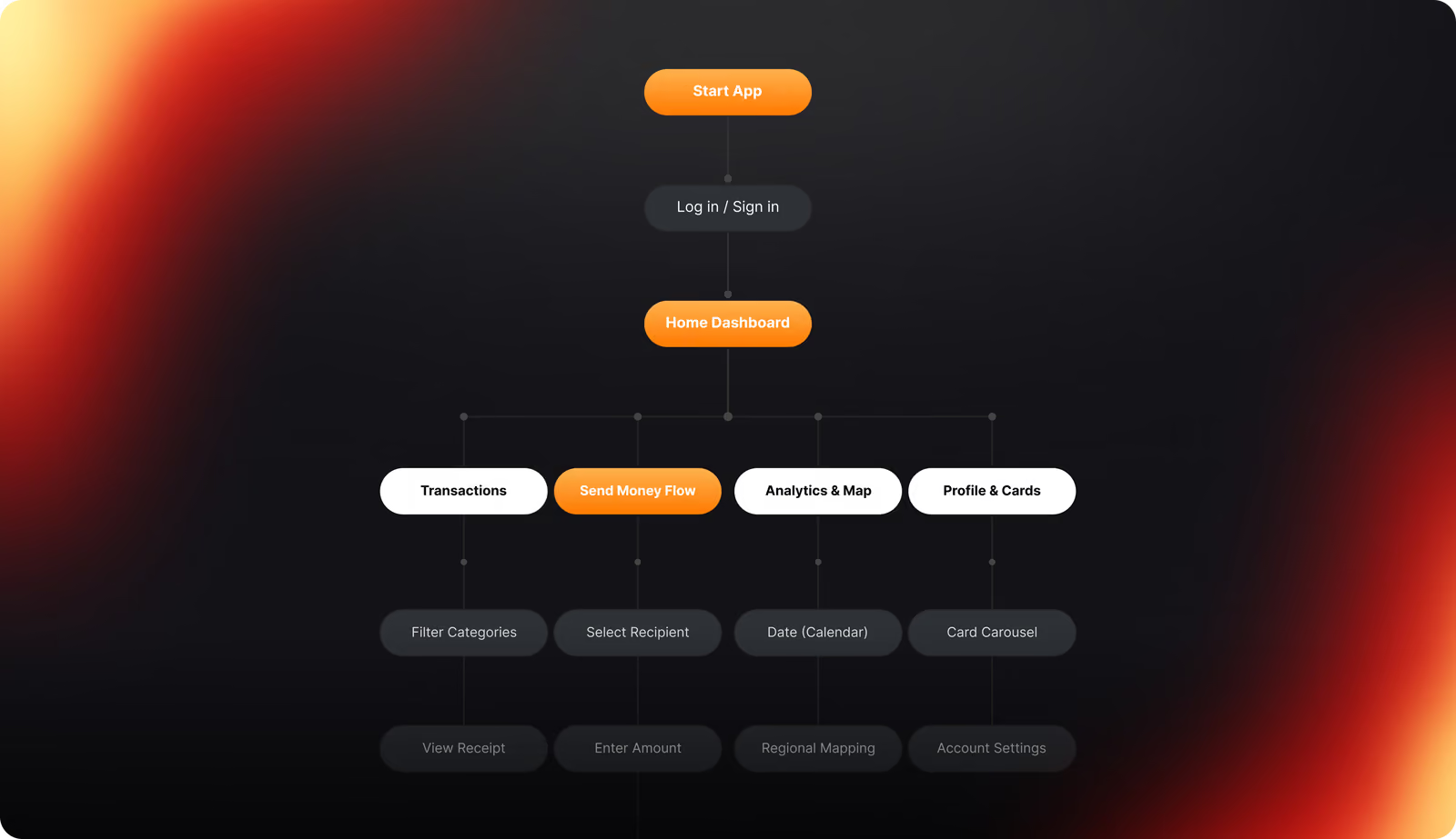
The quickest path goes to the most frequent tasks. Transfers start straight from the home dashboard, while settings sit further down, so progress is saved when users stop and they can pick up where they left off.
Wireframing
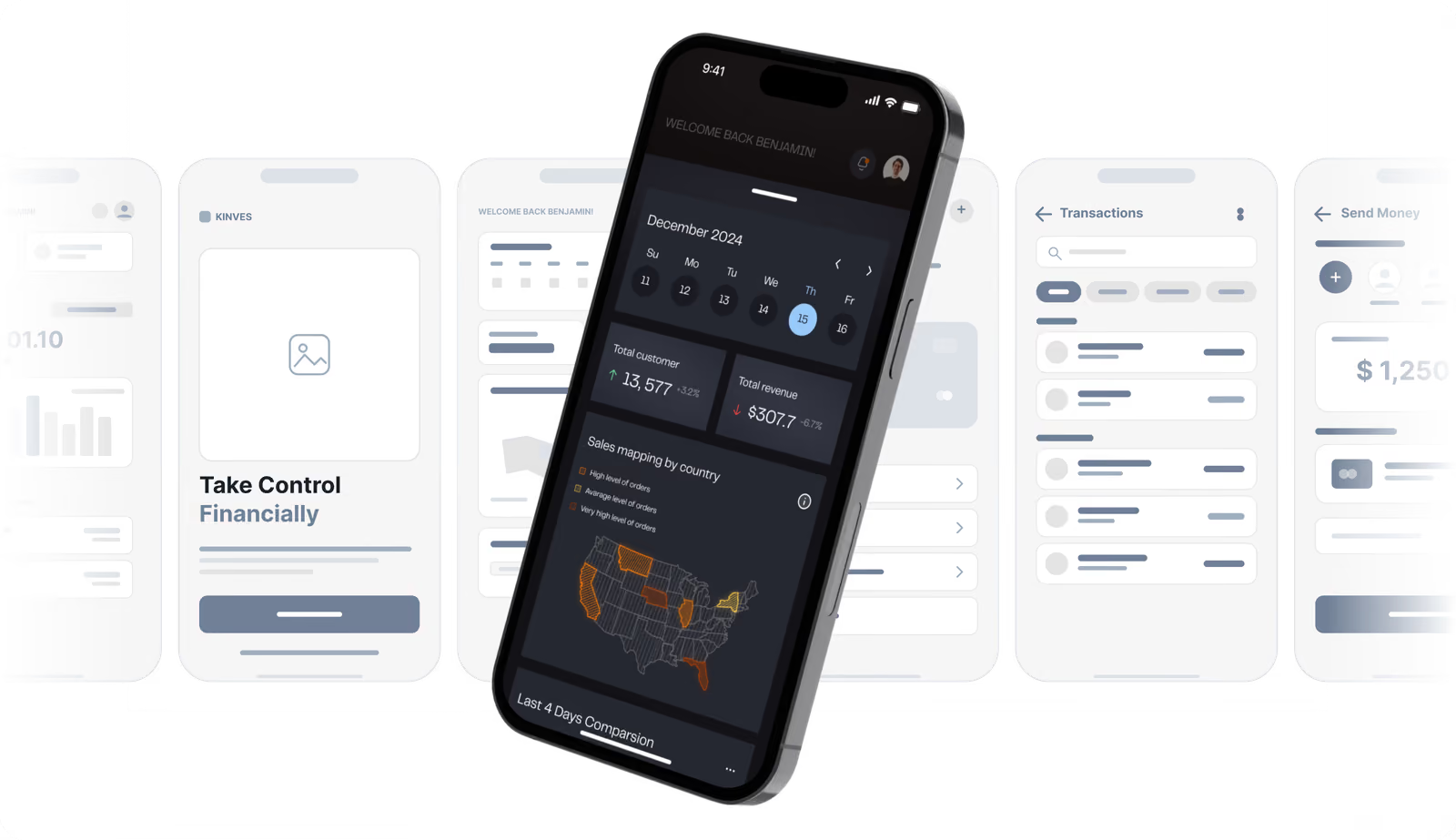
Before any supporting content, wireframes gave every screen one primary purpose. Users of a finance product should never stop to work out which number matters or where the next step starts.
UI layouts
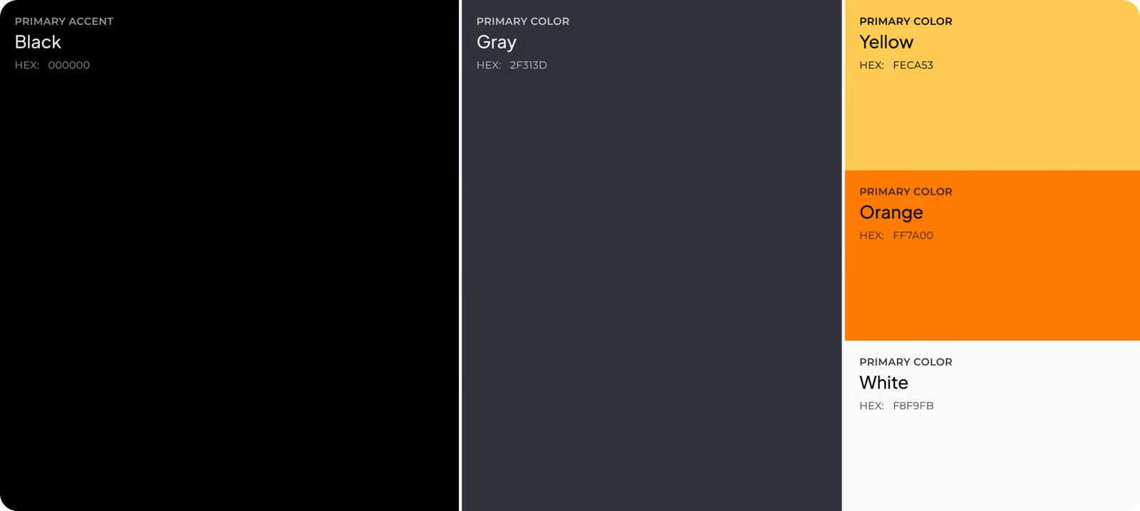
Every element got a defined role before its look was decided. Colour, type and emphasis follow the same rules, so the interface stays consistent as the volume of financial data grows.
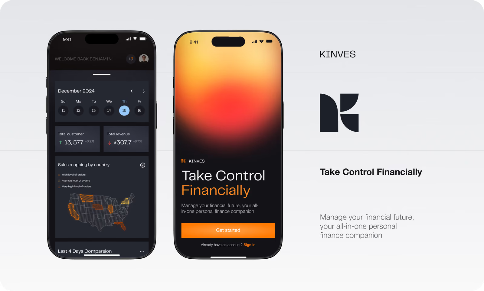
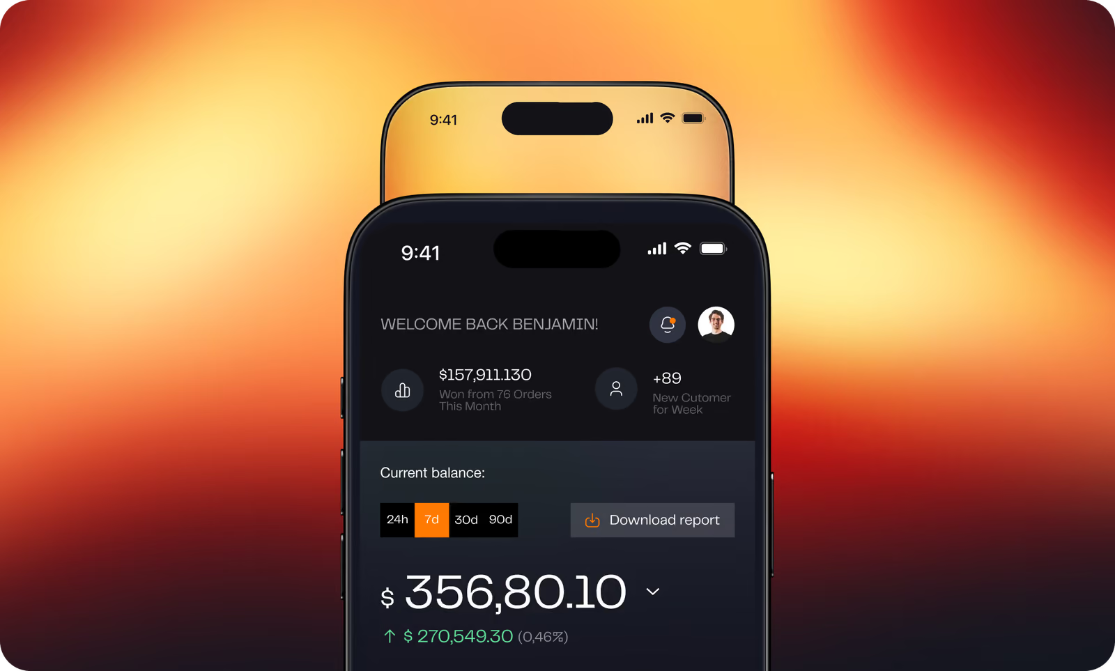
Complex finance that feels natural on a mobile screen.
Design system
A component library and tokens the team can extend without breaking consistency.
( Stack )
- Flutter
- Dart
- Firebase
- Figma
( Results )
WHAT CHANGED
−31%
Navigation errors
Testing showed fewer wrong turns once primary actions got direct paths from the home dashboard.
18 s
Average transfer time
Participants went from choosing a recipient to confirming in 18 seconds on average.
92%
Transfer task success
Participants completed the transfer flow without moderator support.
89%
First-click accuracy
Users picked the right entry point for balance checks and transfers first time.

Social media
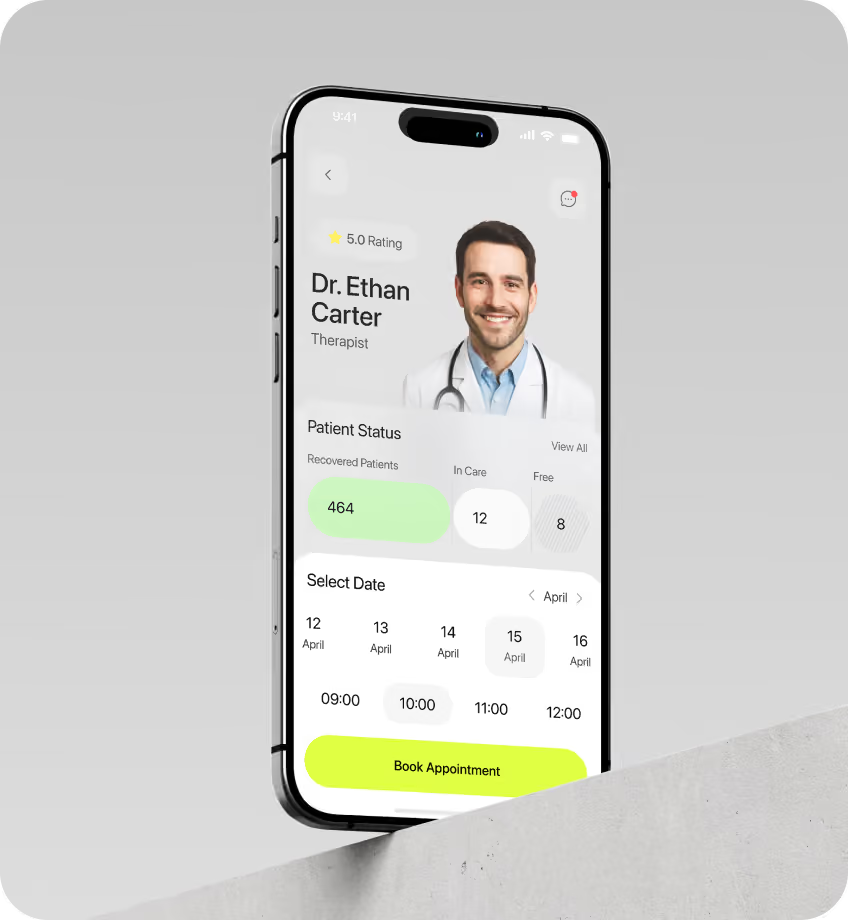
Marketing assets follow the same guidelines as the product, so the visual language stays consistent before and after install.