




- Client
- Lyynk
- Industry
- Healthcare
- Headquarters
- France
( About the project )
About
Lyynk is a French mental health platform that gives young people a safe digital space to track emotions, share difficult moments, and stay connected with trusted adults. The client needed a web and mobile experience that supports daily well-being habits and keeps sensitive interactions simple, calm, and safe.
( The brief )
Challenge
Problem
The app must feel supportive, trustworthy, calm, not clinical or heavy. We also had to design for two age groups (young people and their trusted adults), keep the flow simple, and meet strict privacy and safety rules (GDPR) that protect vulnerable users.
Solution
Our team created a supportive ecosystem with mood tracking, journaling, shared activities, and personal guidance. The interface is calm and matches Lyynk’s vision; the flow naturally connects teens and trusted adults with flexible tools; and the privacy controls are clear.
( How we worked )
Process
- DiscoveryBriefing & onboarding, Q&A, Competitors Research
- UX DesignUX Audit, Wireframes, Site Map
- UI DesignMoodboard + UI Concept, UI Layouts, UI KIT
Wireframing
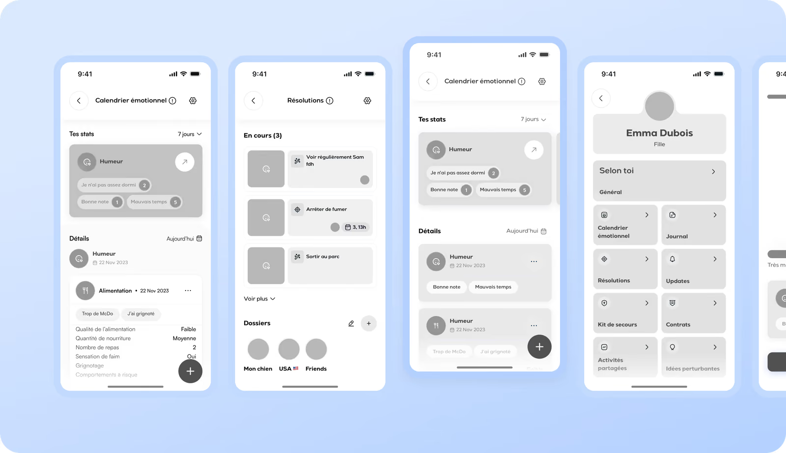
Wireframes helped us move from quick sketches to structured layouts that defined navigation and user roles. The hardest part was serving two groups at once. The app should be warm and simple for young people, but clear and dependable for adults. Another complex task was to put crisis support and privacy tools where they stayed helpful but not intrusive.
Moodboard
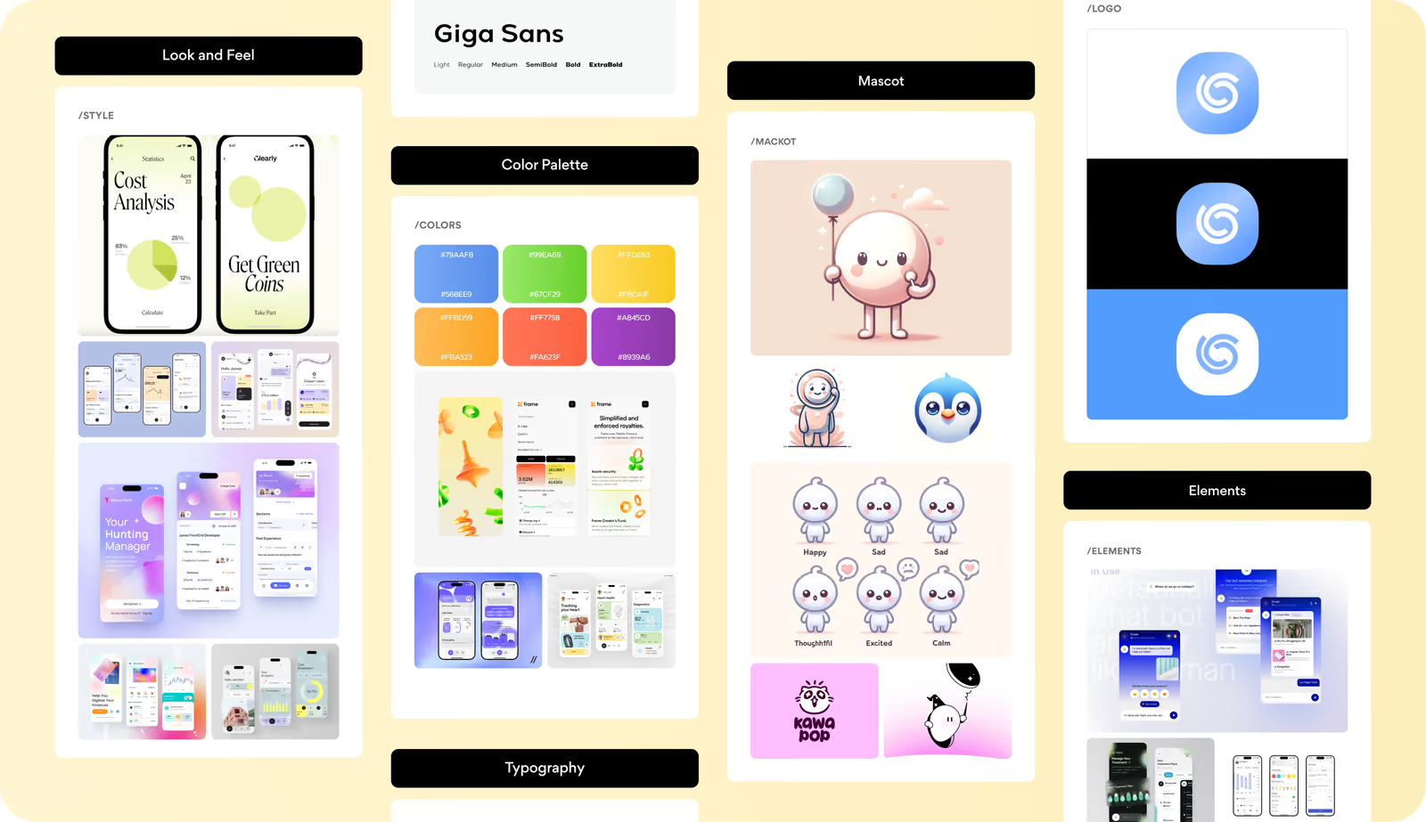
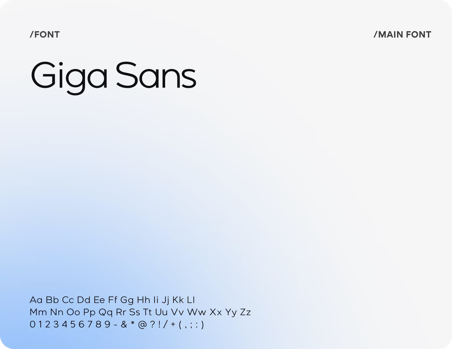
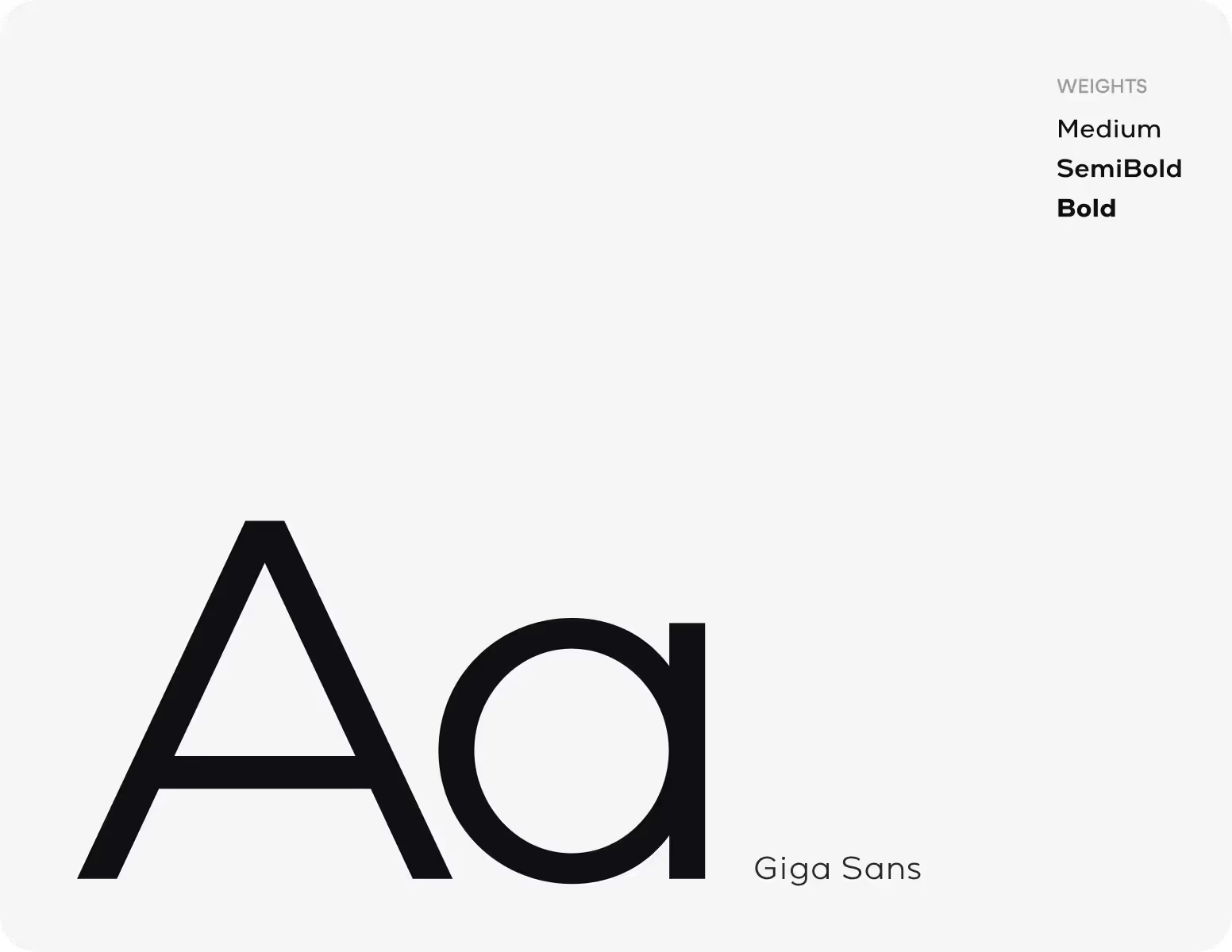
Our moodboard grew from Lyynk’s mission to offer young people a calm, honest, and supportive space. We combined soft neutrals with gentle mint, coral, and lavender tones, rounded typography, and simple card-based elements to reflect emotional safety and clear communication.
Redesign
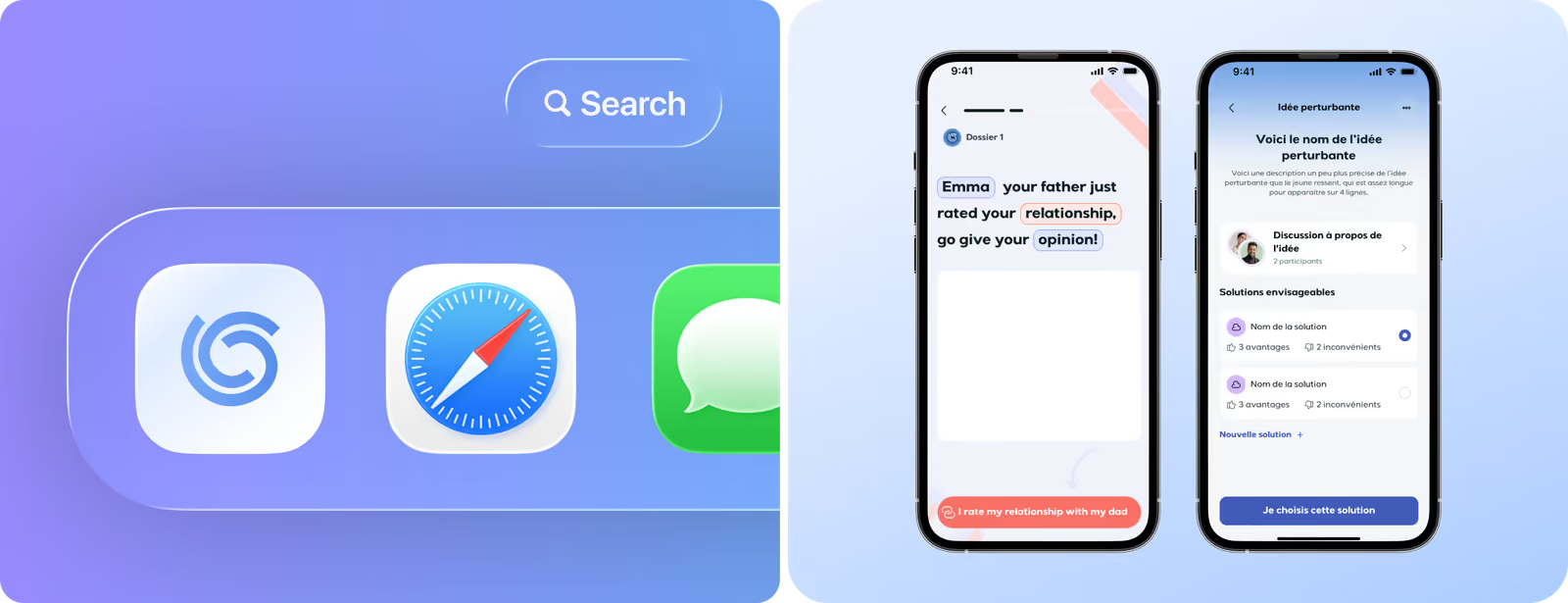
Before the redesign, the product had too many features, unclear navigation, and an outdated visual identity that hid core emotional tools and the AI assistant. We simplified the UX, clarified the hierarchy, highlighted key emotional features, and introduced a consistent modern look.
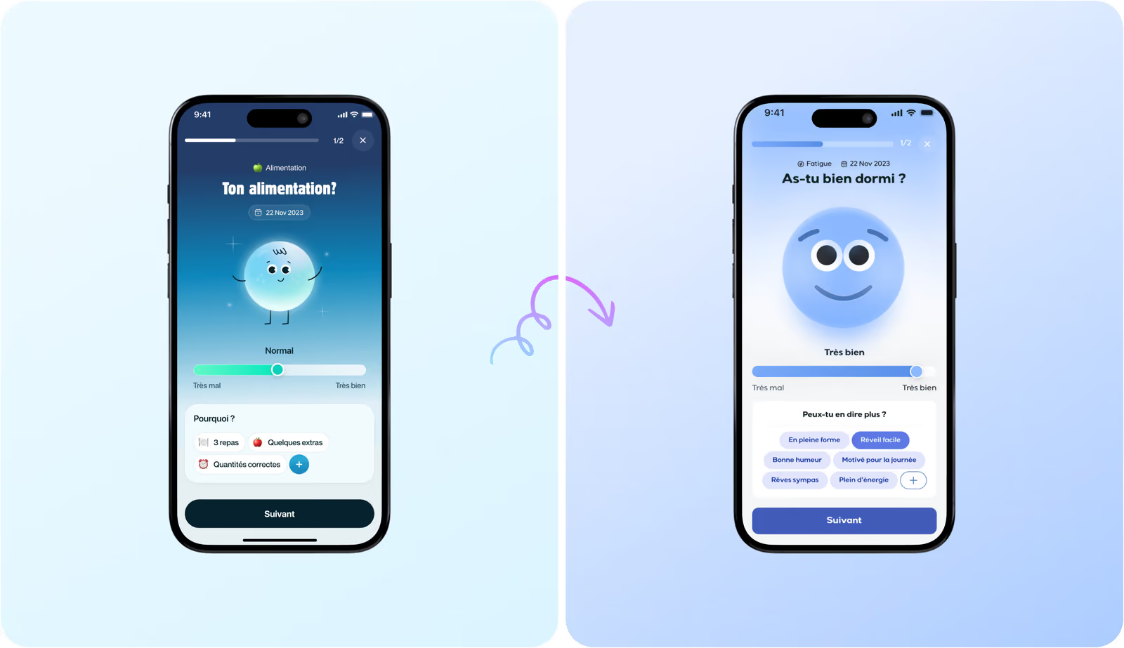
We bring trust and simplicity from the first tap to every interaction
UI Layouts
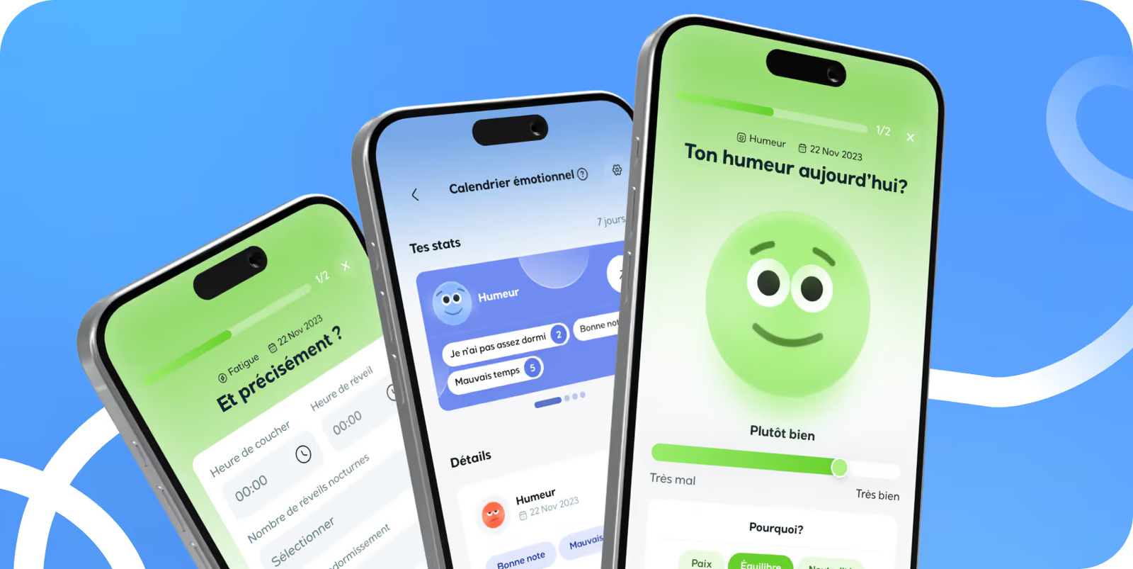
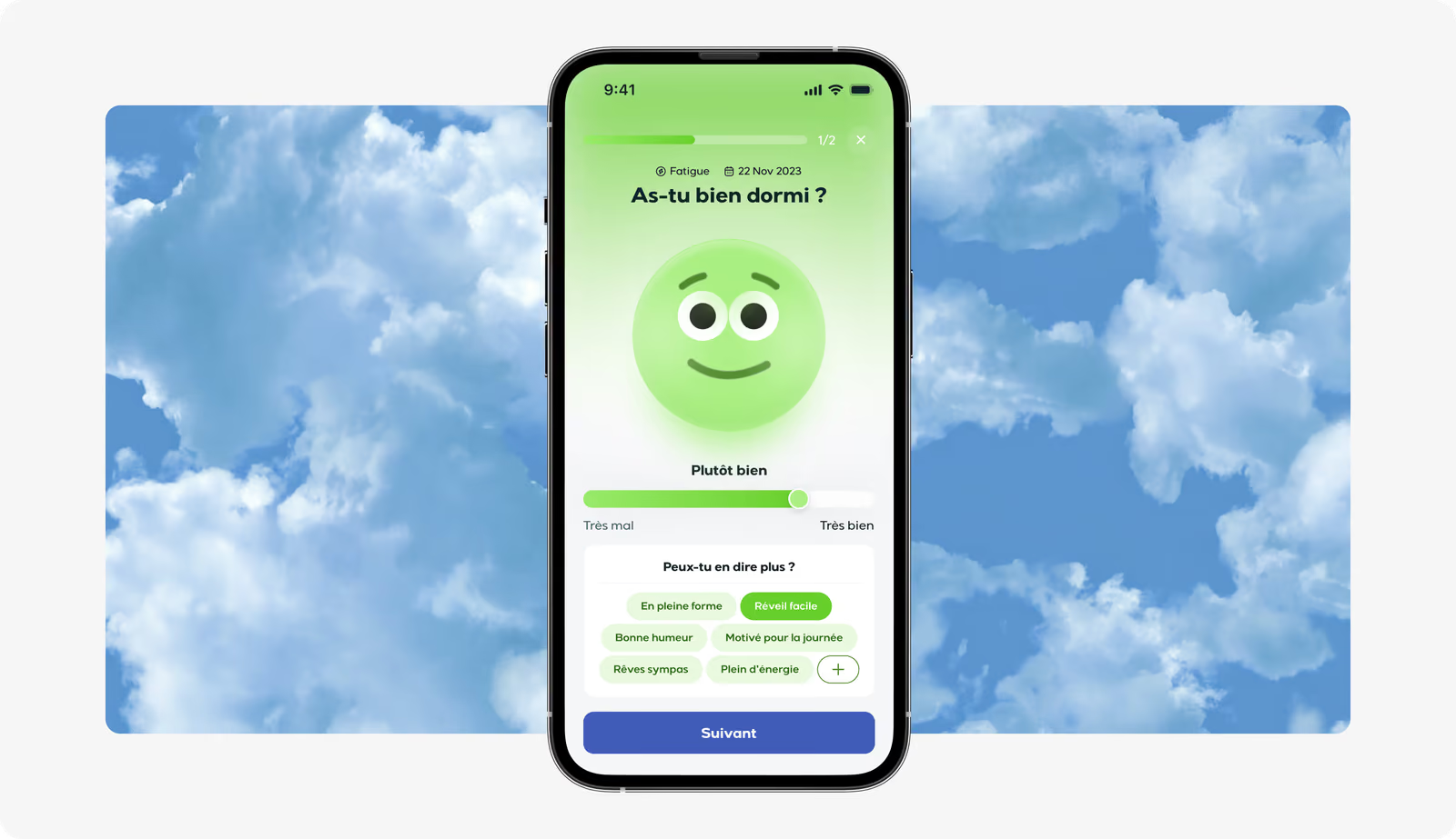
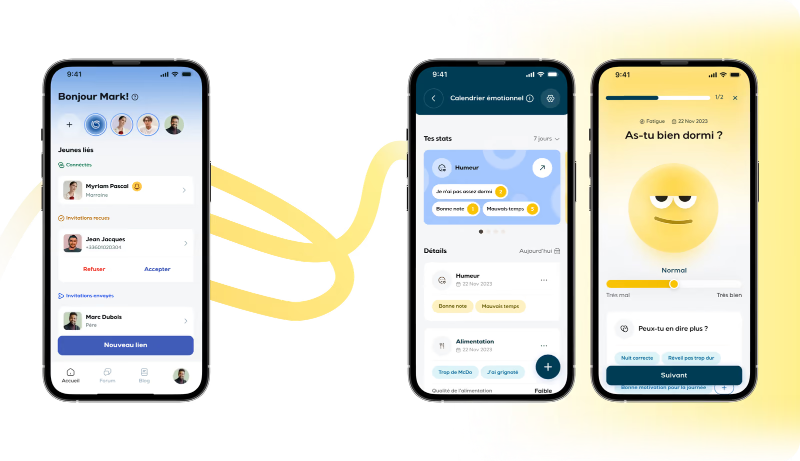
UI layouts have accessible structures that help young users move through the app. We introduced a personalized review flow that adapts to each user's journaling style, so the interface supports their natural habits. Subtle motion cues, tone-based color shifts, and small interaction rewards reflect the emotional tone of each screen without distracting from the core tools.
Illustrations
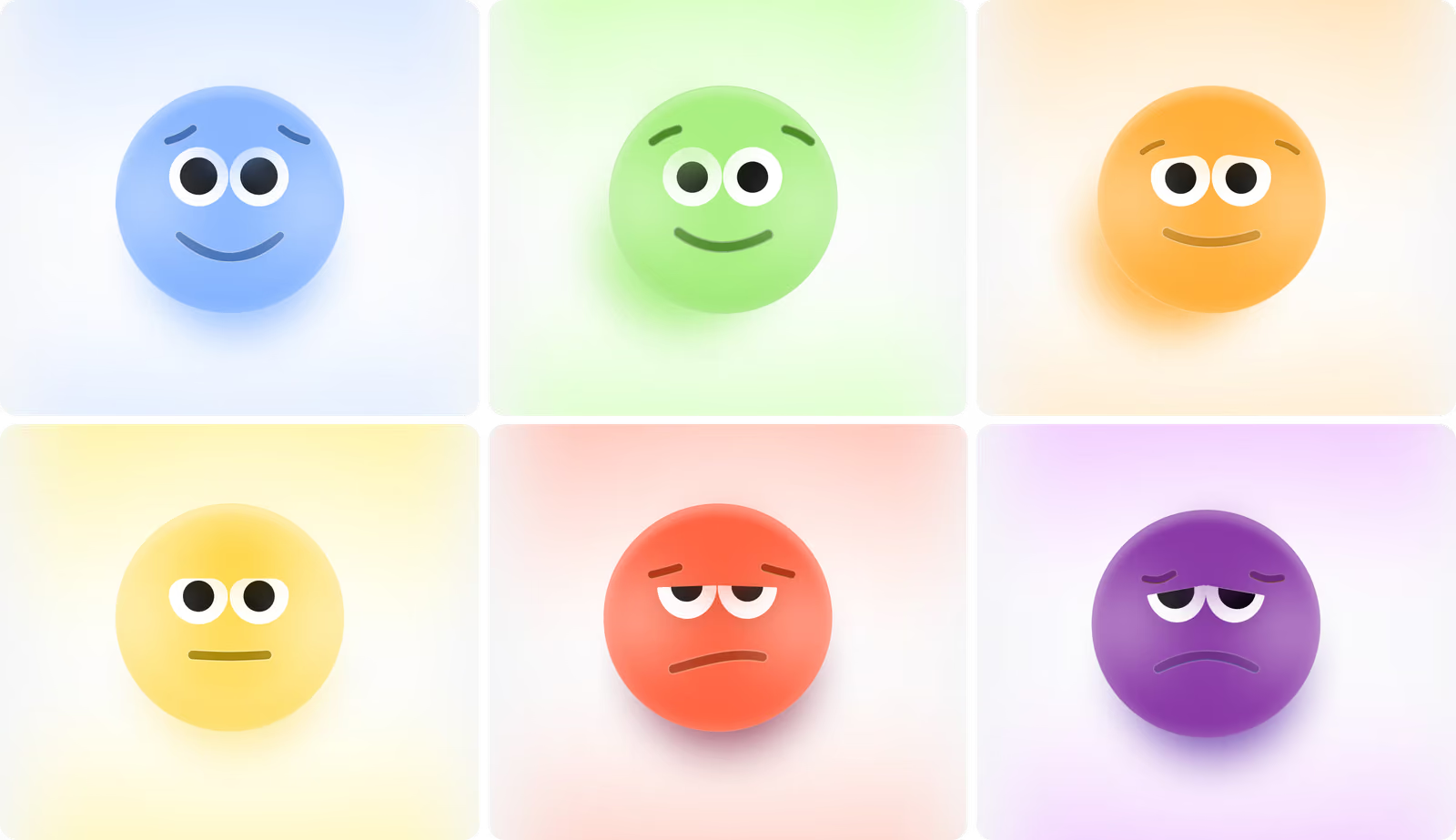
Emotions are the core characteristic of Lyynk, so the illustrations needed to feel honest, calm, and safe. Our experts offered soft 3D mood icons that mirror real emotional states without tipping into childish styling. These visuals connect directly with the journaling flow and emotional calendar, so the daily mood tracking is consistent, personal, and easy to engage.
Print products
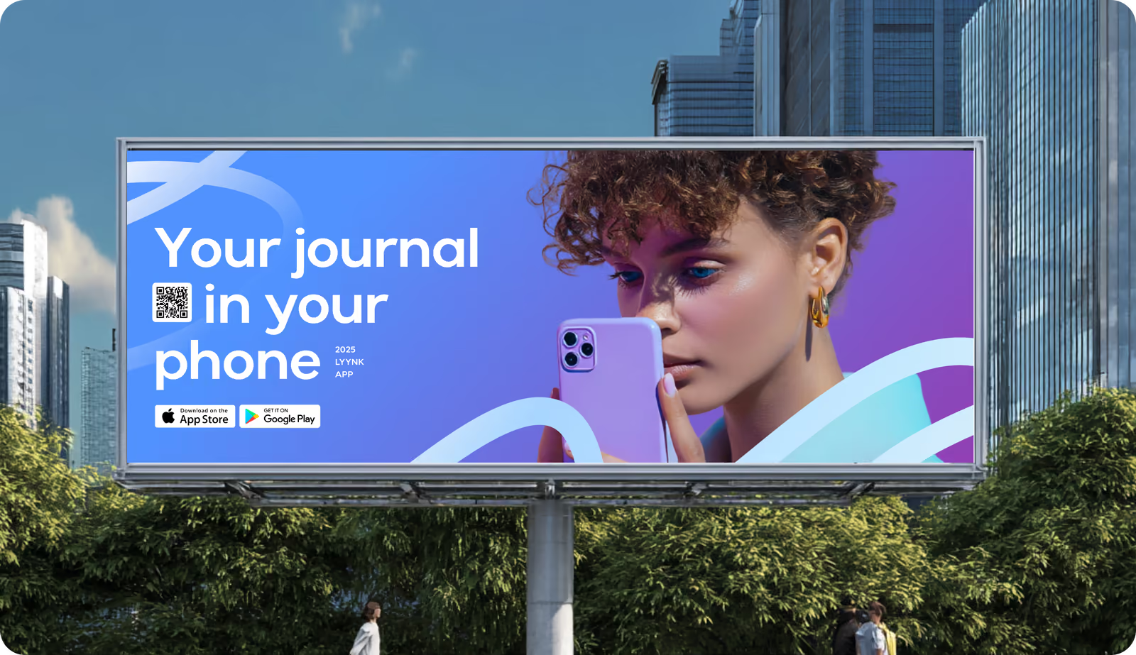
Our client also got print materials for ads, schools, community programs, and community events. They helped introduce the platform to educators, parents, and mental-health professionals in an approachable way. Strong offline branding supported trust-building and made Lyynk easy to recognize wherever its audience first encountered it.
Design system
( Results )
WHAT CHANGED
100k+
Downloads since launch
Steady adoption strengthened Lyynk’s position as a trusted well-being tool.
4.8★
App store rating
Users praised the simple paths, safe space for expression, and overall ease of use.
+38%
Growth in user engagement
Clearer flows and engaging style encouraged teens and adults to use the app more consistently.
+42%
Increase in retention
The improved structure and supportive interactions helped users build daily habits for emotional health