










- Client
- BlockDB
- Industry
- Web3
- Headquarters
- EU
( About the project )
About
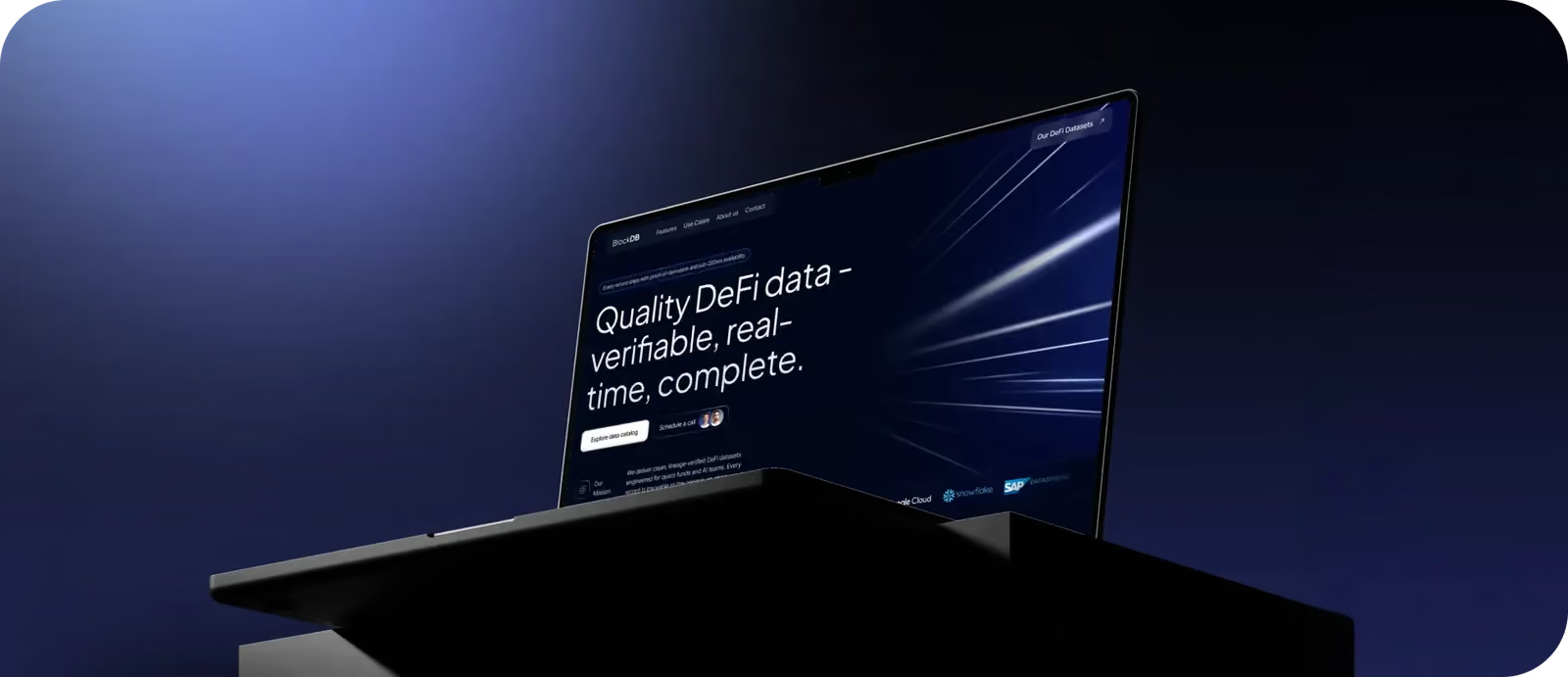
BlockDB is a team of data engineers and quantitative specialists building enterprise-grade DeFi data infrastructure. Their request was to redesign and develop their corporate landing page for a B2B audience (quant funds, banks, AI/ML startups, and research teams).
( The brief )
Challenge
Problem
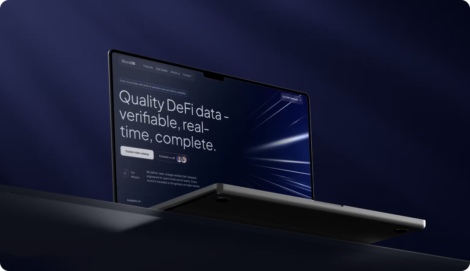
We had to redesign their functional website to communicate enterprise focus, verified data lineage, and infrastructure-level reliability. The interface must be fast-loading, AA-accessible with minimal JavaScript, lightweight visuals, and free of crypto-style design cliches.
Solution
Our team repositioned BlockDB as an enterprise DeFi data provider by highlighting its key advantage on the first screen. We then structured the page with simple sections and next steps, and guided quant and financial teams to exploration, sample requests, or calls.
( How we worked )
Process
- DiscoveryBriefing & onboarding, MVP Scope, Roadmap
- UX DesignProduct/business goals, Competitors analysis, User flow, Wireframes
- UI DesignMoodboard, Concept design, Layouts design, Design system
- Graphic DesignMoodboard, Illustrations & iconography, Social media covers, Pitch deck
Wireframing
Our UI/UX designers structured the wireframes as a one-page flow. The first screen explains the lineage-verified datasets, then the following blocks cover the data pipeline, schema stability, use cases, and integration logic. Each section answered a specific technical question from the quant and AI teams. We used real team photography and subtle data-inspired graphics to avoid crypto visuals and keep a serious financial tone.
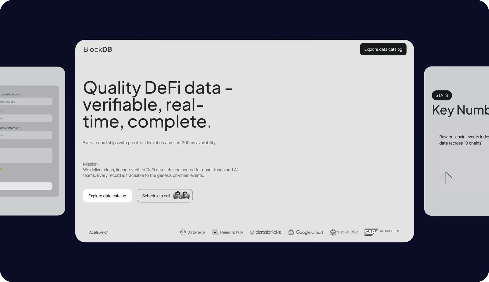
UI Layouts
The UI follows a strict grid and clear hierarchy: core value first, then feature cards, performance metrics (<140 ms), and use cases in separate blocks. After reviewing platforms like Kaiko, Glassnode, and Bitquery, we removed crypto-style clutter and complex messaging, replacing it with a minimal, high-contrast dark interface for institutional clarity.
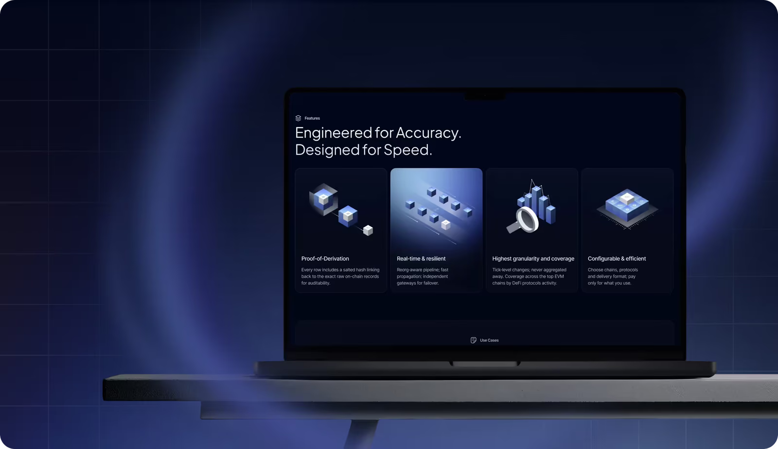
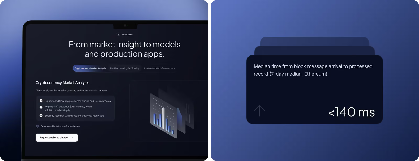
Move from “it’s complicated” to “this makes sense” with our design services.
Mobile Version
The mobile version preserves the same hierarchy but restructures the content into a vertical flow. The goal was to make complex data explanations easy to follow on smaller screens. Optimized typography, spacing, AA-level contrast, and visible CTAs deliver fast performance and a consistent experience with the desktop version.

Pitch Deck
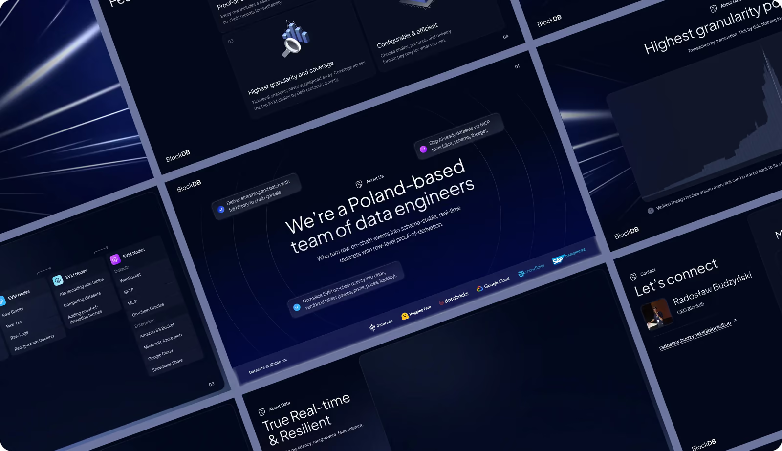
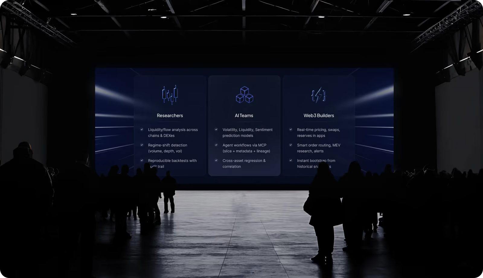
The pitch deck features large-scale screens, strong contrast, focused content blocks, and a coherent style. Each slide isolates one core message (audience, performance, data pipeline, credibility) to avoid cognitive overload and support engaging storytelling.
Illustrations
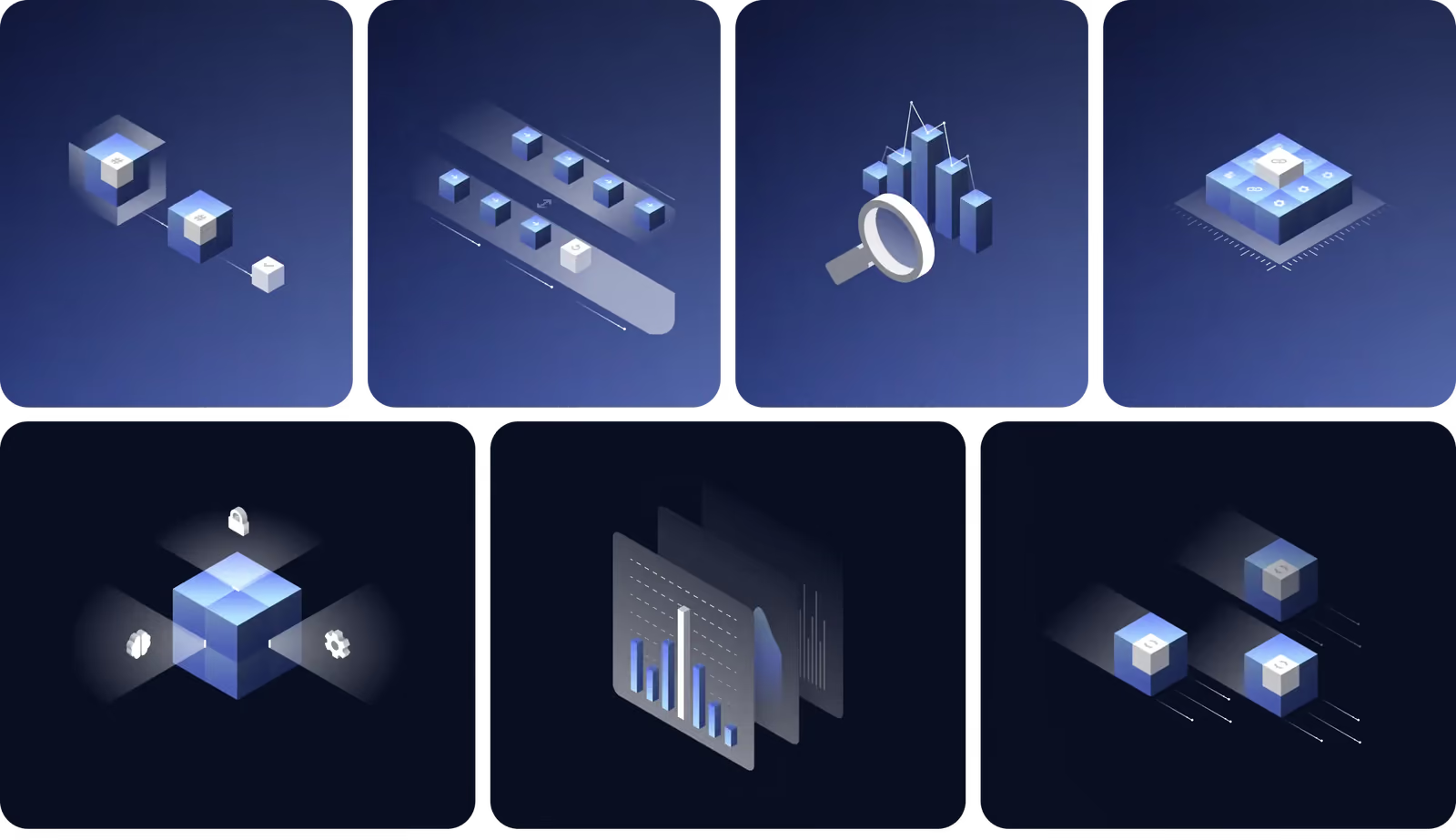
We created a system of geometric, data-inspired illustrations. Cubes are for structured datasets, layered panels for analytics, and light paths for real-time flow. They visually explain lineage verification and processing logic without crypto cliches.
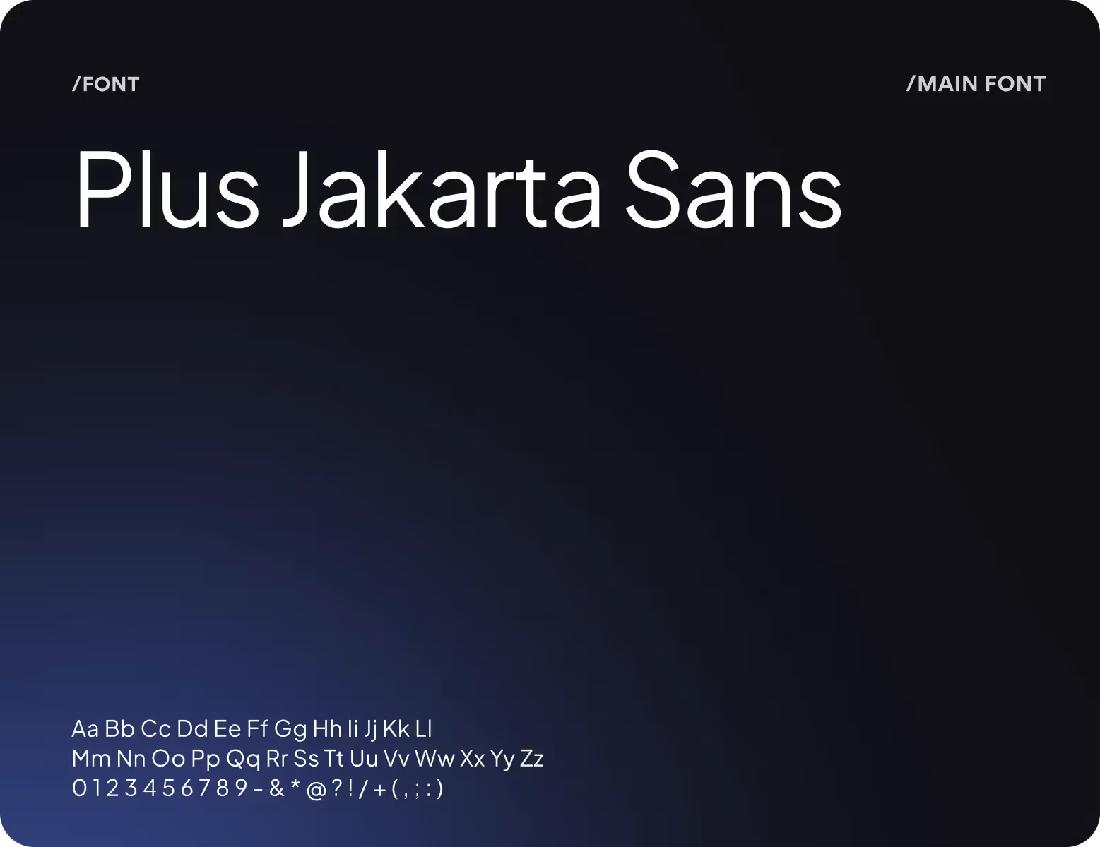
Design system

( Results )
WHAT CHANGED
+58%
Scroll depth across key sections.
Structured blocks for data pipeline, use cases, and performance metrics improved engagement with core product information.
48%
Increase in qualified b2b inquiries.
Clear messaging for defined ICP (quant funds, AI teams, researchers) reduced unqualified traffic and improved lead quality.
-33%
Bounce rate.
Institutional positioning, trust signals, and fast load performance reduced early exits and improved perceived credibility.
+54%
Cta click-through rate.
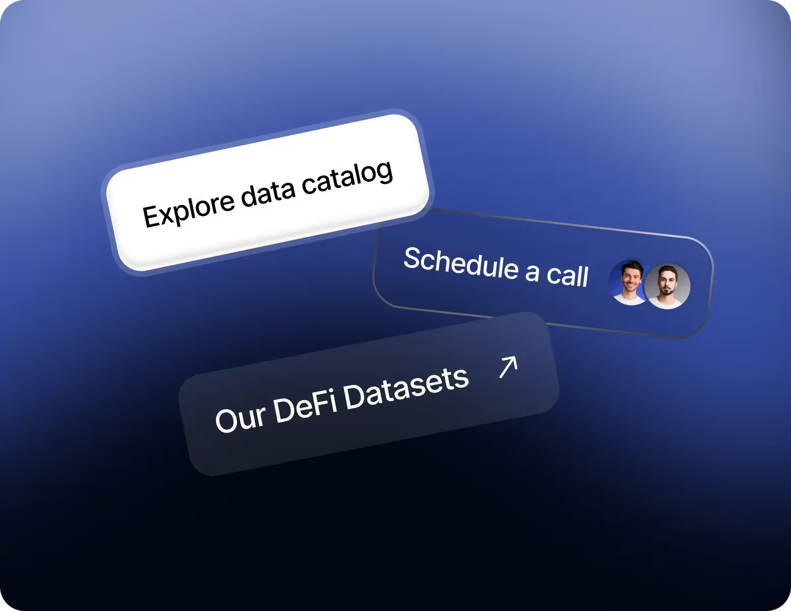
Clear next-step options (Explore catalog / Request sample / Schedule call) improved decision flow.

Social Media
For a B2B DeFi infrastructure company, LinkedIn and similar platforms act as trust checkpoints. Investors, stakeholders, and clients validate credibility there. That’s why consistent visual and verbal positioning across social channels strengthens recognition, authority, and perceived reliability.