




- Client
- Reforge Studios
- Industry
- Wellness & fitness
- Headquarters
- Australia
( About the project )
About
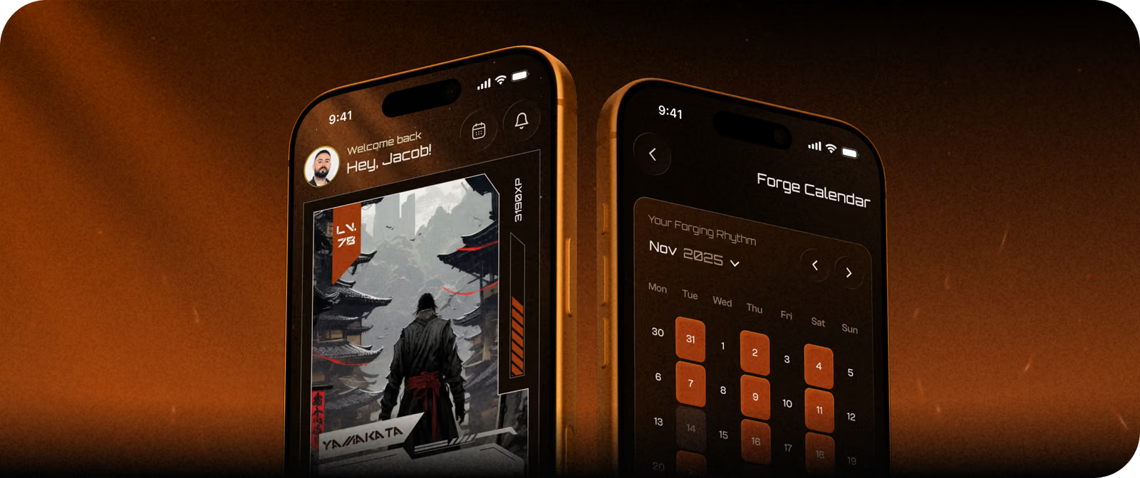
Reforge is a gamified fitness app where workouts translate into ranks, factions, badges, and achievements. It’s inspired by manga storytelling and game mechanics. The request was to design the mobile app for athletes and the desktop admin panel for coaches.
( The brief )
Challenge
Problem
Our team had to translate abstract game concepts (XP, ranks, attributes, etc.) into natural and clear workout flows. The additional constraint: the product logic kept evolving throughout the project, so every system required continuous adjustments and rethinking, but with UX consistency.
Solution
We adapted Reforge's manga-inspired progression logic into a usable UX system. Every workout metric (reps, weight, time, distance, etc.) directly affects XP, ranks, and rewards. The admin interface allows coaches complete control over program structure without exposing athletes to its complexities.
( How we worked )
Process
- DiscoveryBriefing, Research, Competitors Research
- UX DesignWireframes, App flow
- UI DesignMoodboard, UI Proposal, Mobile design, Admin Panel
- Graphic DesignMoodboard, Concepts, Illustrations
App Flow
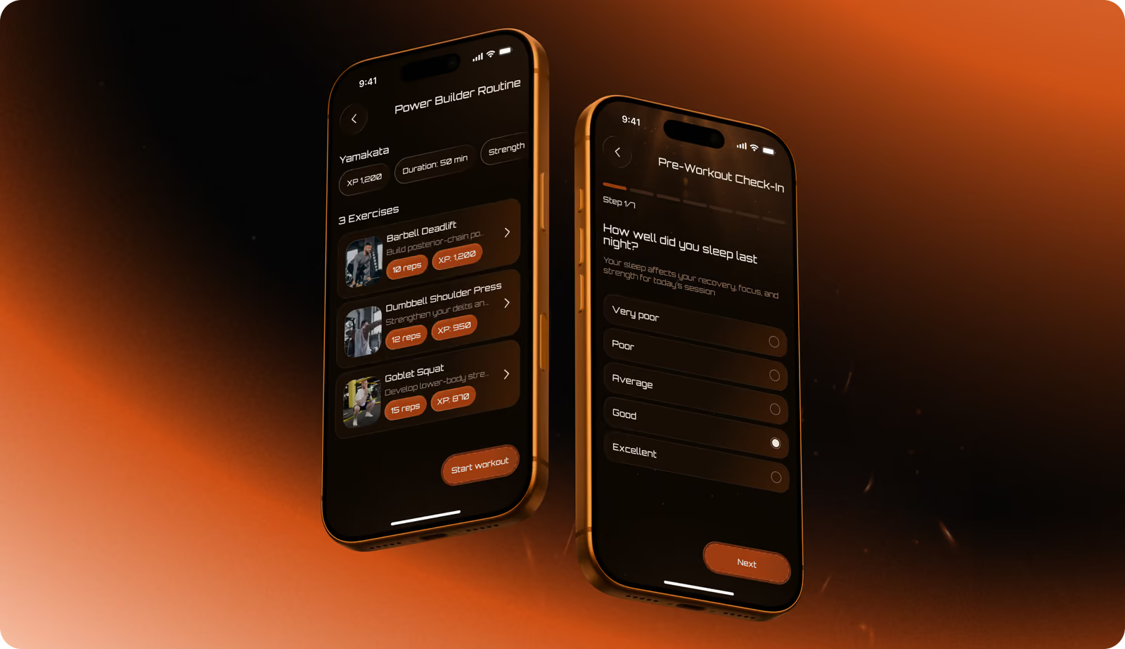
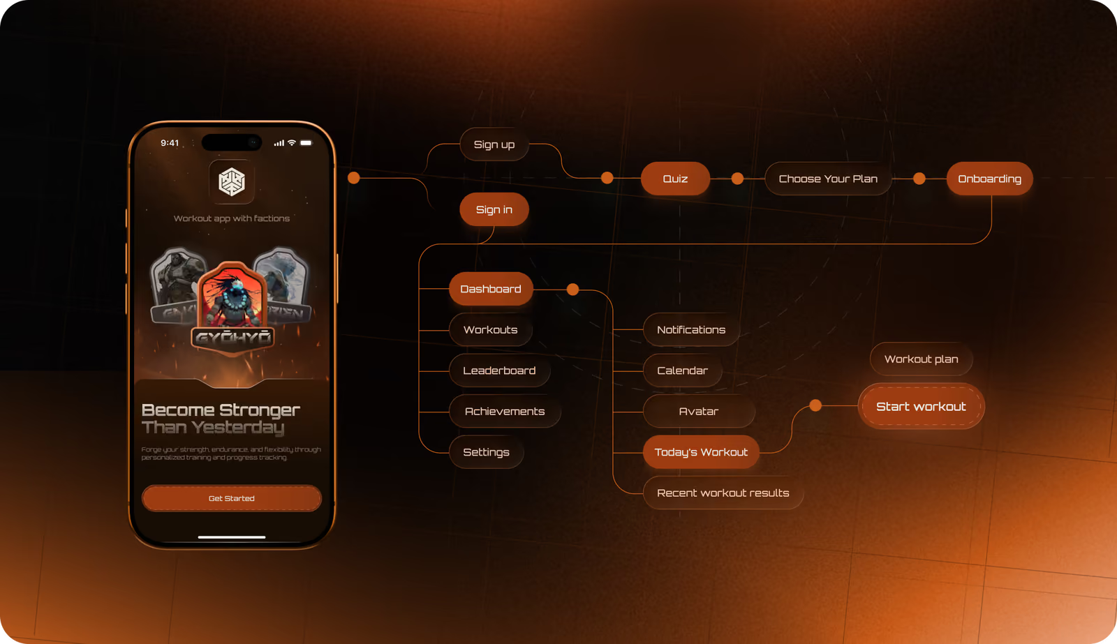
The app flow follows a single cause-and-effect logic: onboarding quiz → workout → measurement input → XP → rank or badge. Every screen supports this chain, so users always see exactly how their effort connects to progress.
Wireframing
Our UI/UX designers started with high-fidelity wireframes to validate the logic of complex flows: Workout Tracking, Rank Progression, Achievements, Factions, and the Admin Program Builder. The goal was to confirm how measurements, XP, and ranks connect across screens before moving to visual design. Changes at this stage are low-cost.
Mobile App
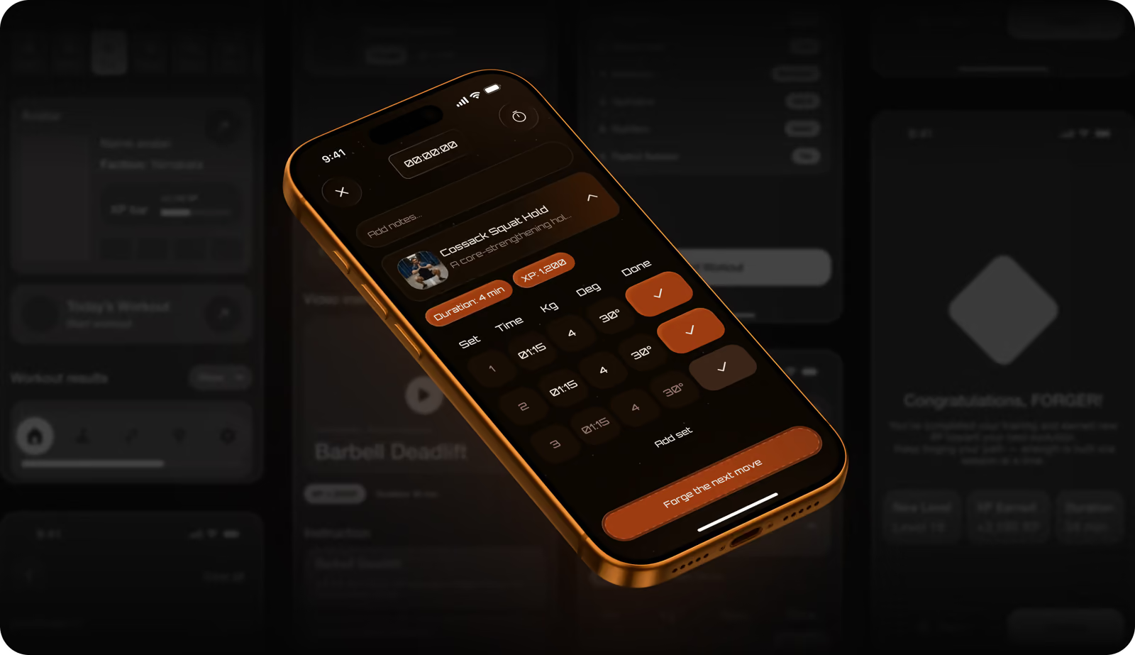
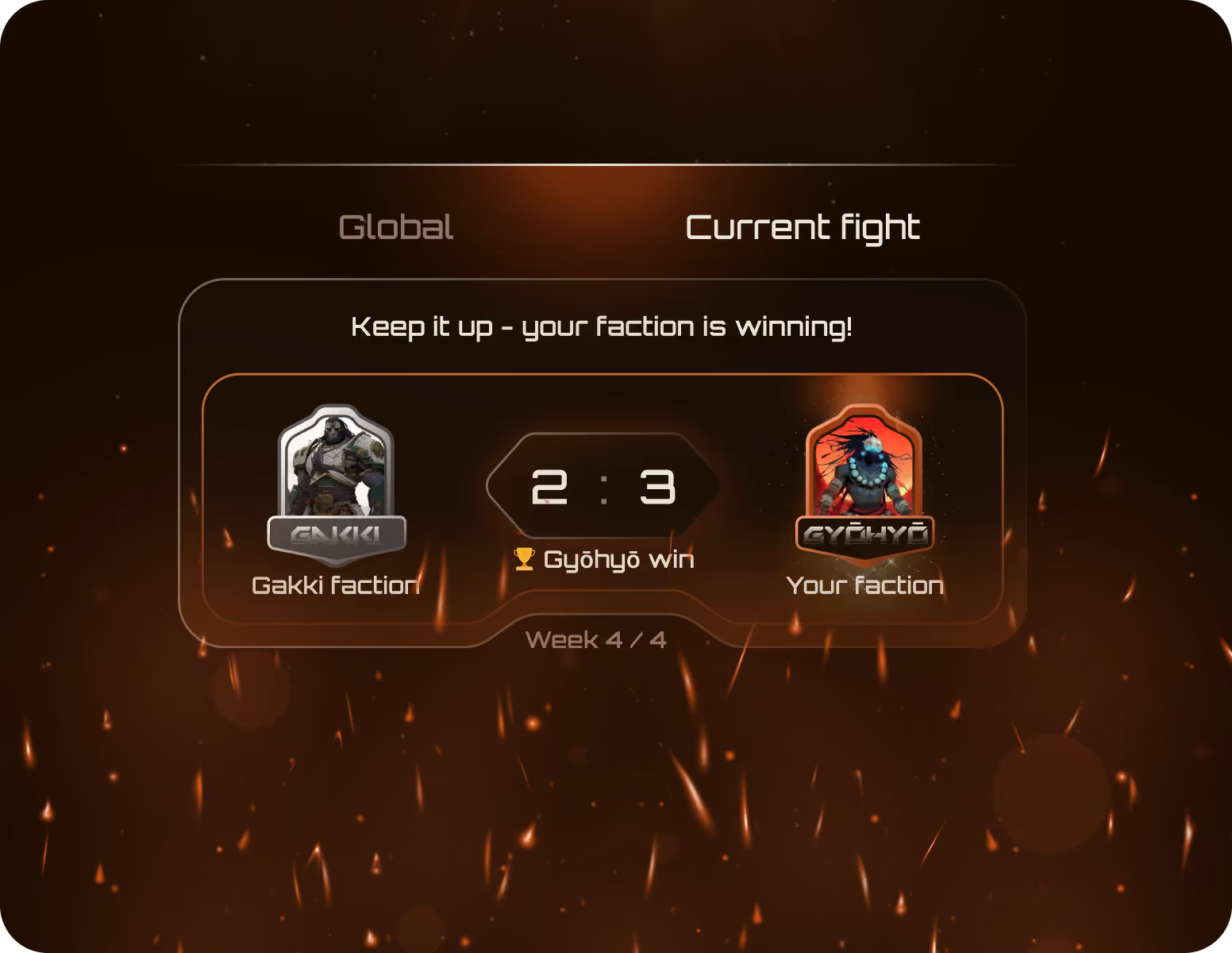
Competitor fitness apps center on data dashboards, so for Reforge, we decided to do the opposite. Create a mobile app with a motivating user experience and gamified progress feedback. Strong contrast, metallic elements, and layered pictures highlight the idea of progress. Measurement inputs connect directly to XP, ranks, and achievements. Every screen keeps the workout simple and the progress visible.

We bring structure to complex product logic or systems, so your users can navigate without confusion.
Graphic design
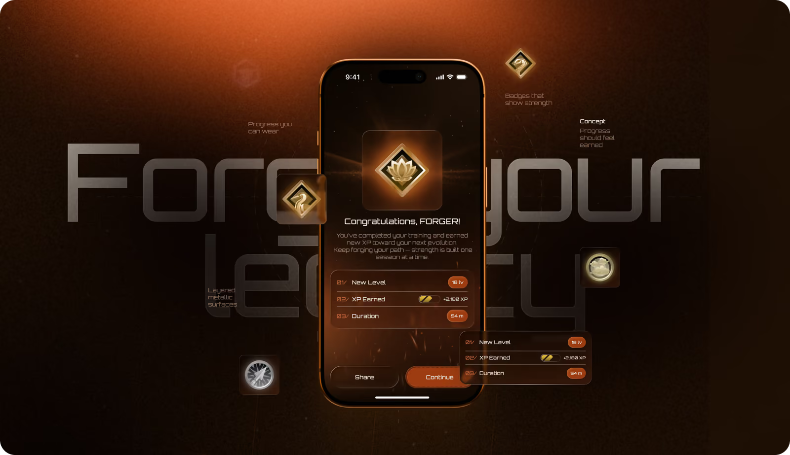
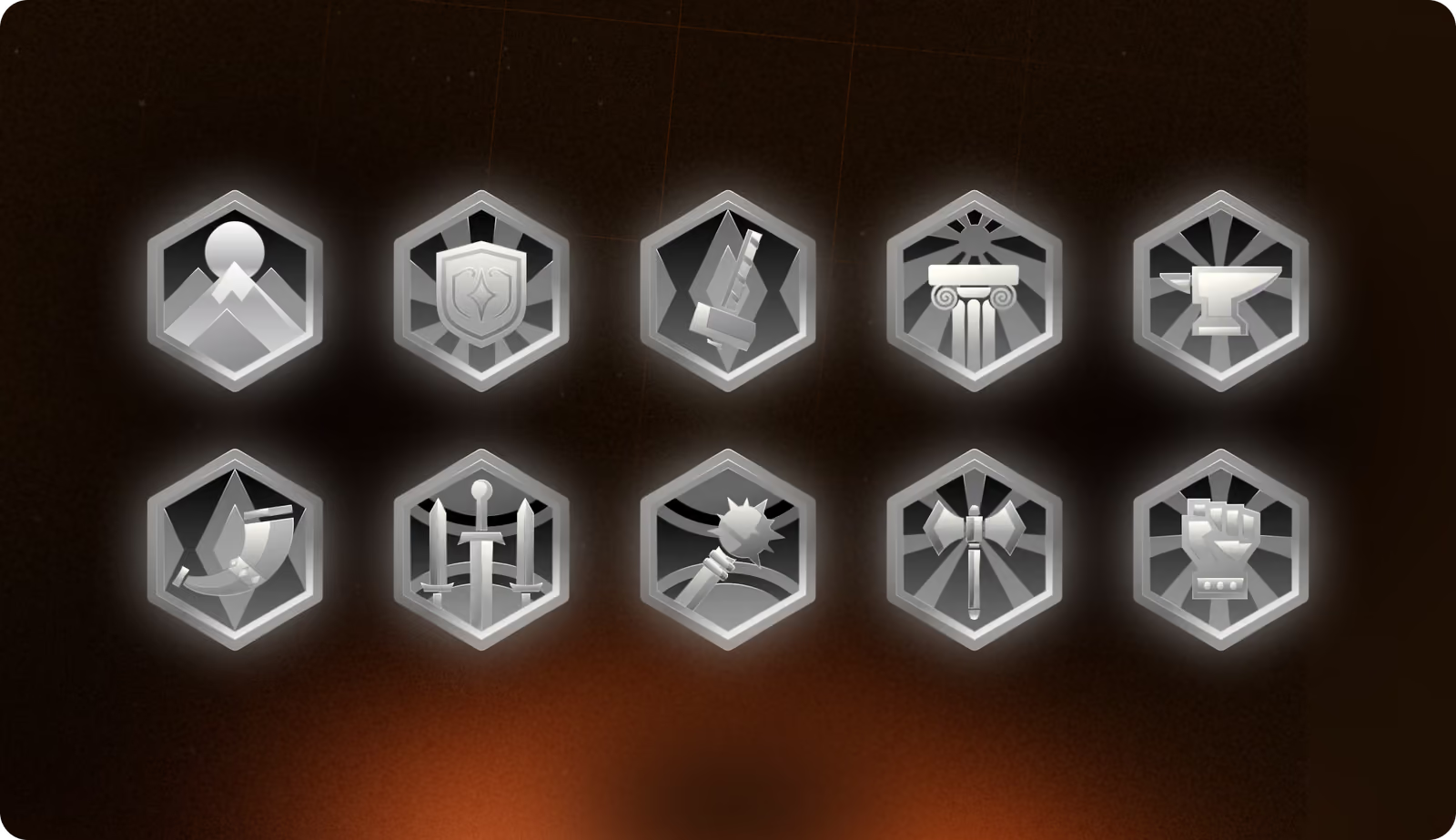
We graphic designer delivered a badge system across five tiers: bronze, silver, gold, platinum, and diamond. They have metallic textures, layered depth, and strong contrast typical of manga aesthetics. These badges are core progression elements. Each one indicates a specific rank, accomplishment, or milestone in the user's training journey.
Admin Panel
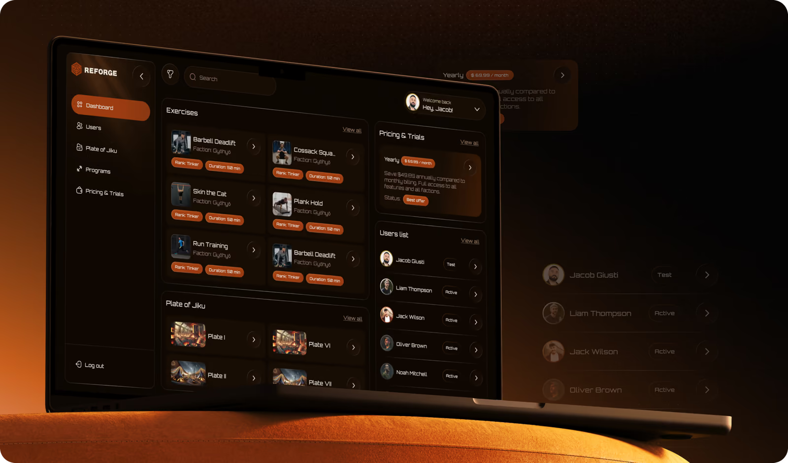
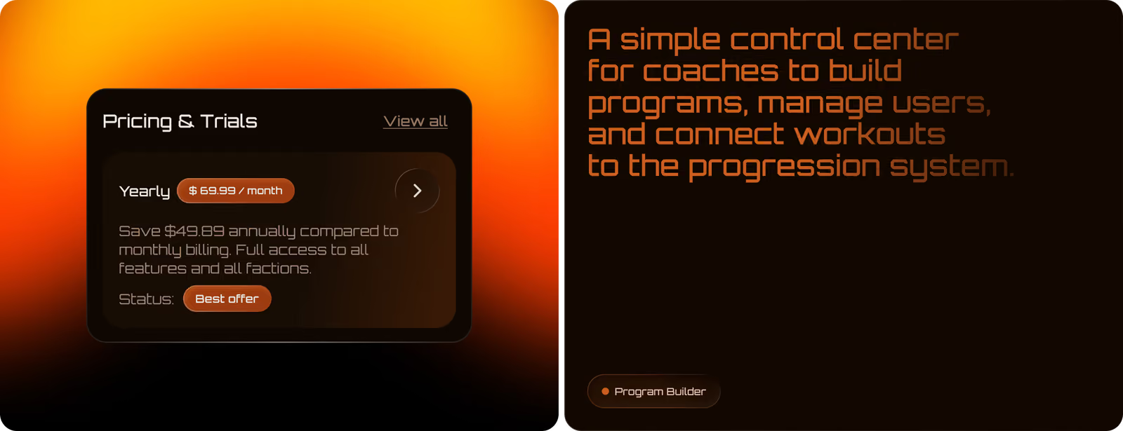
The admin panel gives coaches full control over training process and user management. They see a clean desktop interface with modular blocks and step-by-step flows. Complex configuration stays manageable through strong hierarchy, minimal visual noise, and intuitive controls (like drag-and-drop and filtered dropdowns).
( Results )
WHAT CHANGED
+74%
Task completion rate during usability testing.
Clear cause-and-effect flow (workout → measurement → XP → rank) reduced drop-offs across core progression screens.
3x
Faster program creation for coaches.
Modular blocks, drag-and-drop controls, and step-by-step flows reduced the time needed to build and publish a full training program.
+38%
Retention intent in early user feedback.
Users who completed onboarding and saw the rank system reported stronger motivation to return compared to standard fitness app benchmarks.
-41%
Cognitive load score in user testing.
Structured information hierarchy and minimal visual noise kept the gamification system understandable during active workouts.