












- Client
- Piifund
- Industry
- Fintech
- Timeframe
- 2 months
- Headquarters
- USA
( About the project )
About
PIIFUND is a fintech platform that brings digital banking, microloans, and insurance to users in underserved African markets. Our client request was to design a WCAG-compliant, mobile-responsive web app that works on low-speed connections and serves users with no prior experience in digital finance.
( The brief )
Challenge
Problem
The customer required complex banking, microloan, and insurance flows to be simplified for first-time digital finance consumers. The app must fulfill stringent compliance standards and function well on older devices with shaky connectivity. Our team also had to strike a balance between step-by-step instructions for low-literacy users and efficiency for more experienced ones.
Solution
We developed an interface in accordance with WCAG accessibility standards and simplified financial transactions. The most well-thought-out solution was the microloan application algorithm. Instead of a single confirmation button, the design guides users through a detailed description of repayment terms, payment deadlines, and interest rates, and then finalizes the approval with a “swipe to confirm” interaction.
( How we worked )
Process
- DiscoveryBriefing & onboarding, Onboarding, Competitors Research
- UX DesignUX audit, Site map, Wireframes
- UI DesignMoodboard, Concept design, Layouts design, UI Kit
App Flow
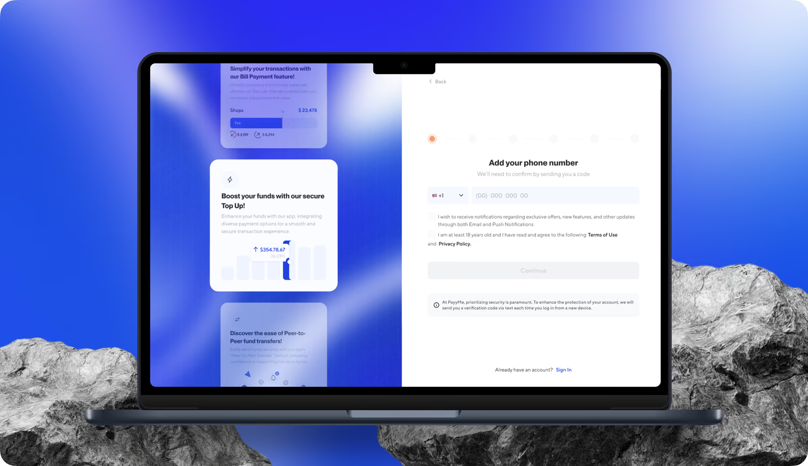
Our UX/UI team mapped the onboarding flow to keep each step single-focused and free of unnecessary decisions for first-time users. Every screen reduces cognitive load. We added clear input labels, explicit back navigation, and inline compliance steps that meet regulatory requirements without interrupting the user's path forward.
Wireframing
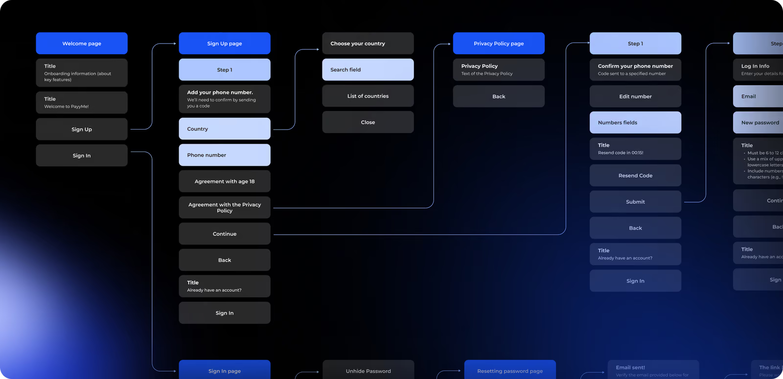
The wireframes explain the logic of phone verification and account setup, payment flows, transaction history, and multi-recipient transfer confirmation. Each wireframe prioritized single-action screens, explicit confirmation steps for high-risk operations, and a persistent sidebar navigation.
Web Application Design
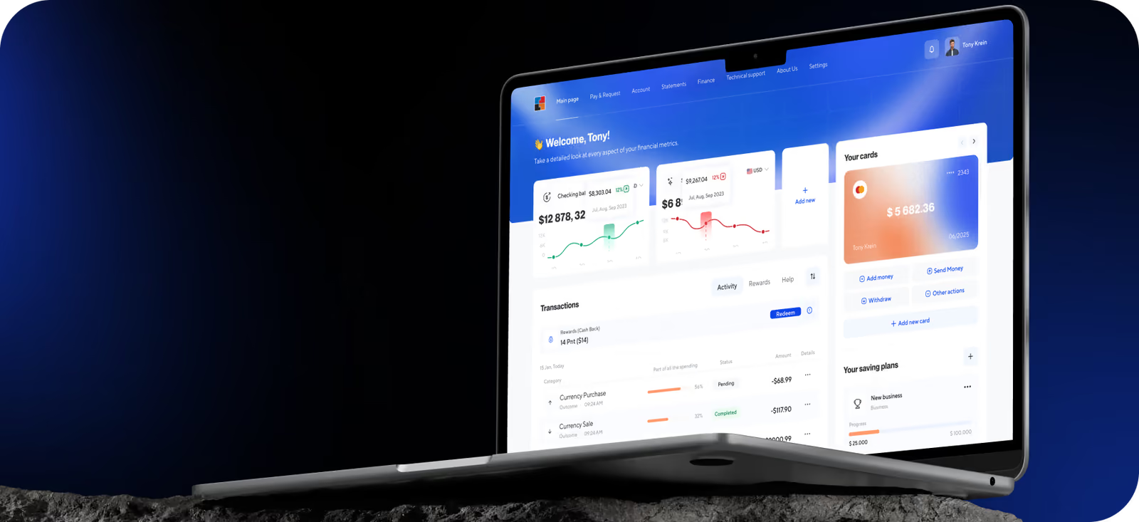
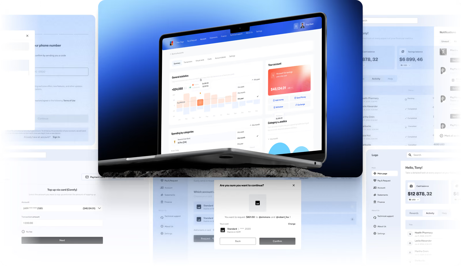
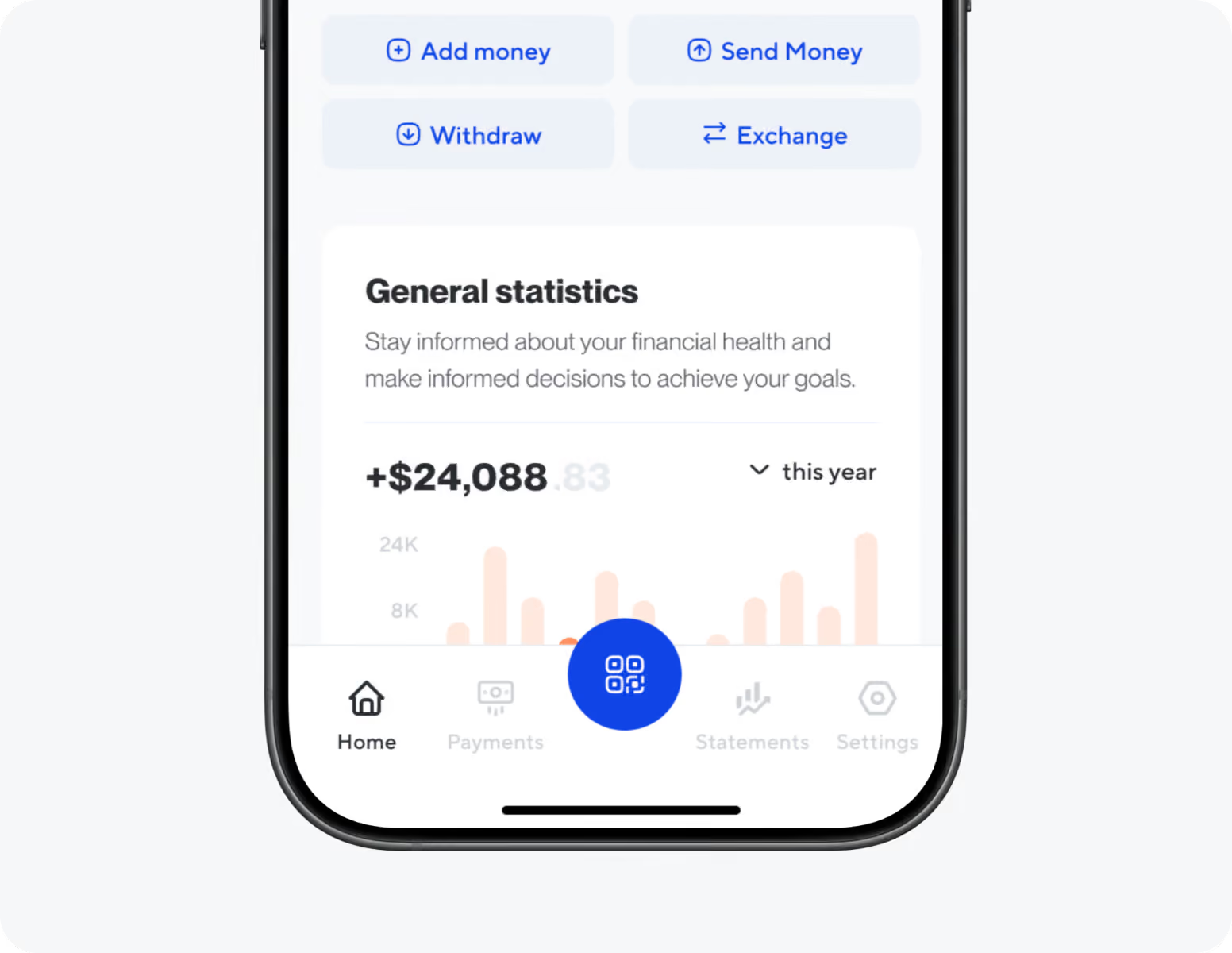
The web interface features a card-based layout with a clear visual hierarchy, subtle color accents to highlight balances and key actions, and intuitive navigation. Users with varying levels of digital experience are provided with a predictable workflow for banking, payment, and financial functions. We simplified the KYC process by transforming it into a minimal, step-by-step verification sequence that collects only the information required by compliance regulations. This approach reduces the number of drop-offs at the most common exit point for new users.


Our fintech design handles complexity, passes compliance, and converts first-time users.
Mobile App
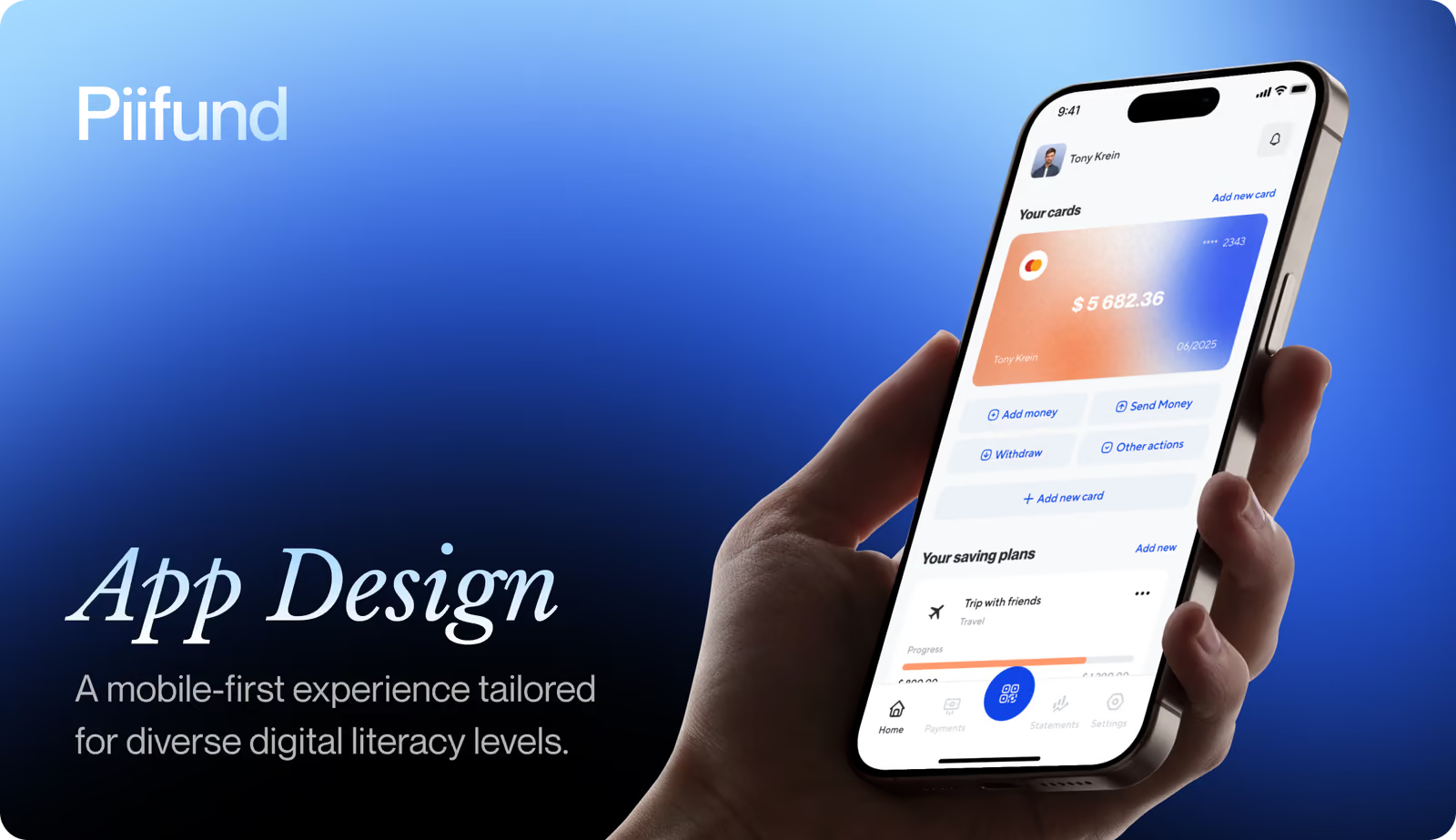
Our primary focus was on mobile experience in low-connectivity areas. We created high-contrast UI elements to ensure legibility on low-resolution screens. Single-column layouts eliminate scrolling and minimize input errors on small screens. Lightweight interface patterns load reliably over slower connections. Every high-stakes action requires clear user consent.
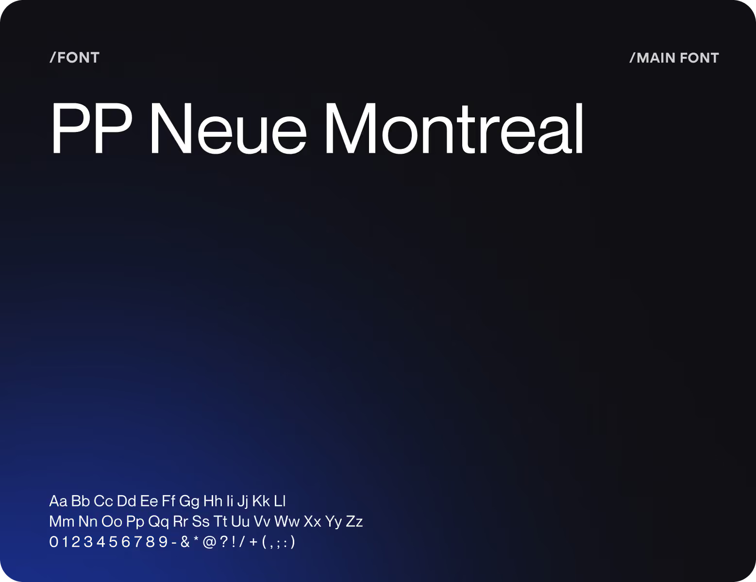
Design system

( Results )
WHAT CHANGED
42%
Fewer user errors
Simpler processes, a clearer hierarchy, and well-designed verification workflows have helped minimize the number of errors when performing critical actions.
31%
Faster onboarding
flow A clearer KYC structure helped users move through verification faster while still keeping the process understandable and compliant.
87%
Task completion rate
According to user testing, the majority of participants were able to accomplish essential banking operations such as account review, transfers, payments, and loan-related processes without requiring external assistance.
84%
Mobile usability
Score Participants were able to perform key actions seamlessly on mobile devices, confirming the project’s goal of providing a responsive user experience for users across different devices and under various connection conditions.

Social Media
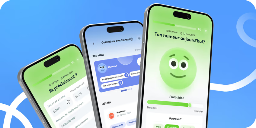
PIIFUND’s visual content on social media allows users to immediately assess financial value. Striking typography and concrete metrics replace abstract claims with direct evidence. A dark gradient background with soft blue accents maintains a consistent brand style across all formats. Each banner contains a single message. One number. One benefit. One clear call to action.