






- Client
- Velox
- Industry
- Travel & mobility
- Headquarters
- USA
( About the project )
About
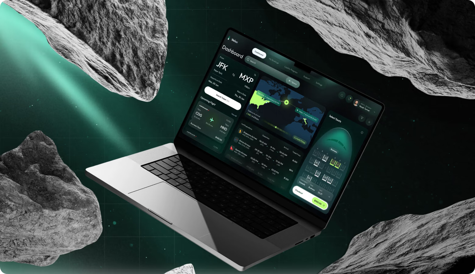
Velox is an airline booking platform that lets users search, compare, and book flights in a single-screen dashboard without switching tabs or pages. The request was to design a web app with a clear flow for frequent flyers and business travelers.
( The brief )
Challenge
Problem
The key issue was to combine flight comparison, seat selection, and checkout on a single page. We had to avoid cognitive overload or losing context between booking steps. The interface should balance a dark theme with high readability and accessibility.
Solution
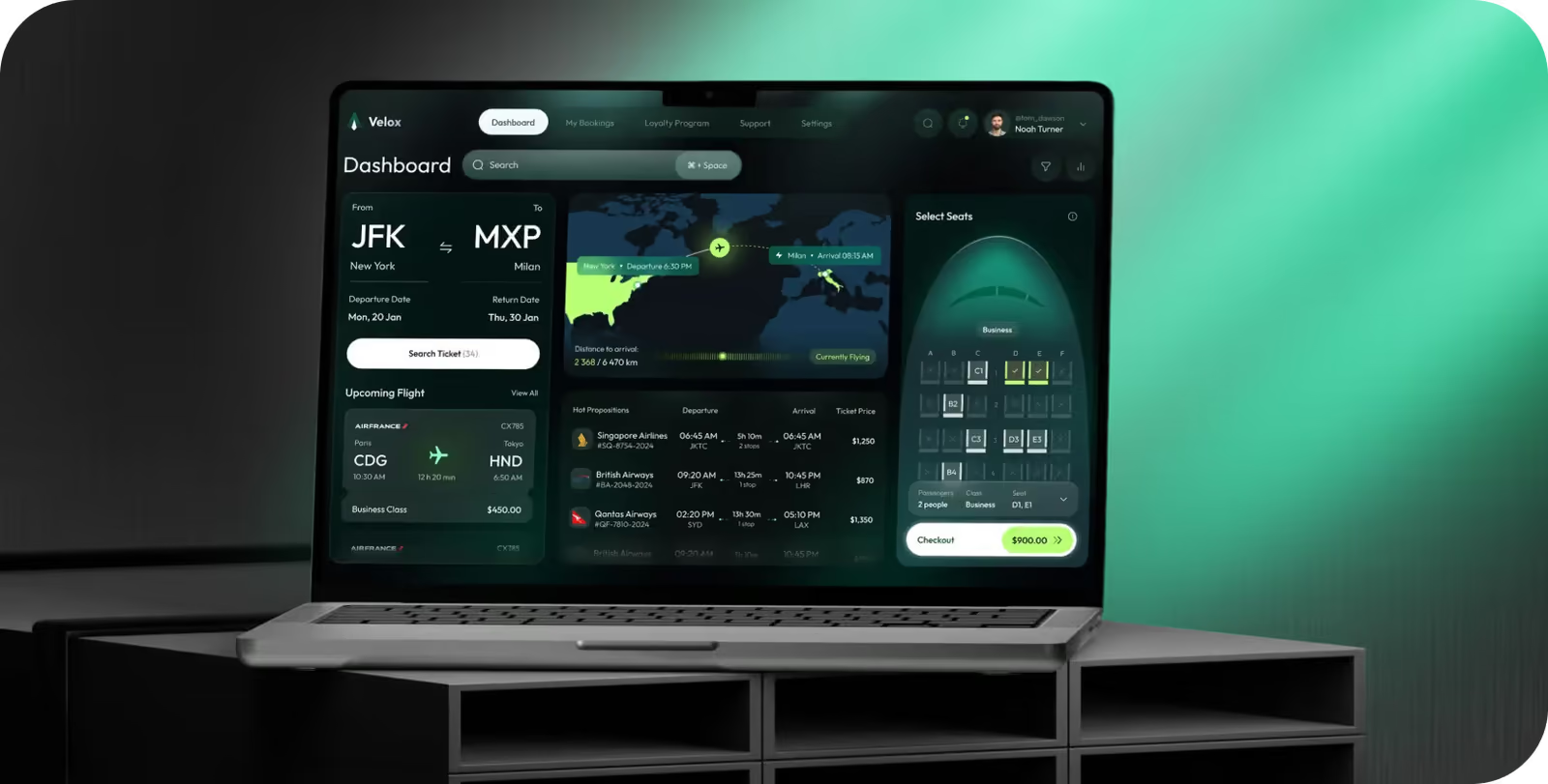
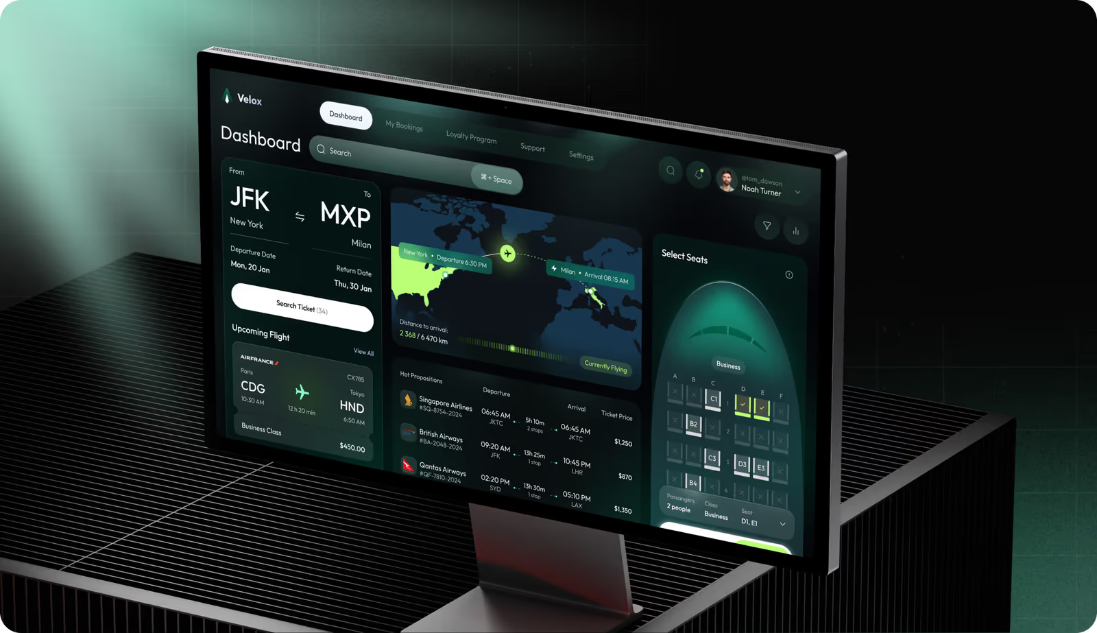
Our team designed the dashboard where flight search, comparison, seat selection, and checkout operate as integrated panels on a single screen. Each step doesn’t hide previous selections. Layered shadows and glow accents separate functional zones and direct attention in a left-to-right logic flow.
( How we worked )
Process
- DiscoveryBriefing & onboarding, Competitor analysis
- BrandingLogo Concepts, Social Media, Brand Guidelines
- UX designApp Flow, User Flow, Wireframes
- UI designDiscovery, Moodboard, UI Concept, UI Layouts
Logo Concept Design
We brand designer created a Velox mark that combined an upward arrow and an aircraft silhouette. It reinforces the brand's core idea of speed and precise direction. We built the logo on the same emerald-to-dark gradient used across the dashboard, so the brand identity feels like part of the user experience.


Web Application Design
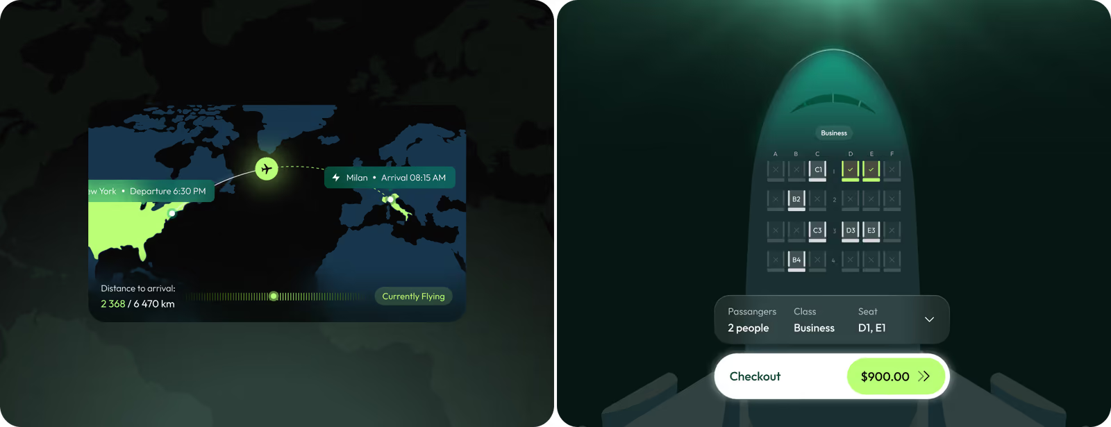
Our UI/UX designer placed flight search, airline comparison, and seat selection side by side in a dashboard for fast decision-making. We show the route visually on the map with several airline options. Their prices, durations, and stopover details sit directly below for quick comparison. The seat selection panel opens in the context of a top-down aircraft view, with color-coded availability and a checkout summary, so users never leave the dashboard to complete a booking.
Mobile Version
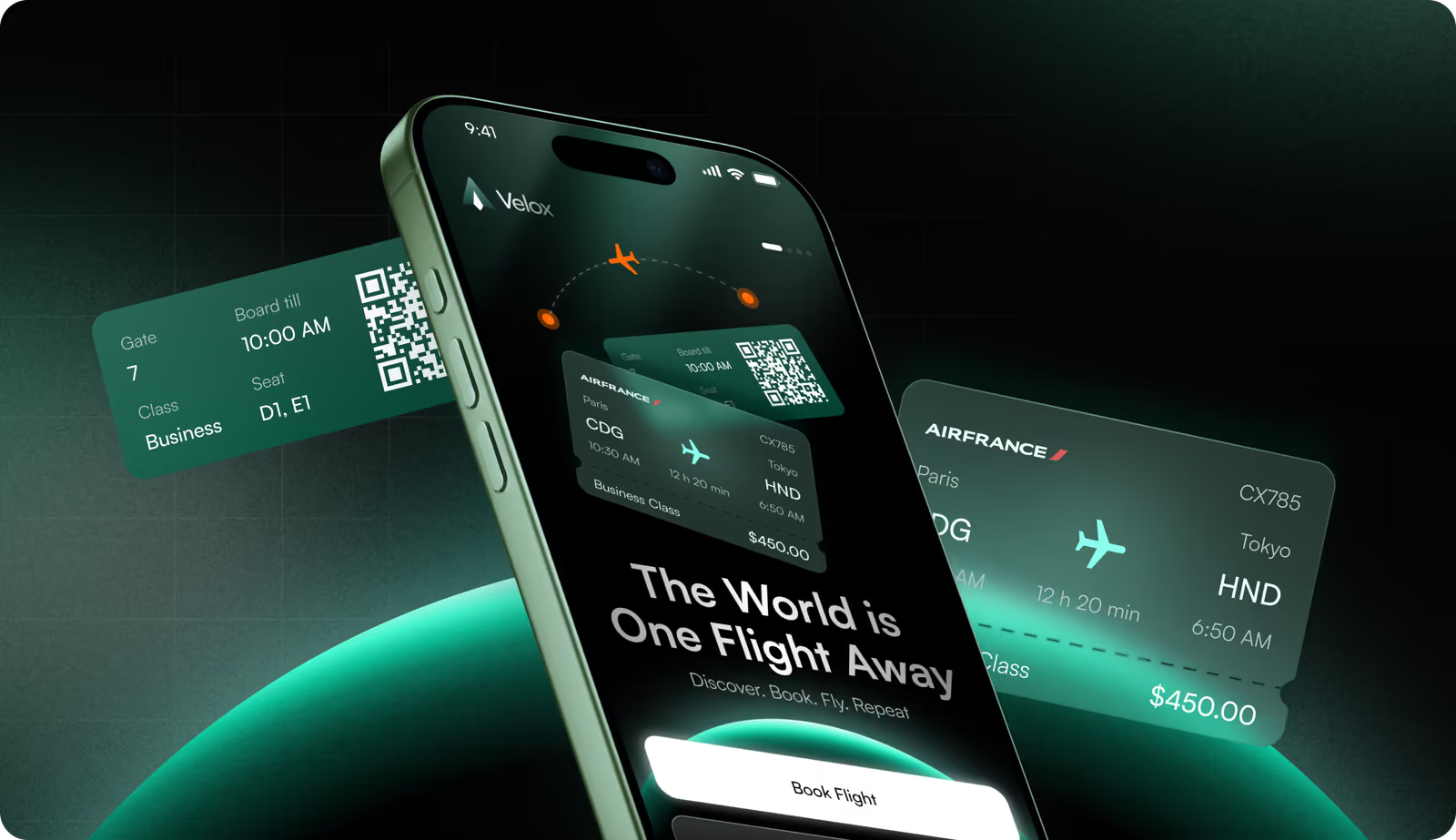
The mobile interface adapts the app's logic to a vertical card flow and keeps pricing and booking status visible at every step via a persistent bottom summary bar. Our graphic designer delivered a custom set of aviation-specific UI elements: seat availability indicators, flight state markers, airline badges, and interactive map pins. Each element has a functional meaning to work at a small-screen scale without text description.

We specialize in high-density interface design to make it intuitive from the first session.
Instagram Layouts
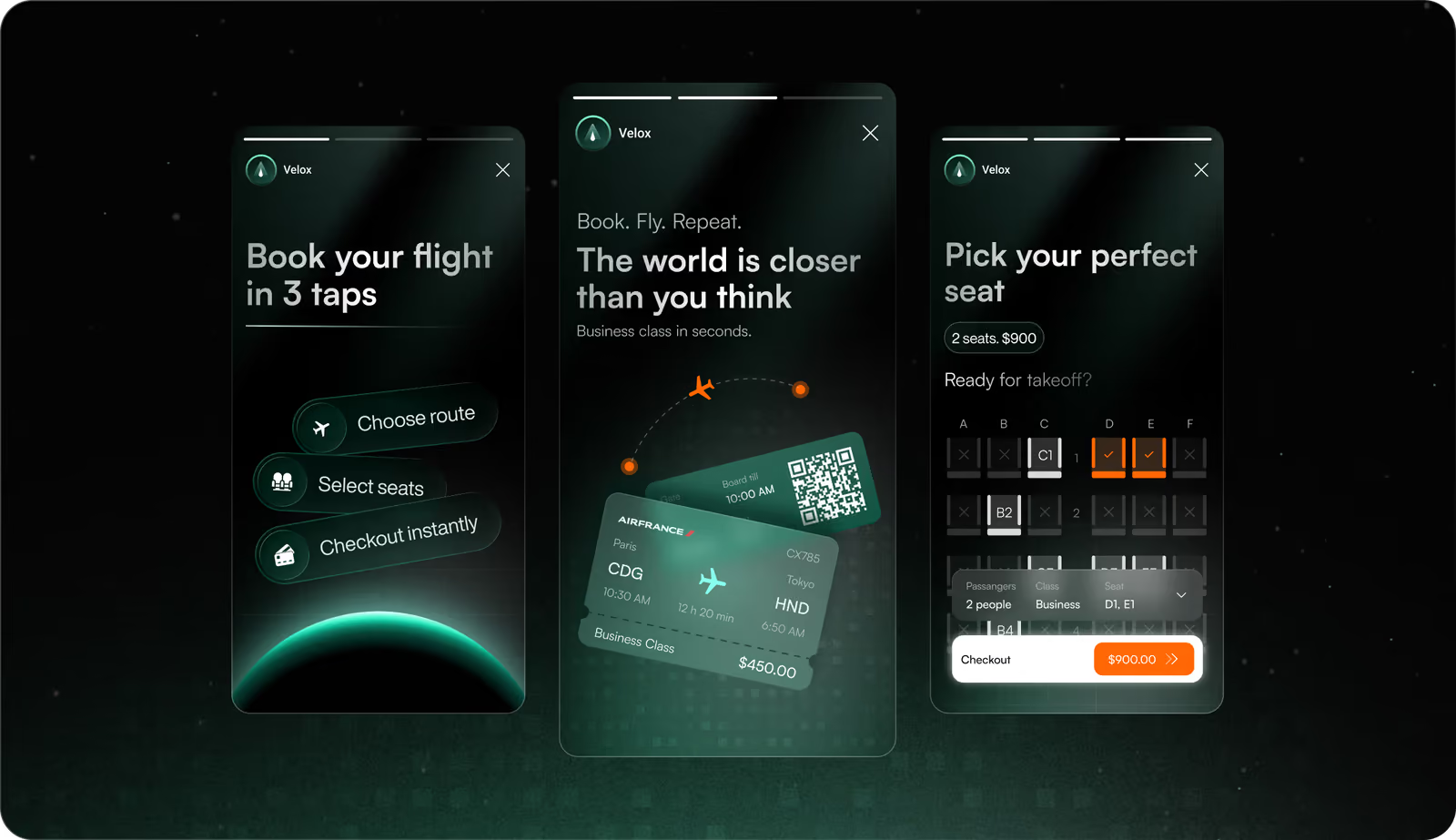
Our client got a set of Instagram screens that walk potential users through the Velox booking flow. They communicate a specific product value without extra context. The social media approach treats every frame as a landing page. Visuals match the product UI exactly, so users already know what the interface looks like before they download.
Design system
( Results )
WHAT CHANGED
94%
Task completion rate
Participants completed the full booking flow from flight search to checkout without navigating back or restarting any step.
87/100
System usability scale score
Testers rated the single-screen dashboard layout as highly intuitive and easy to learn on first interaction.
1.5 min
Average booking time
Users finished the entire search-to-payment flow in under 2 minutes, compared to the 3-4 minutes on multi-page airline platforms.
<3%
Error rate
Color-coded availability indicators and instant price updates kept misclicks and booking mistakes near zero during testing.